7.4. Motion design
Here I will explain per micro interaction what the motion design does and why it is implemented this way, giving you insight on my motivation and reasoning. The page was too big and it made my whole biography load slow, this is why it is on a separate page.
Disclaimer: This page features a lot of GIFs, please let it load for a minute.
Introduction
1. Loading & Login
-

- Loading indicator
-

- Login steps
Reasoning:
I wanted the loading indicator to give that winter sports vibe, so I made one that represents a snowflake dissolving. The loading indicator is only used on the first screen to show it off, it has no actual use in the app yet, but if the app gets developed this is the kind of loading indicator I want. As for the login steps, they fade in from top to bottom to ease the user into this screen. A lot of sports apps, like Nike Run Club, have a video playing in the background. I wanted to turn this around and present the user with a more subtle approach.
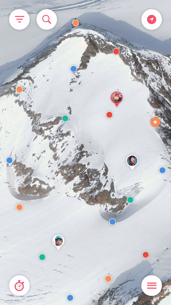
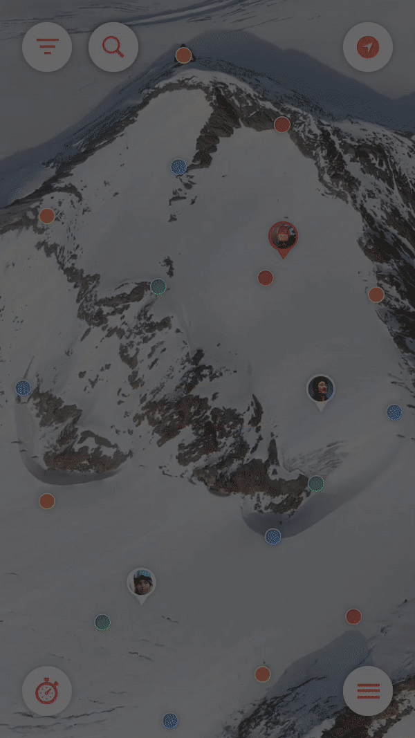
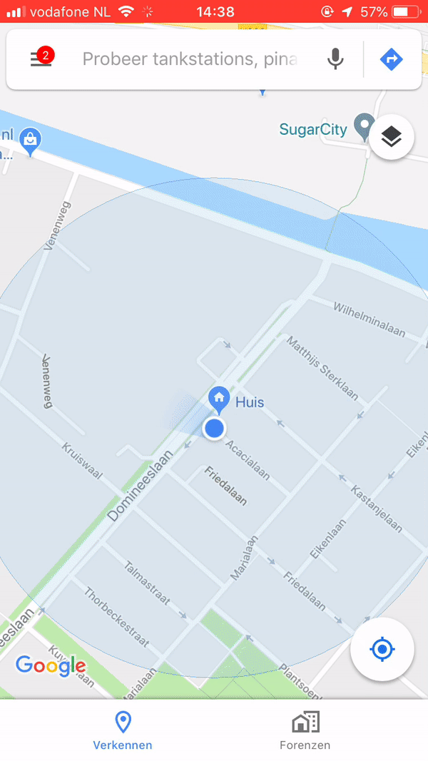
Map
1. Menu
-

- Menu
Reasoning:
The menu is of my own creation with no outside inspiration involved. I wanted to go with a classic hamburger menu button so users instinctually know this is the menu, but open it in such a new fashion that they have never seen before. The menu items ‘pop’ out of from the back of the menu button and spread out like a fan. The menu items are placed in a curve manner to they compete a half circle from the right to the left UI button.
2. Filter & Search
-
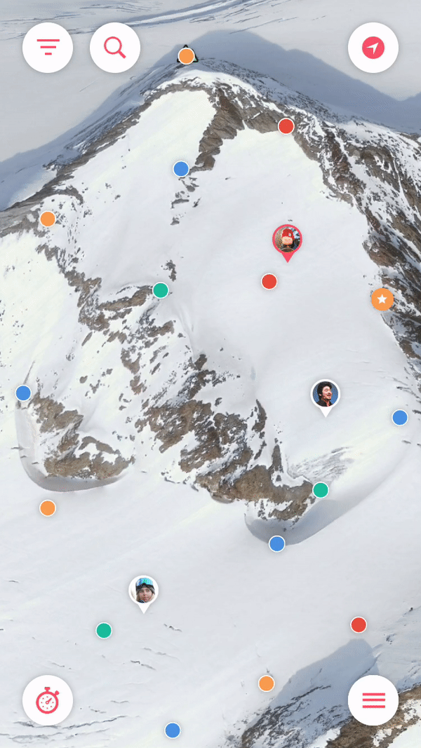
- Filter
-
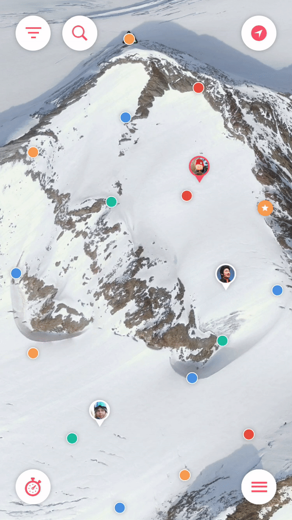
- Search
Reasoning:
The filter icon is a funnel represented by three lines from large to small. If this button is clicked the top and bottom lines shrink and enlarge respectively to indicate the menu can be closed again. It does not only represent a funnel icon, but also an arrow pointing up or downwards. The elements inside the filter menu represent the POI dots on the map. When clicked, a filter can be turned on or off indicated by the buttons being filled with color or not. The filters give a ‘bounce’ when pressed to give a quick feedback to the user.
The search bar opens op with a bounce as well. It fills in the blank space between the top two UI buttons. When clicked a series of steps happen, the bar expands and text appears, the search icon turns 180 degrees, a keyboard pops up and a blinking typing line appears. This is all done to give the user feedback that the app is ready for him/her to type.
4. POI detail
-

- POI click
Reasoning:
The POI’s on the map are smaller, condensed versions of the filter buttons. When clicked the POI’s expand with a bounce and show the full icon. Also a information bar ‘falls’ down and three buttons with options pop out from behind the bar. The bar and the buttons move separately to indicate these are separate elements and that they can be interacted with differently. When a user has the an POI open and clicks on a different POI, the bar does not disappear, it only changes information. This is done to not give the user an ‘animation overload’ so to speak, it would get to heavy on animations otherwise. No matter what POI is open, when closed (by tapping outside of the POI) the information bar slides back up.
Activity Tracker
1. Activity tracking
-
- Activity Tracker
Reasoning:
When the Activity tracker feature is opened and the page slides in from the bottom, the gradients slides in from a slanted angle and the opacity is filled. Also the two main buttons ‘pop’ out from the bottom of the screen. This is to give the user the feeling the page is accelerating, just like they will be doing when sliding down the slopes.
My Mountain
1. Weather & King of the Hill
-
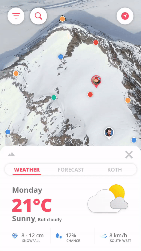
- Animated weather icon
-
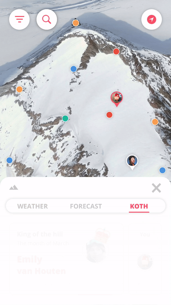
- King of the hill
Reasoning:
This is very micro, but the weather icon is animated. The clouds move all so slightly and the sun radiates. It is so subtle you might not notice it, but that is the beauty of it. If the app is developed, all the weather icons will have an animated variant. But the animated variant is only seen on the weather page, not the forecast page. The king of the hill points bar grows from the bottom of the card view to give the users the hint that the person on the left’s bar is higher than yours. That equals more points.
Achievements
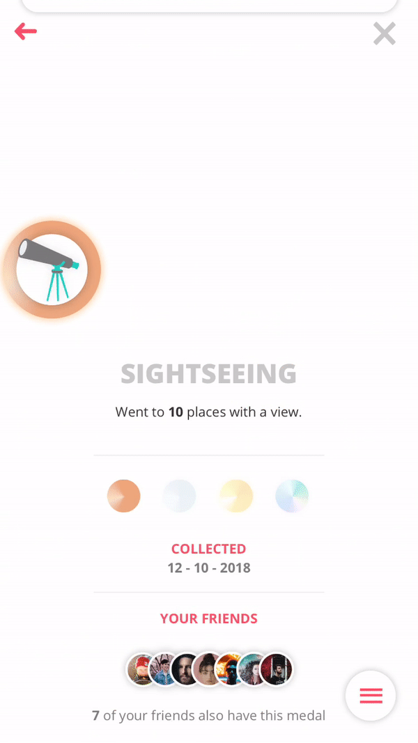
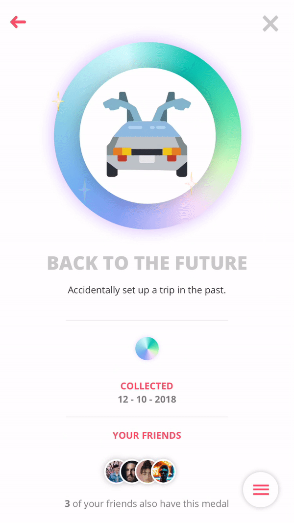
1. Medals & Leaderboards
-
- Medals
-
- Diamond medal shine
-
- Earning a medal
-
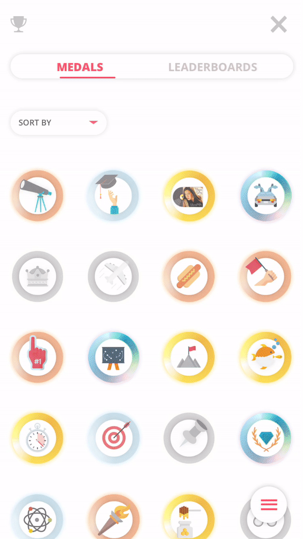
- Leaderboards
Reasoning:
The animation that plays when you tap on different variants of one medal can be describes as a ‘pop’ or ‘bounce’ this is a common thing in the app as more elements (like buttons) do this.
The medals have ranks, gold is obviously ‘better’ than bronze with diamond being top tier. This is the reason why diamond medals have a extra ‘shine’ to indicate that 1. you have collected this and 2. it is very.. very special.
When a medal is earned a screen pops up that says MEDAL EARNED! Not only this but there is also an animation of a medal flying into the users screen with a sound playing as well. All done for that satisfying instant feedback of achieving something great like a medal.
The leaderboards gold, silver and bronze bars fill in just like the King of the hill bars. Feedback indicating the top three and also making sure the users eyes go to that part of the screen.
Profile
1. Swipe notification, Trips & Add
-
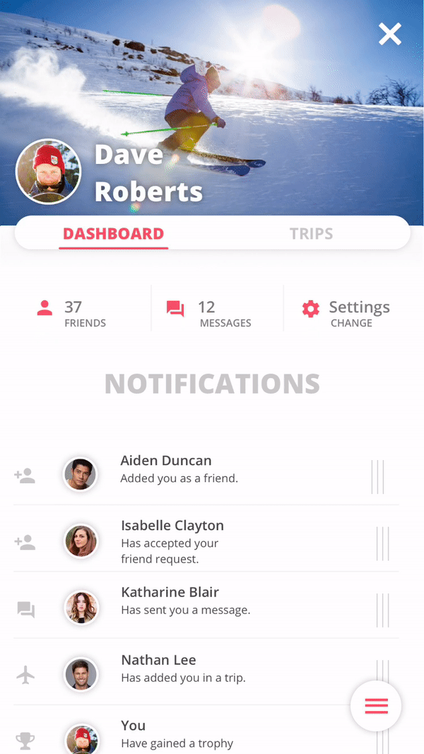
- Swipe notification
-

- Trips
-
- Add button
Reasoning:
This is one i’m particularly proud of. The notifications have a ‘grip’ indicator on the right hand side so the users will instinctively know that that notification can be pulled aside to show buttons or other elements, just like in the most email applications. While the notification itself slides to the left in a ‘snappy’ manner, the buttons slide in from the right with a bounce. This is to draw the users attention more to the clicable options that to the notification.
Others
1. Slide in from bottom
Inspiration:
-
- Google Maps
-
- Local by Facebook
-
- Slide in
Reasoning:
The inspiration for all the pages sliding in from the bottom of the screen came to me from apps like Google Maps and Local by Facebook. I want the map to have the main focus, and I want the user to have the feeling the map is always waiting for them just behind that screen they are currently on. The pages can simple be swiped down again or closed with the ‘X’ button. Some pages fill up half the screen, while others overlay the complete map. This is done because some features need to have the map visible at all times, like discover and my mountain. But other screens need more room for information, like achievements and your profile.