1. Index
General information
| Name | Dale Schnieders |
| Student number | 500717503 |
| Educational institution | Amsterdam University of Applied Sciences |
| Course | Communication & Multimedia Design |
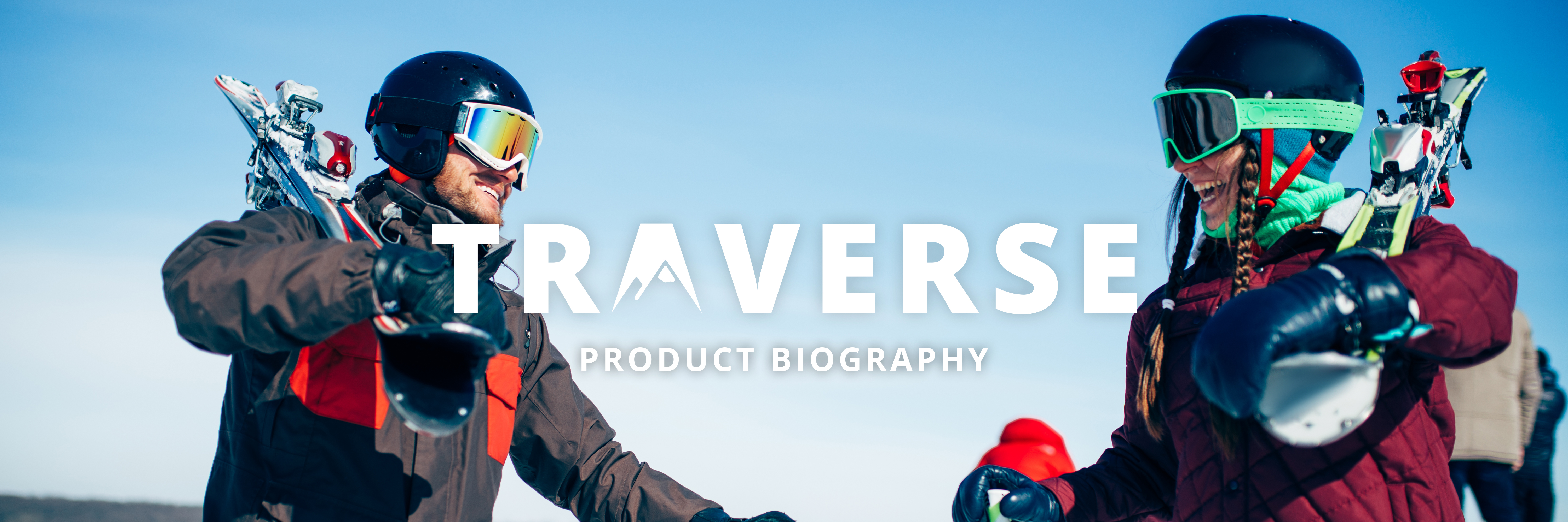
| Graduation project | ‘Traverse’ |
| Graduation supervisor | Roey Tsemah |
Contact information
| Name | Number | |
| Dale Schnieders | 06-15033080 | Design@DoorDale.nl |
Design rationale
You can view the design rationale of this project by clicking the button below. The design rationale is a more concise document based on this product biography.

2. Introduction
In this document you can read about the research and design choices for the application ‘Traverse’. The application has been designed, prototyped and tested based on CMD methods. This document will provide insight into the thought processes and the choices that have been made.
What is Traverse?
Traverse is a winter sports application for snowboarders and skiers based on gamification. The snowboarders and skiers will be able to use this application before, during and after skiing trips to not only have insights on their performance, but also compete with each other for points and achievements and make and share memories with friends and family.
The project
This is a graduation project for the Communication & Multimedia Design course on the University of Applied Sciences in Amsterdam. The project lasted 20 weeks, with weekly feedback from an assigned graduation supervisor. The feedback sessions were shared with a group of four fellow students.

3. Context
This chapter gives context to the situation of the project, describing the problems people face while on a skiing trip, where the idea for the project came from, who the stakeholder are and who the audience is that is being targeted.
3.1. The problem
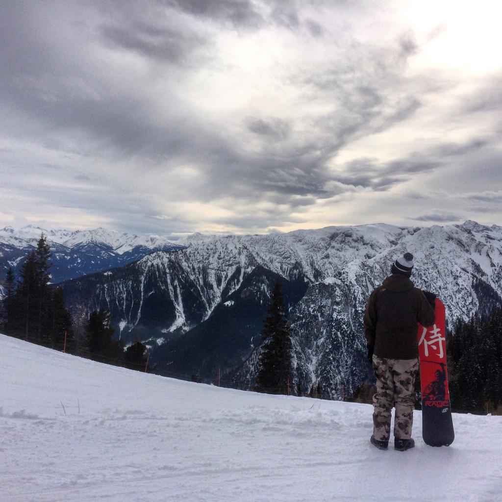
Close your eyes and imagine…
You are on a beautiful snowy mountain, wind blowing through your hair and some ski’s strapped to your feet.
You wave your two friends goodbye because they have gone ahead. They planned on taking a black route, but you just wanted to some blue ones because you’re not that good yet. You brought a map of the ski resort from down the valley and you take it out of your pocket. Just wat you need, it’s soggy. You throw the map in the trash and think to yourself: “whatever I will just go and see where I’ll end up.”
You’re cruising down the mountain and you remember that your friends wanted to meet up at 12 at a Cabin for some food. You check the time and realize it’s already 11:45, better get going. You take the chairlift up and check the big map on the slope. “This is not clear at all” you think to yourself.
When you finally arrive at your destination, you’re 20 minutes late. Your friends laugh at you being late. You sit there and think to yourself, there has got to be a better way.
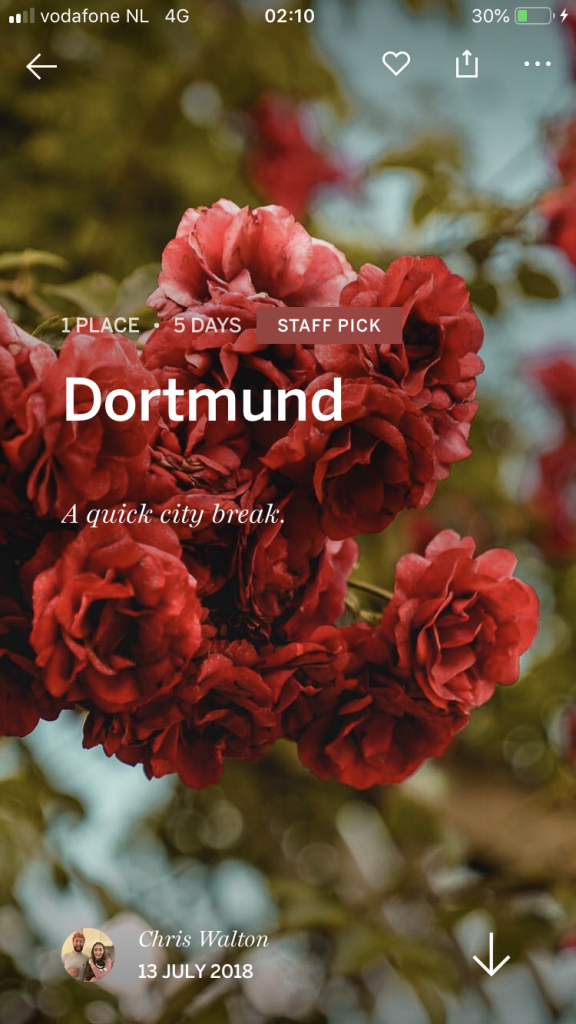
That’s where my project comes in.
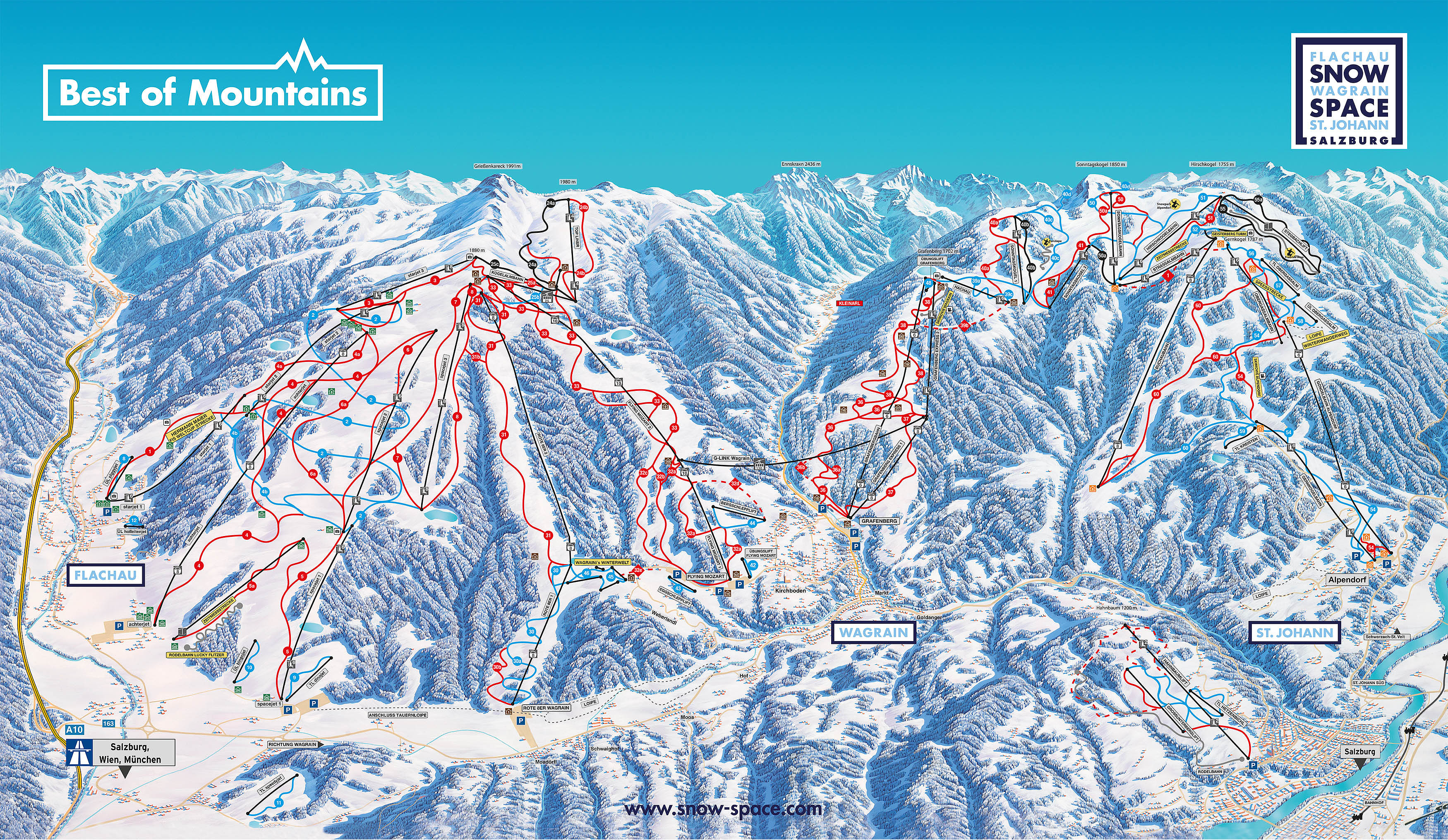
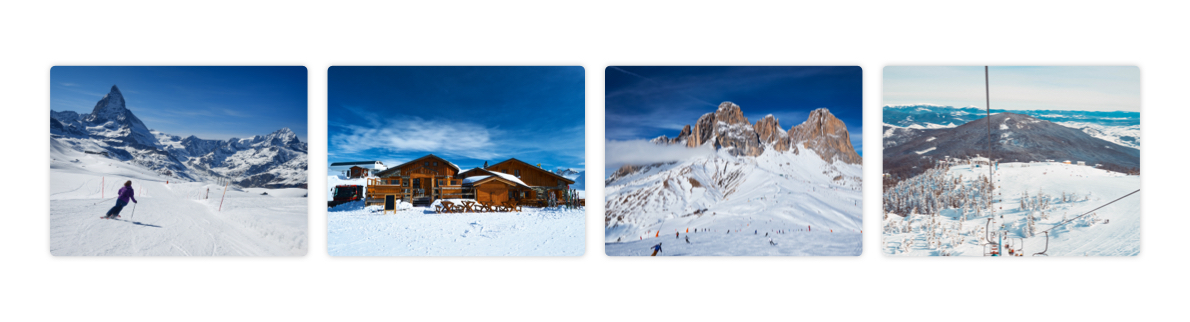
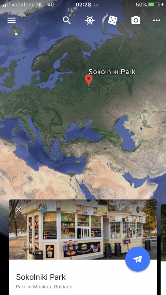
Example of a ski resort map
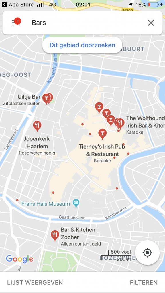
On the image above you can see a map of a big ski resort. These maps usually can be picked up in the gondola buildings in the valley or on the mountain itself. These maps are made of a material that can not handle being wet, something what comes natural in snowy area’s. However, there is a large version of the ski resort map on the slope itself. The problem here is that you can’t take this with you. This result in a “I will see where I will end up” attitude. This snowballs and creates another set of problems for the people. For example: they’re not exploring the map and all its secrets, they miss out on great spots they would not spot on their own or they have trouble finding each other after splitting up. A lot of people try to solve the issue with the map by making pictures of the map so they have it with them at all times or have an internet page open of the ski resort so they can check the map there.
The idea to solve this problem came from my own experiences on winter sports trips. I have experienced most of the problems depicted after snowboarding for almost 15 years now. This project gave me a platform to solve a problem I have first hand experience in.
-
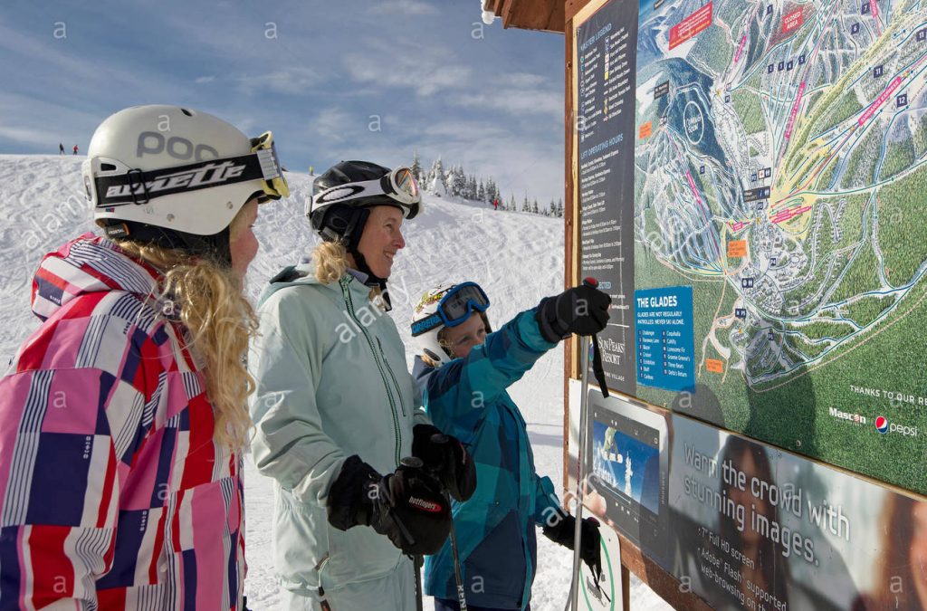
- Example of a map on the mountain
-
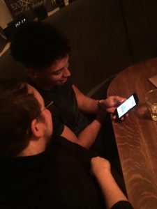
- Myself, on a skiing trip
3.2. Stakeholders
Identifying the stakeholders
I started off making a list of who the stakeholders were in my particular problem. I started with the biggest and most important group of stakeholders, the winter sports enthousiasts. They experience the problem first hand. They became the core stakeholders. The rest of the stakeholders are directly and indirectly involved in their problem. The stakeholder map is a visual representation of this list.
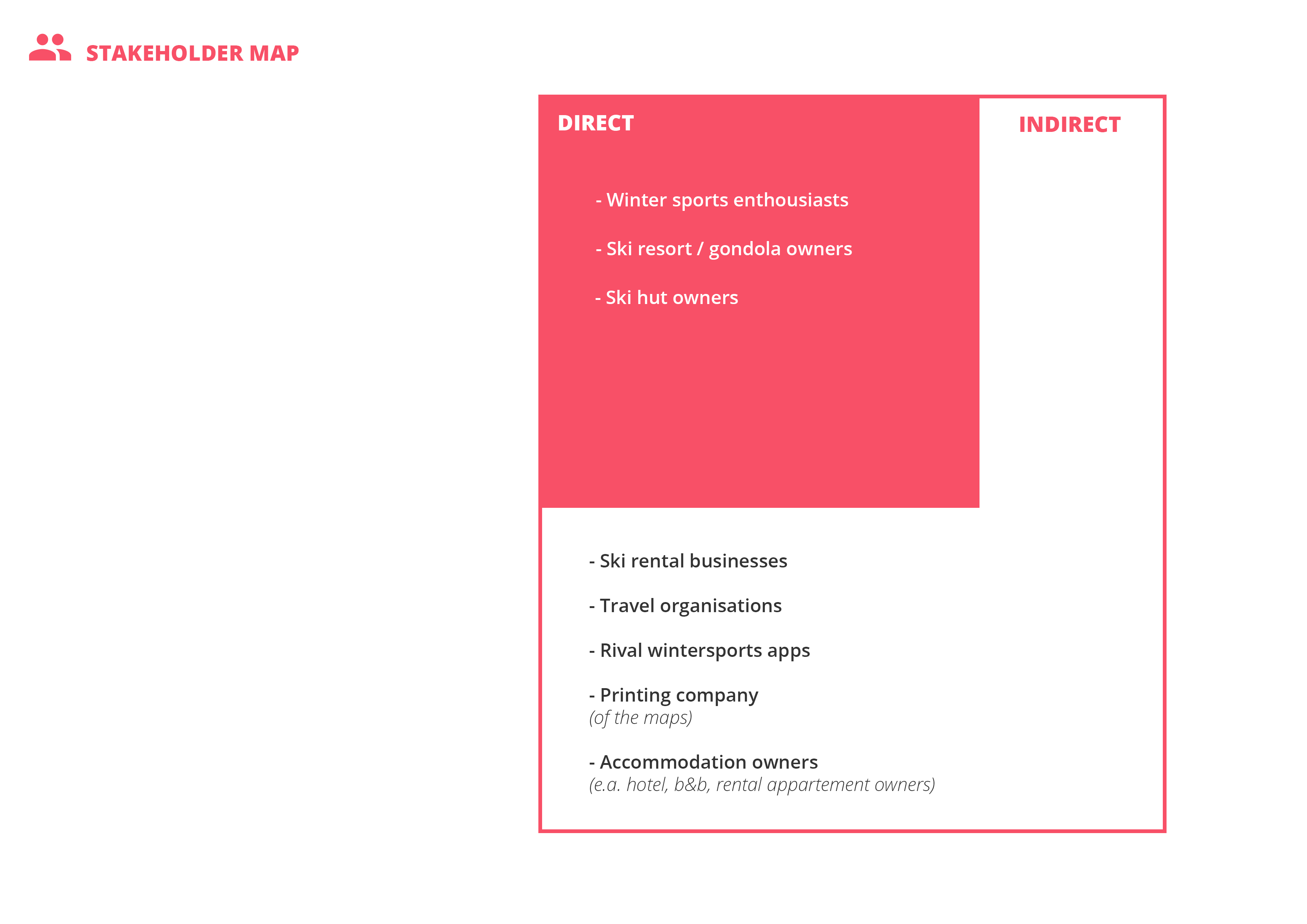
I continued by placing all the stakeholders in a matrix, to see how much power and interest they have in the problem. After this research I had decided that three of the stakeholders were more important than others for implementing a solution for the problem.
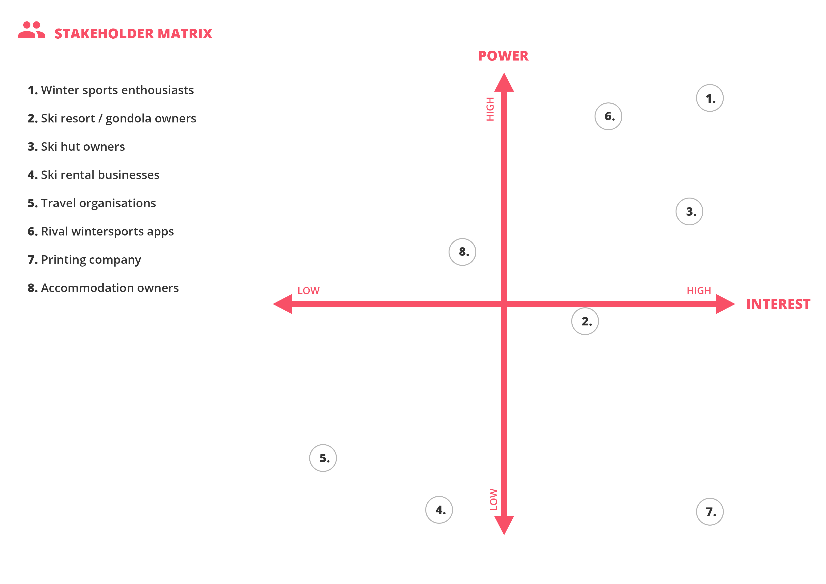
Analyzing the stakeholders
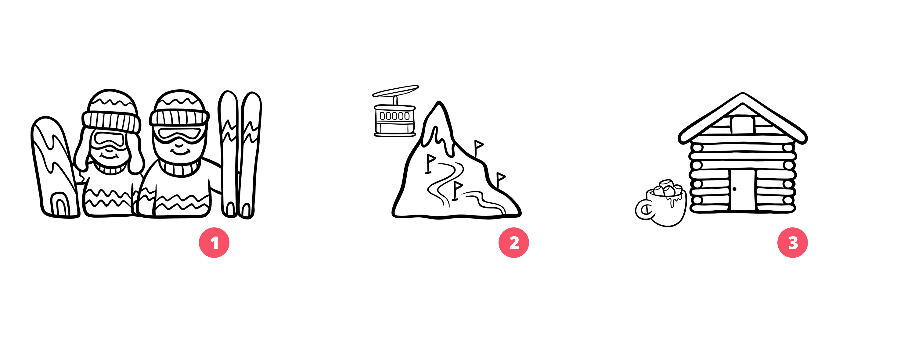
There are three stakeholders that have direct influence in the problem. The winter sports enthousiasts, the ski resort / gondola owners and the owners of the huts that food and beverages. Here I will explore their needs further.
1. Winter sports enthusiasts
Winter sports enthusiasts are the main stakeholder in the problem because they experience it first hand. The problem they experience that the static map makes orientating on the mountain in big winter sports areas, choosing a path down or meeting up somewhere harder than it should be.
Certain wants:
– Winter sports enthousiasts want to have the map with them at all times.
– Winter sports enthousiasts want to be able to find each other after splitting up.
Uncertain wants:
– Winter sports enthousiasts want to use 1 app, not multiple.
– Winter sports enthousiasts want to explore the mountain.
2. Ski resort / gondola owner(s)
The owner(s) of the ski resort are usually the owner of the main gondola as well. They spend a fair amount of money printing maps and they don’t do anything to redesign them or innovate because this can be time consuming, expensive or maybe both.
Certain wants:
– Ski resort owners want to have more awareness for their resort.
– Ski resort owners want to spend less and earn more.
Uncertain wants:
– Ski resort owners want to innovate and improve the winter sports experience.
3. Ski hut owners
Eating- and drinking establishments are located on the mountain and are shown on the map most of the time, but that does not mean they are known. Some establishments are always full and never have room, but some are not busy at all because they are off the beaten path.
Certain wants:
– Ski hut owners want to have more brand awareness.
– Ski hut owners want to have a more prominent role on the map.
Uncertain wants:
– Ski hut owners want to distribute pressure evenly to other ski huts.
– Ski hut owners want to have more clients on times of the day where business is slow.
3.3. The target audience
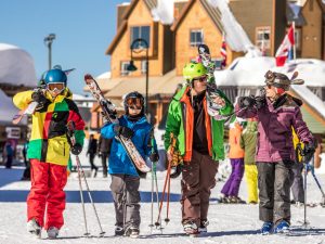
Winter sports enthousiasts
The main stakeholder I want to be focussing on is the one that will be using the product, the winter sports enthousiast. While ‘winter sports enthousiasts’ is a broad term that can involve sports like langlaufen, ice skating, bob-sleighing or curling, I will mainly focus on skiing and snowboarding. This is because the majority of the Dutch winter sports enthousiasts go on a skiing trip to ski or snowboard.
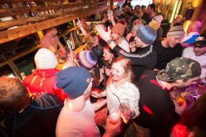
Après ski
A lot of the young Dutch winter sports enthousiasts go on skiing trips for the après ski, and only that. They will probably do some skiing, but it is not their primary focus. This is why I decided to exclude these users from my target audience.
-
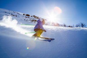
- Skier going down a slope
-
- Indoor après ski enviroment
Conclusion
The users I want to be focussing on are the winter sports enthusiasts that are over their ‘I just go for the après ski’ fase and are serious about their respective sport, will it be skiing or snowboarding and are always willing to challenge themselves. The winter sports enthusiasts can be male or female between 20 and 35 and are average or above at their respective sport.
More on how I came to this conclusion in the next chapter: “04. Initial research”
4. Initial research
Here you will find the various methods I did to conduct research on the subject matter. All research methods used are from CMD methods.
4.1. Desk research
In this chapter I searched the internet to get to know my target audience better and to research methods and trends in the industry that could aid me in making this project stand out from the rest.
4.1.1. The target audience
Dutch winter sports
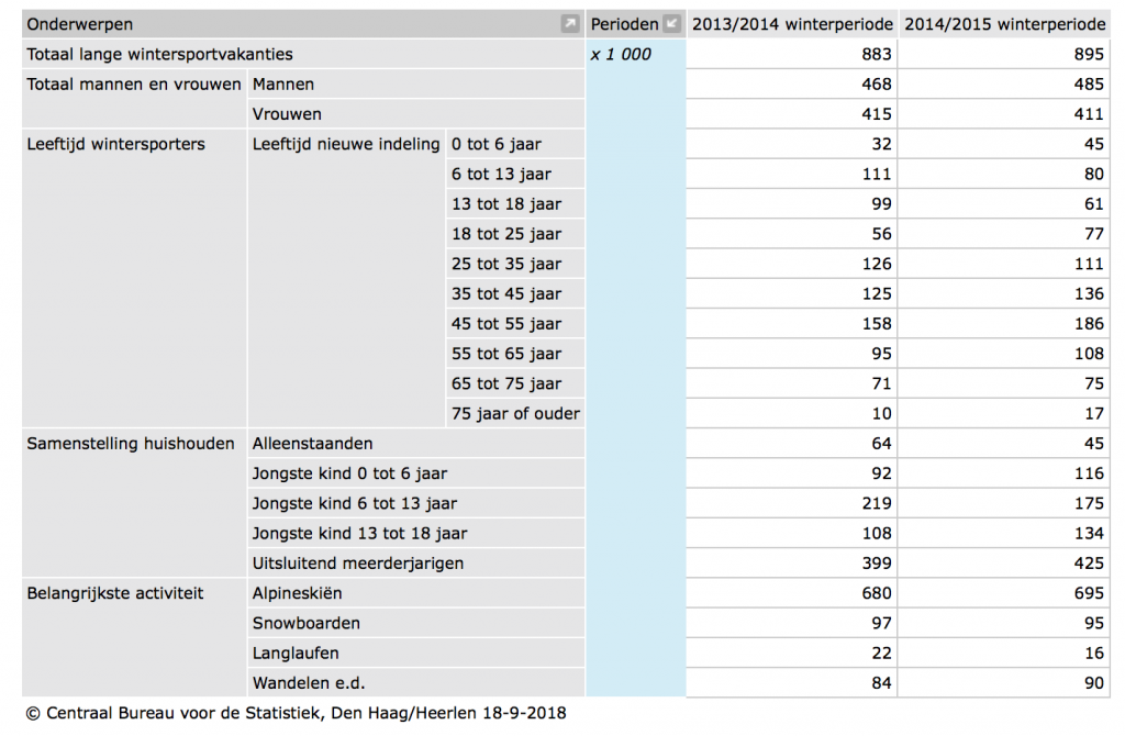
While the dream is for the app to go international, Dutch winter sports enthusiasts are the first I want to focuss on because of our natural likeness to the winter sport area’s. A research from the CBS states that Dutch people don’t back down from their winter sports holidays because from 2010 till 2016 the number of people going to countries like Austria, Switzerland and Denmark are pretty consistent. CBS also concluded that not only is the group that goes skiing about seven times as large as the group that goes snowboarding (695×1000 skiers to 95×1000 snowboarders) but they also concluded that winter sports enthousiasts in the age group 25 to 25 are one of the biggest groups out there.
-
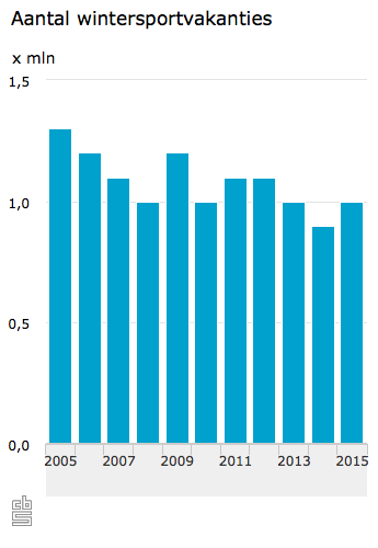
- Number of winter sports holidays
-
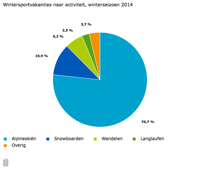
- Winter sports holidays per activity
-
- Winter sports holidays per age group
-
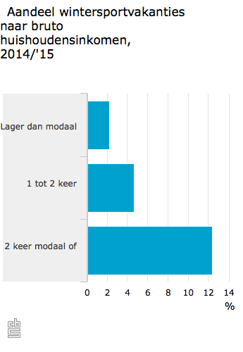
- Percentage of winter sports holidays per income class
The user
The user I want to be aiming for is the winter sports enthousiasts that are in the range of 20 to 35 years old. This age group is using his/her phone for everything in daily life and will be able to be intrigued by a new innovative app. As seen in the dataset provided by CBS, it is shown that this age group is a large enough number to focuss on.
The focus group should be of a certain level of expertise in their respective sport (snowboarding or skiing) to understand and fully implement the app in their winter sports runs and routines. Insideoutskiing.com describes this expertise as ‘levels’ and have a handy guide for determining your own level. The group I want to adress is Level 6 – Early Intermediate and up. This guarantees the user is proficient enough to have the know-how for all the features.
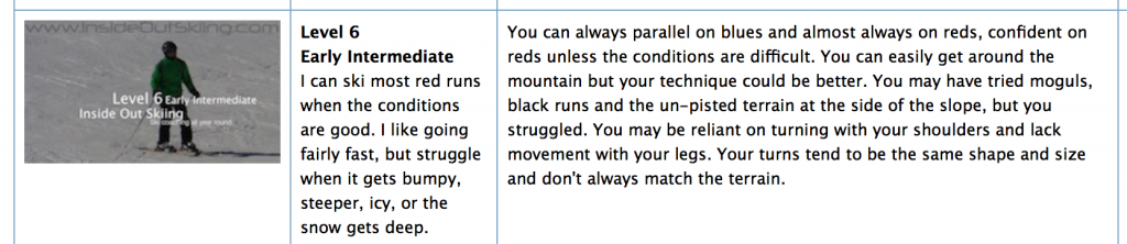
Explanation of level 6 from insideoutskiing.com
-
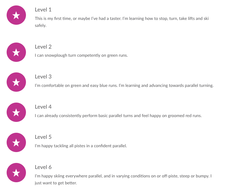
- Skiing levels from skinewgen.com
-
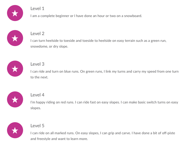
- Snowboarding levels from skinewgen.com
Conclusion
The user I want to be aiming for is the winter sports enthousiasts that are in the range of 20 to 35 years old. This age group is using his/her phone for everything in daily life and will be able to be intrigued by a new innovative app. As seen in the dataset provided by CBS, it is shown that this age group is a large enough number to focuss on.
Sources:
– CBS. (2015, 30 december). Strandvakantie in de winter bijna even populair als wintersport [Dataset]. Geraadpleegd op 30 maart 2018, van https://www.cbs.nl/nl-nl/nieuws/2015/53/strandvakantie-in-de-winter-bijna-even-populair-als-wintersport
– CBS. (2016, 22 december). Wintersport vooral populair onder hogere inkomens. Geraadpleegd op 30 maart 2018, van https://www.cbs.nl/nl-nl/nieuws/2016/51/wintersport-vooral-populair-onder-hogere-inkomens
– CBS. (2017, 1 meia). Vakanties; kerncijfers [Dataset]. Geraadpleegd op 30 maart 2018, van https://opendata.cbs.nl/statline/#/CBS/nl/dataset/70232NED/table?dl=8136
– CBS. (2017, 2 meib). Wintersportvakanties; achtergrond- en vakantiekenmerken [Dataset]. Geraadpleegd op 30 maart 2018, van http://statline.cbs.nl/Statweb/publication/?DM=SLNL&PA=37282&D1=0,13-22,47-53,72,75,78,84,89-90,96,99-104,111-115&D2=24-25&HDR=G1&STB=T&VW=T
– CBS. (2018, 24 februari). Minder skiën en meer wandelen tijdens wintersport. Geraadpleegd op 30 maart 2018, van https://www.cbs.nl/nl-nl/nieuws/2018/08/minder-skien-en-meer-wandelen-tijdens-wintersport
– What’s my level. (2018). Geraadpleegd op 30 maart 2018, van http://www.insideoutskiing.com/level.html
– CBS. (2016, 22 december). Wintersport vooral populair onder hogere inkomens. Geraadpleegd op 30 maart 2018, van https://www.cbs.nl/nl-nl/nieuws/2016/51/wintersport-vooral-populair-onder-hogere-inkomens
– CBS. (2017, 2 mei). Wintersportvakanties; achtergrond- en vakantiekenmerken [Dataset]. Geraadpleegd op 30 maart 2018, van http://statline.cbs.nl/Statweb/publication/?DM=SLNL&PA=37282&D1=0-2,13-27,101-104&D2=24-25&HDR=G1&STB=T&VW=T
4.1.2. Methods & trends
Methods
Gamification
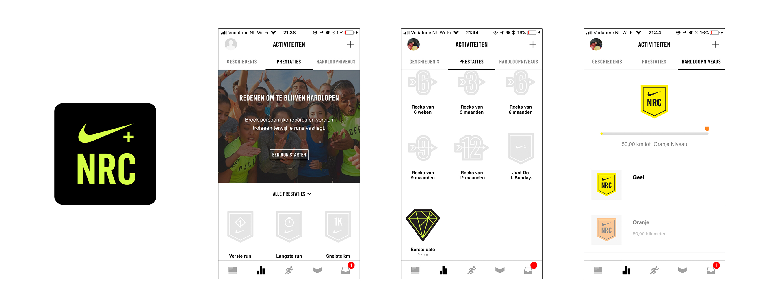
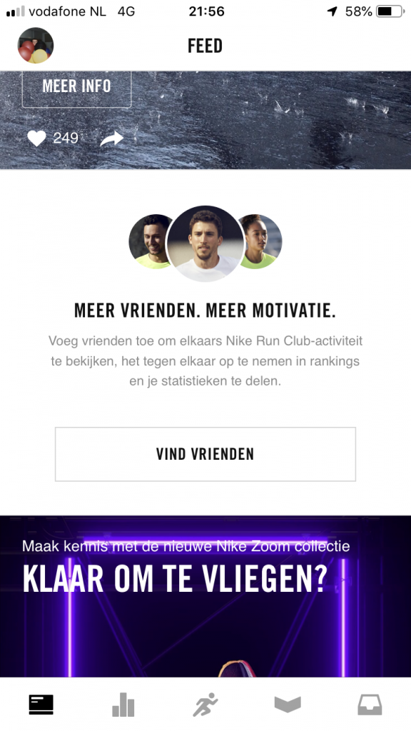
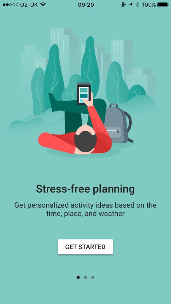
Gamification is used in a lot of different types of apps, but they work especially well in sports related apps. Sports related apps (e.a. for running, cycling or skiing.) use gamification methods to motivate and reward their users for good behavior, in this case: actually working out. In an article about this subject matter Boulet asks the following question: “Isn’t gamification an acknowledgement that the content isn’t compelling? Otherwise why would we need to gamify it?”. For learning tools this is debatable, but for sports apps it’s a major motivator. A lot of people do not like working out and need extra motivators to actually do something, I am also one of these people. “If I run today, I can play videogames tonight” is what I was thinking, and while this helps a little I need more stimulation. That’s where gamification comes in. Just look at the Nike Run + app, it’s an app to help you track your running activity, see how your friends are doing, join in on events and get trophies, all these aspects stimulate the user to go out there and ‘Just do it’. This is the exact reason I want to implement this as well.
Microinteractions
The best products do two things well: features and details. Features are what draw people to your product. Details are what keep them there. And details are what actually make our app stand out from our competition. – Nick Babich
Another thing I want to be focussing in on are microinteractions, I want to be able to keep the users hooked about the details. Small feedback moments in the app that truly stand out.
-
- heart like 1
-
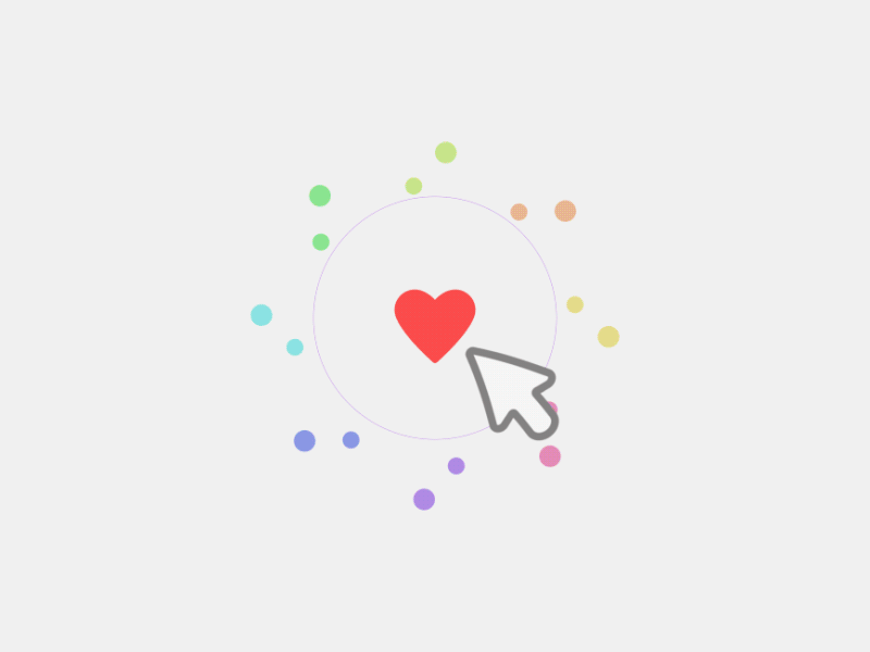
- heart like 2
-
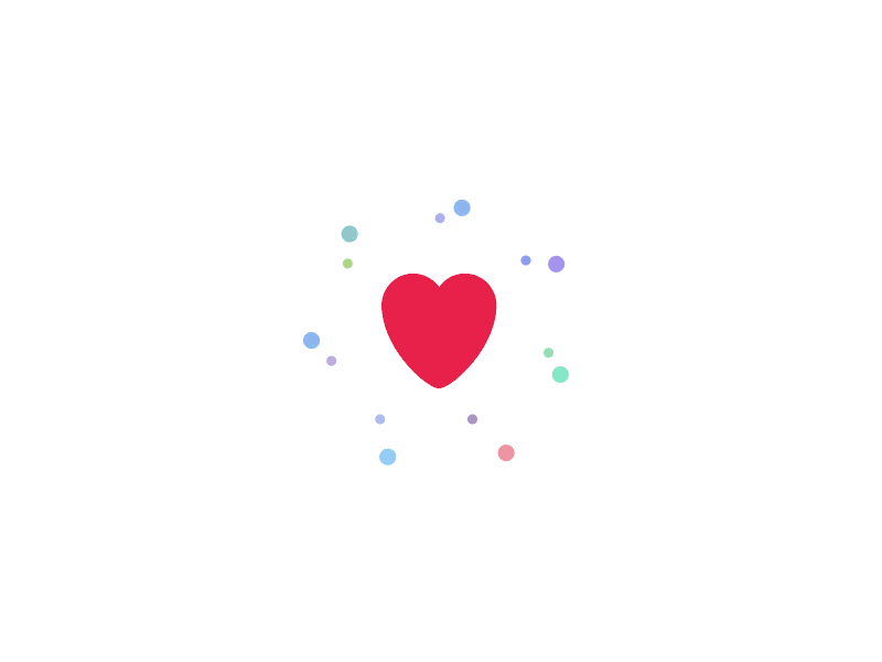
- heart like 3
-

- loader 1
-
- loader 2
Trends
AR intergration
There are a lot of possibilities in current technologies, take ‘augmented reality’ for instance. RideOn has produced ski goggles that has integrated AR technology in the visor itself. Not only do you have practical information like weather, but it is also gamified. Now they have announced a ski helmet with AR as well.
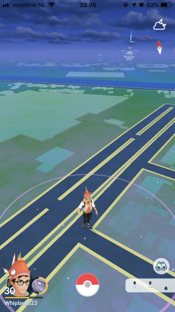
When Pokemon GO took the world by storm, everybody was walking around trying to be a Pokemon master. When this hype died down, a lot of applications tried to have the same buzz as the beloved Pokemon game. While most of them did not work out, some stay relevant to this day. There are numerous games playable with AR capabilities, like the mobile Sims game that lets you project the house you’ve made. But the most nifty usage of AR in my opinion is in applications like ‘Zombies, Run!’. Zombies, Run! is a running app that gets you motivated by (you’ve probably guessed it) making you believe zombies are gaining on you while on a run. The game itself is played outside of the running phase, with the running phase having audio telling you about zombies on your tail.
While augmented reality is too difficult to implement right now, but in the future with proper funding it would certainly be possible.
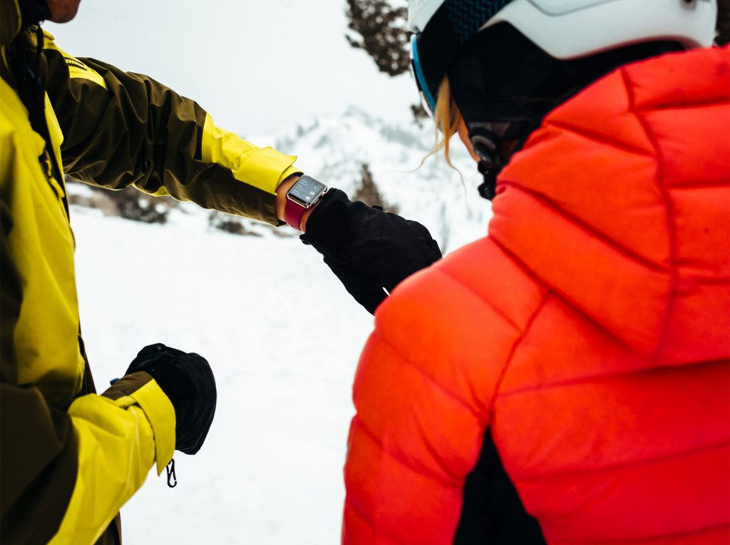
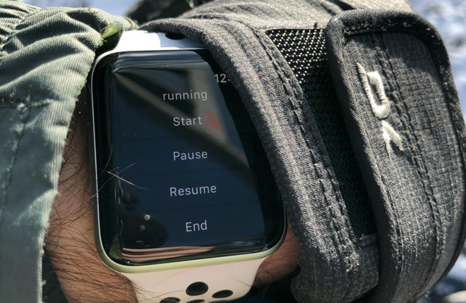
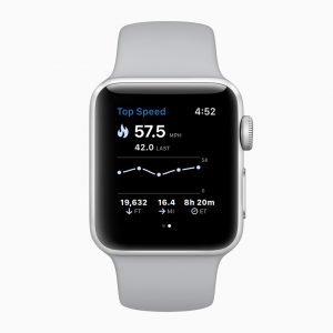
Wearables
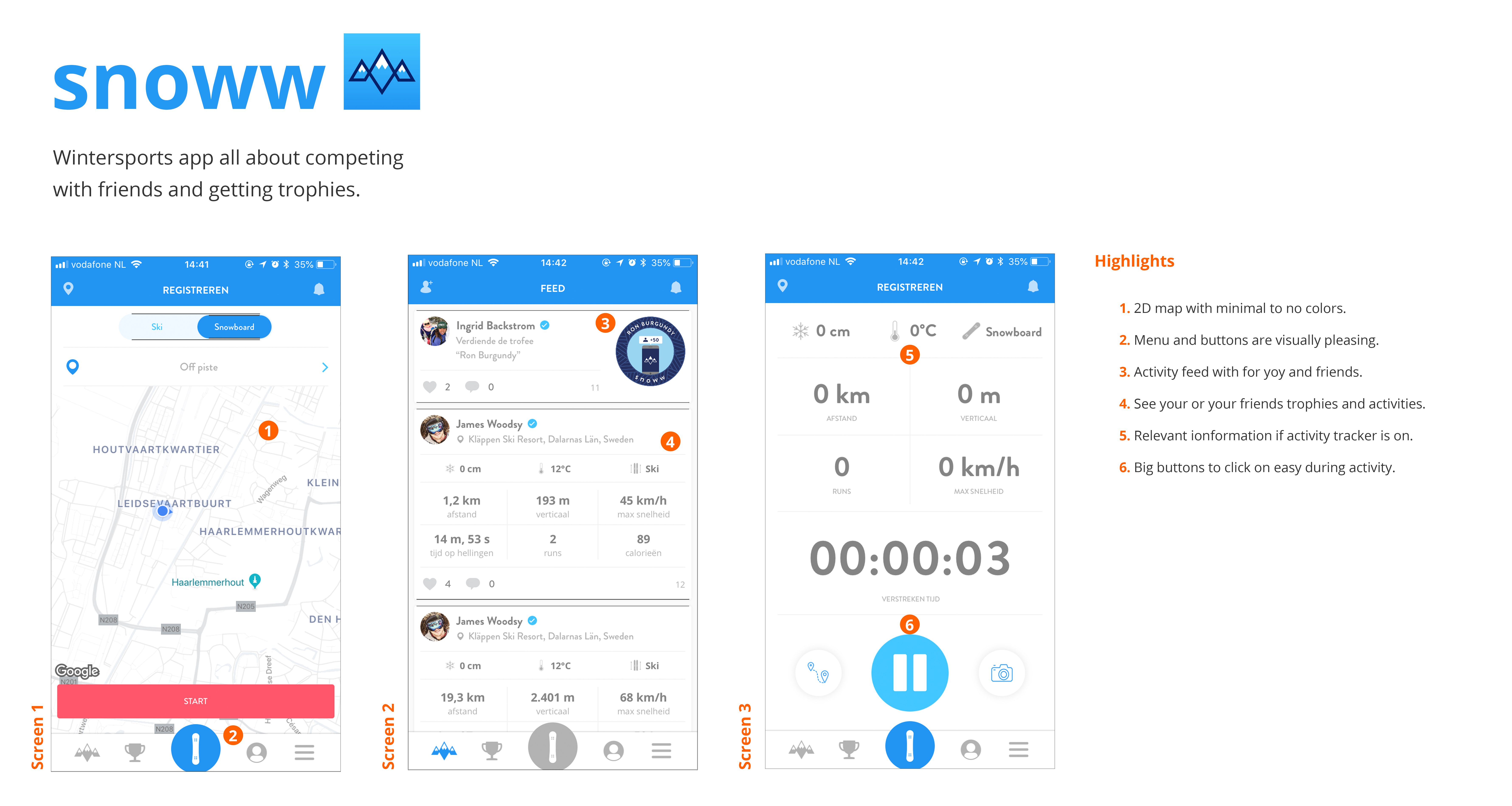
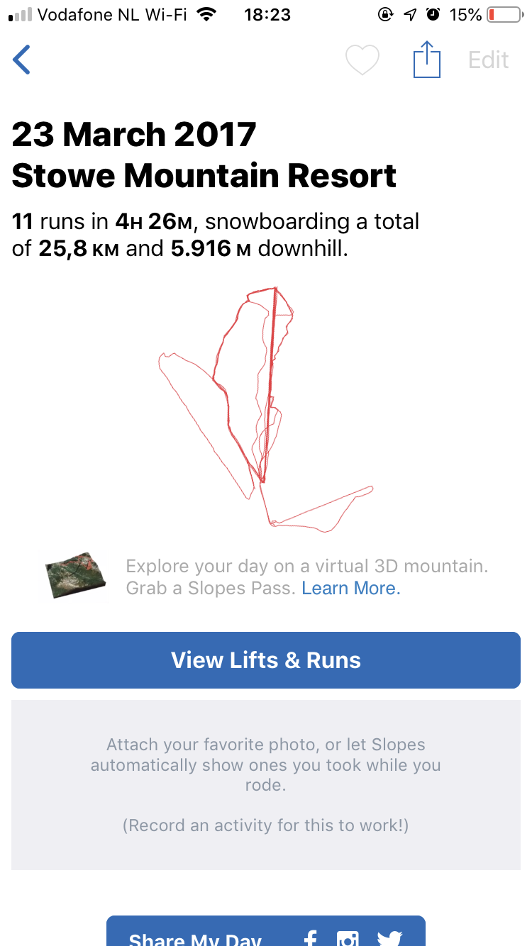
Another possibility in the tech department is one that is achievable, i’m talking about wearables. In a article from Appleinsider, Hughes states that sinds the rise of the Apple Watch 25% of the users of the winter sports app ‘Slopes’ have started using the Apple Watch app. But Slopes is not the only app that has seen a rise in numbers, snoww, Squaw Alpine, Snowcru, and Ski Tracks are also noticing this change. This can be a major advantage for me and my project aswel.
-
- Slopes
-
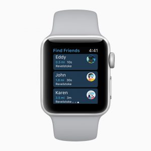
- snoww
-
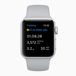
- Squaw Alpine
-
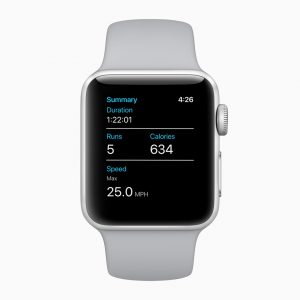
- Snocru
-
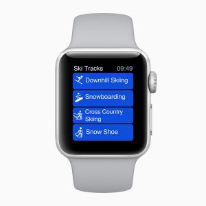
- Ski Tracks
Sources:
– Boulet, G. (2016, 23 juli). Gamification And Motivation: It’s The Content That Matters, Not The Container [Blogpost]. Geraadpleegd op 15 april 2018, van https://elearningindustry.com/gamification-and-motivation-content-matters
– Babich, N. (2016, 29 februari). Microinteractions: The Secret of Great App Design. Geraadpleegd op 18 september 2018, van https://uxplanet.org/microinteractions-the-secret-to-great-app-design-4cfe70fbaccf?gi=6b2dc25332bc
– Hughes, N. (2018, 28 februari). Apple Watch a hit on the mountain. Geraadpleegd op 28 maart 2018, van https://appleinsider.com/articles/18/02/28/apple-watch-a-hit-on-the-mountain-25-of-slopes-app-skiers-and-riders-start-tracking-via-wrist
– Rog, G. (2018, 4 september). 5 tips for better microinteractions in InVision Studio. Geraadpleegd op 4 september 2018, van https://www.invisionapp.com/blog/microinteractions-invision-studio/?utm_campaign=Weekly%20Digest
– Svarytsevych, D. (2015, 6 juli). 7 Secrets for Enhancing UX with Micro-Interactions. Geraadpleegd op 30 augustus 2018, van https://www.webdesignerdepot.com/2015/07/7-secrets-for-enhancing-ux-with-micro-interactions/
– Howes, A. (2016, 22 augustus). RideOn Ski Goggles Bring Augmented Reality to the Slopes. Geraadpleegd op 13 augustus 2018, van https://www.highsnobiety.com/2016/08/22/rideon-ski-goggles-augmented-reality/
– Apple. (2018, 28 februari). Apple Watch Series 3 houdt nu ook ski- en snowboardactiviteiten bij. Geraadpleegd op 13 july 2018, van https://www.apple.com/nl/newsroom/2018/02/apple-watch-series-3-now-tracks-skiing-and-snowboarding-activity/
4.2. User research
In this chapter I talked to my user to get a final grip on who they are and what they want. I used surveys to get quantity and interviews to get quality. This information helped me create persona’s that I could use to remind me who my users are exactly.
4.2.1. Survey
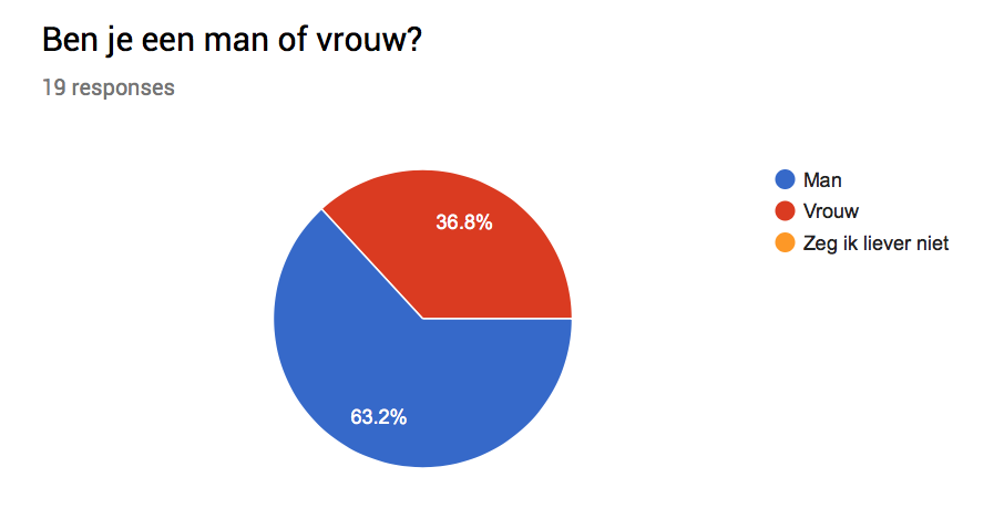
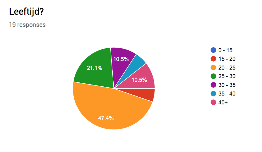
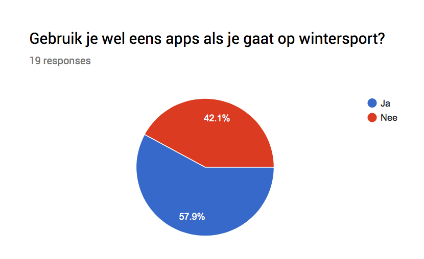
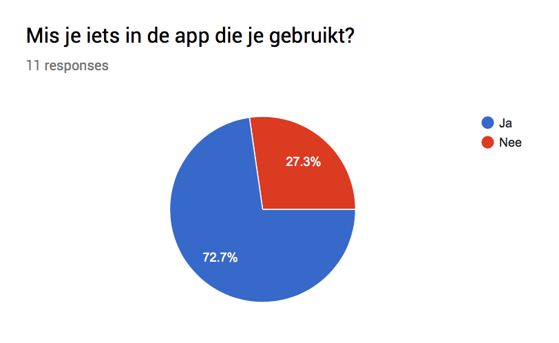
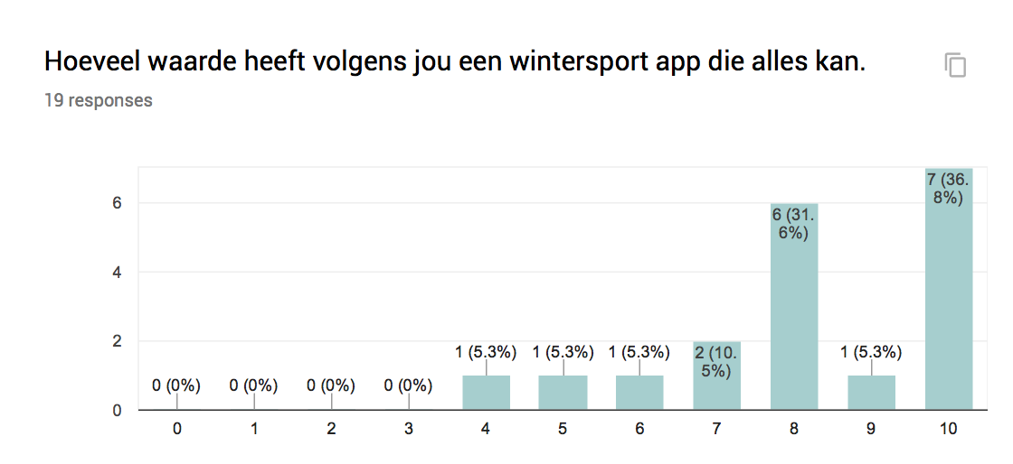
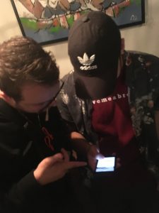
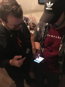
I started this survey because I wanted to know how many of my focus group uses an app for winter sports. Turns out 57,9% of the people questioned uses apps. 72,7% of those app users feels like they are missing something in the app or while using it. What also peaked my interest is that a majority of the people that filled in the survey are in the age limit i’m focusing on, namely 47,4% is 20 to 25 and 25 to 30. 73% of the people that uses apps on winter sports use it to track their activity, this means this is a major feature for most people.

This survey was filled in by 20 people.
-
- male or female
-
- age
-
- app usage – skitrips
-
- app usage – missing
If you want to download the Google sheets file with all the answers:

Other, less important data was:
– 63,2% of the focus group is male.
– The majority of people who don’t use apps while skiing or snowboarding answered ‘did not think about it’ when answering to the question of why they don’t apps.
– A lot of people answered ‘The things you’ve just described’ to the question what they miss in the current app they use.
– Positive reactions to the idea of an app that does ‘everything’.
4.2.2. Interviews
The survey data was intriguing, so I contacted various types of skiers and snowboarders to have a talk about the problems they face while on a skiing trip and the applications that they use during these trips.

Results:
– A lot of different needs, but most of them use apps to track their activity.
– Map is an issue with multiple people.
– SO MANY DIFFERENT APPS.
– Multiple people compare their stats with friend, competitive nature?
– App + Site open is common.
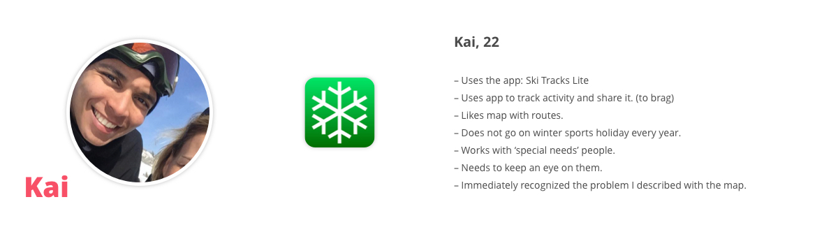
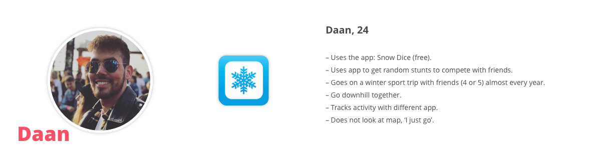
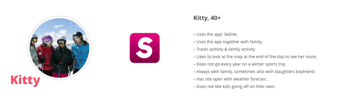
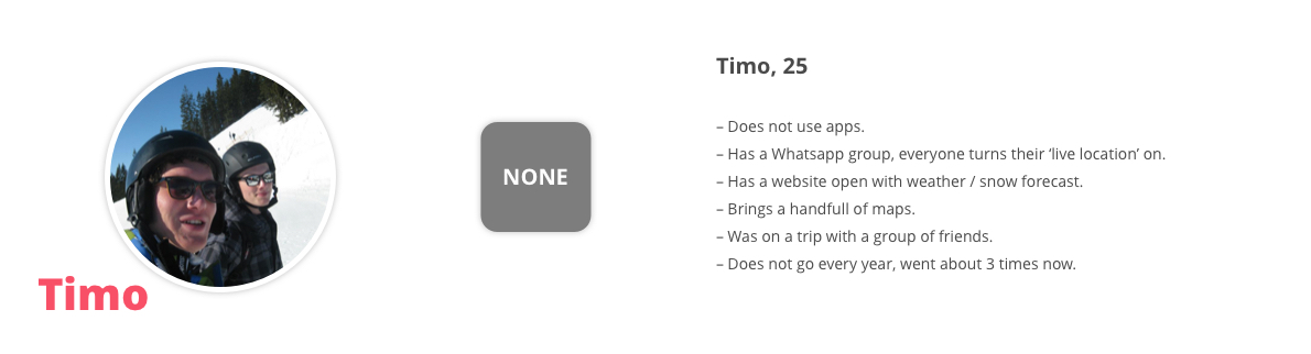
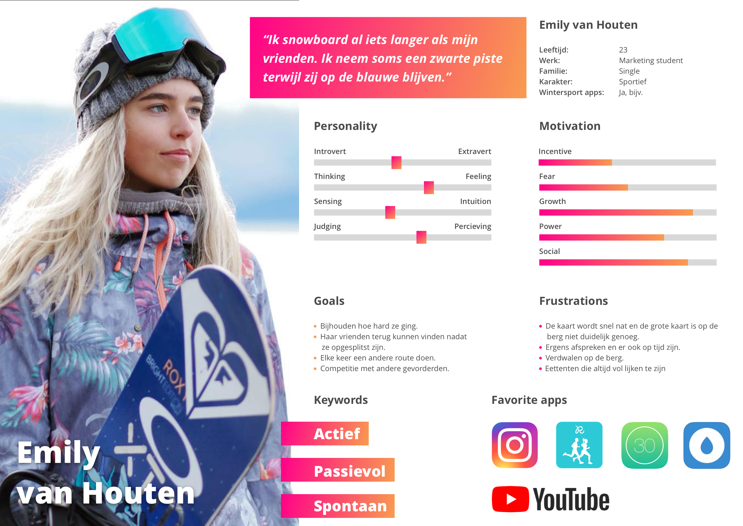
4.2.3. Persona's
The people portrayed on these persona’s are fictional and were created to represent the kind of users that will use the product. These persona’s will be a guideline for understanding the user’s needs, goals and motivations.

4.3. Product research
In this chapter I researched other products and experiences to help me gather good and bad practices. The similar products research helped me gather a lot of data on products that solve a similar problem, have similar features or have elements that I can use to learn from and make my product better. This research helped me make concise decisions about features and the scope of the application.
4.3.1 Similar products
We don’t have to re-invent the wheel. That’s why I researched a lot of apps that have similar features to my concept, wrote these down in a Google Sheet and collected a lot of valuable data. In every category I wrote down notes on what made that aspect great / not great and what I could learn from it. These categories where if it had an Interactive map, if it had some kind of Navigation, if it showed a Route, if it had Social features and if it had additional features that made it good. I also noted the pros and cons of the app and if I could use it for inspiration in one of these categories: Visual, UX, Technical or Feature wise. I also added the date when I reviewed it, when the app was last updated and the link to the app store.
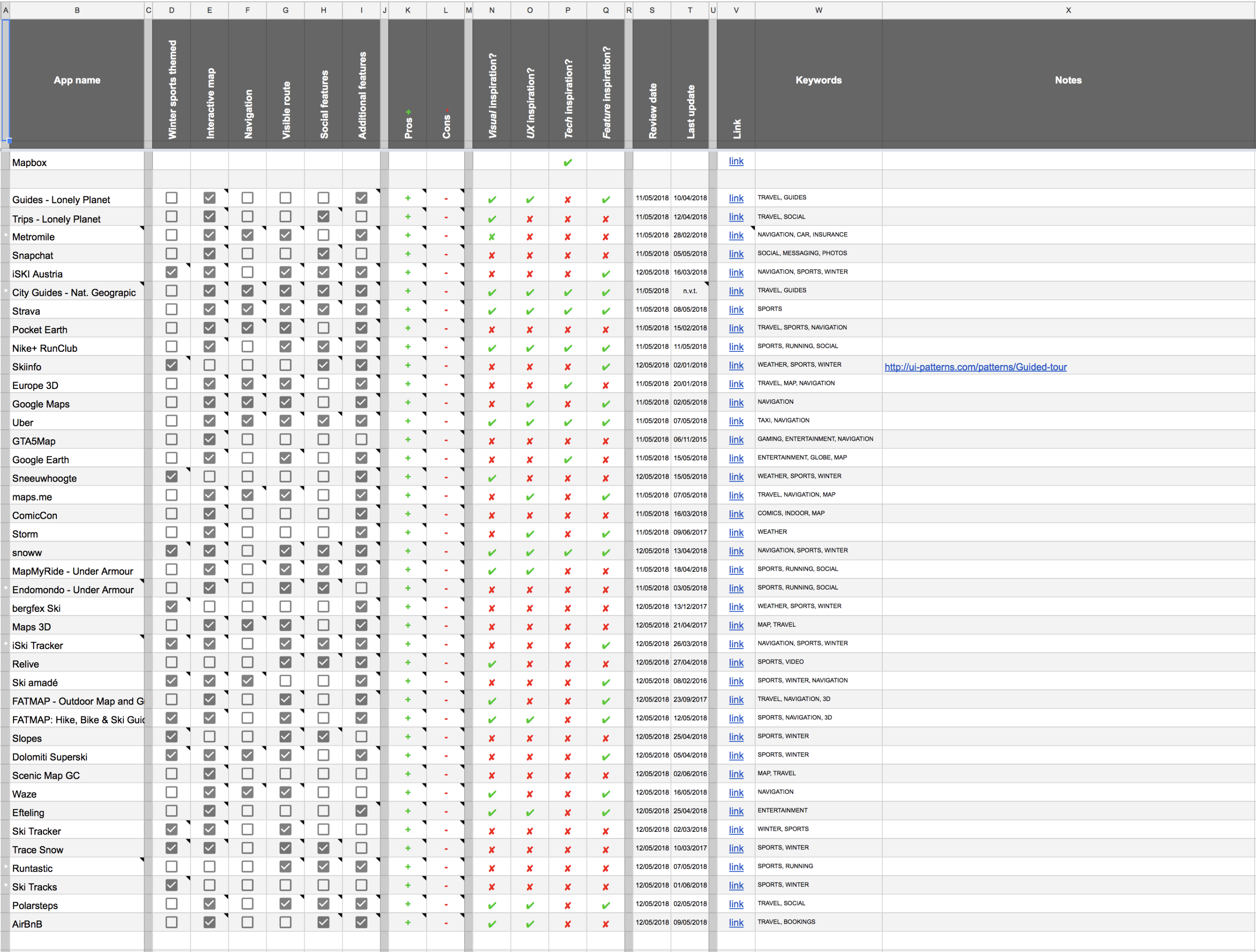
Apps that stood out
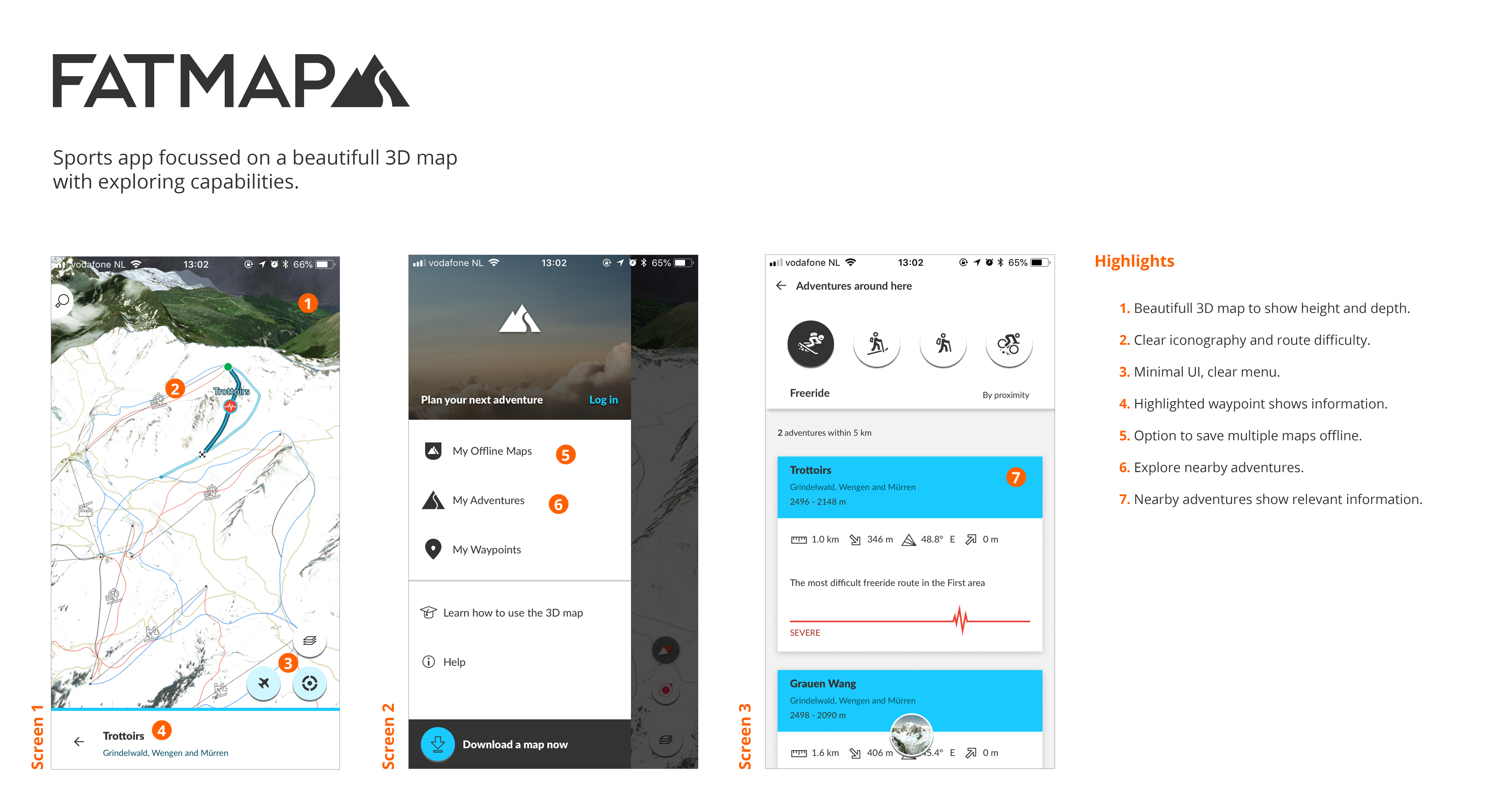
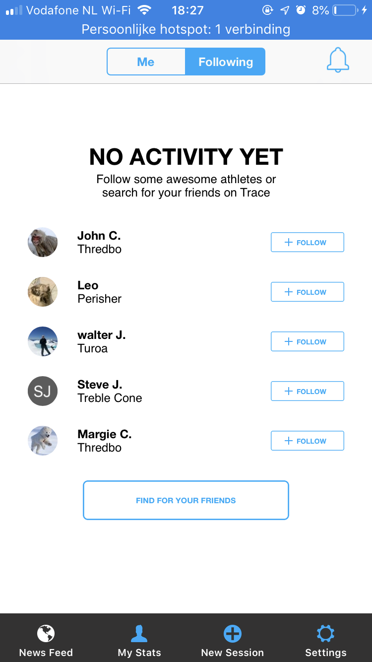
During my research on the similar apps, two apps stood out to me. These two are very similar to my idea in concept but both don’t make use of their full potential. One of these is Fatmap, Fatmap is a beautifully 3D rendered map where you can see the whole mountain and all the trails, it also had the option to show interesting routes on the map but it misses a lot like: social features and a good UX. The controls are very wonky and don’t behave the way they should. snoww is the other one, and while snoww had social features and good UX. It misses the other aspects that made Fatmap great like the 3D map. snoww had achievements, but they are not very well thought out and getting them seems like a chore, they are not fun.
Conclusion
I can learn from similar apps and services to make my own product better. The things I’ve noticed and seen can be used as a learning experience for myself to know the ‘to-do’s and the do-not’s’ while also collecting valuable data like features and inspiration
4.3.2 Features

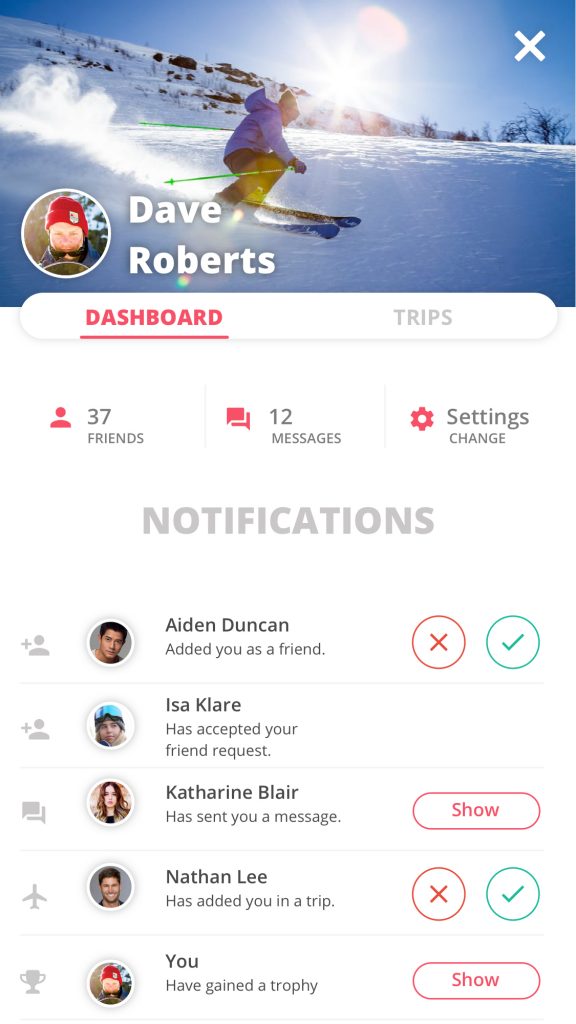
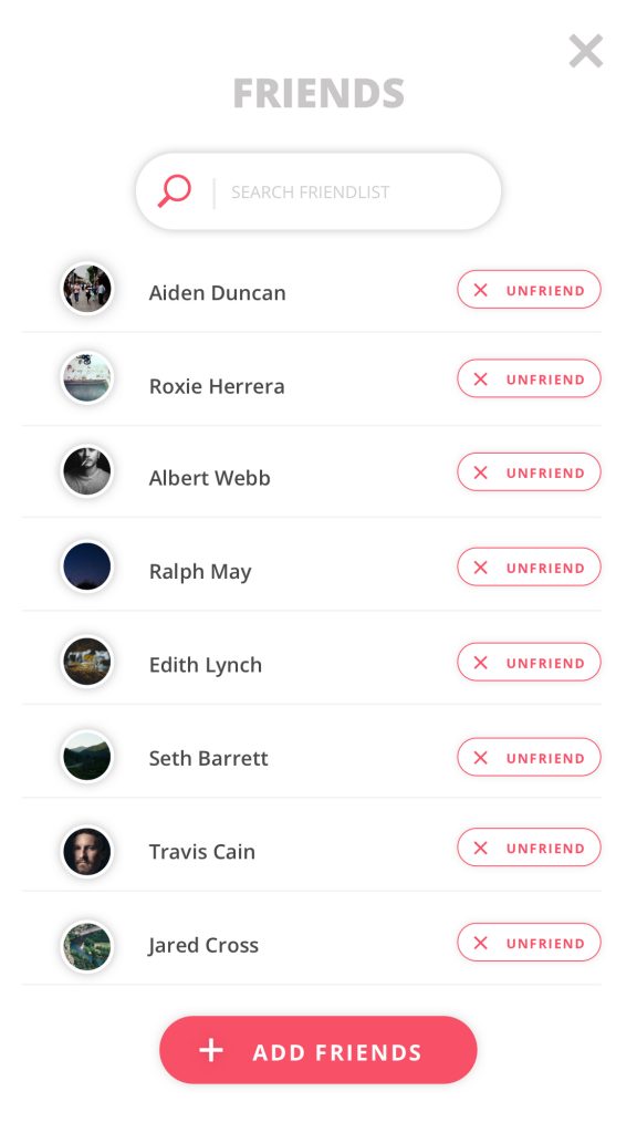
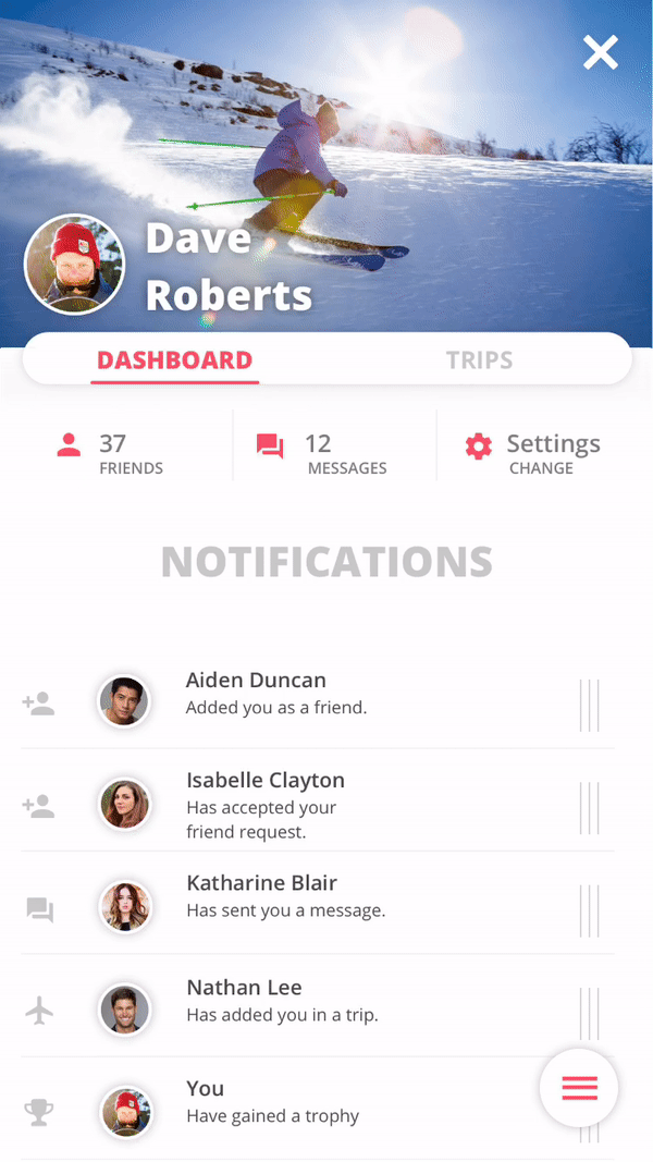
1. Profile
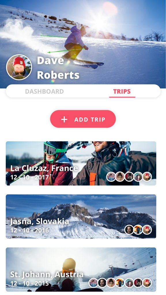
The user has to make a profile to use the application. This is needed to connect with other users and save data. In the profile the user can find his friends, message them, see notifications and add Trips. Trips can be described as compact travel collections. In these you can see where, when and with who you went on a skiing trip, see the photo’s you and your friends posted, see your activity and add information like texts.
2. Activity feed
The activity feed is another social element of the application. The user can post his photo’s, achievements and ski data here, while the user can also see this information of his/her friends.
3. Map
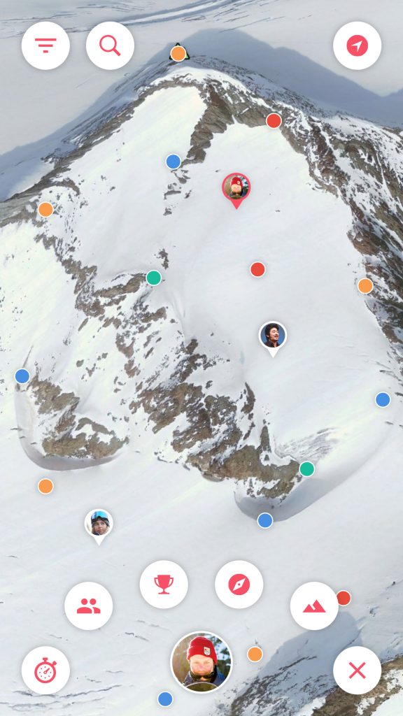
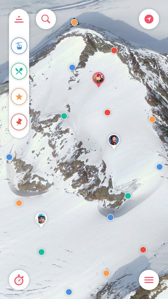
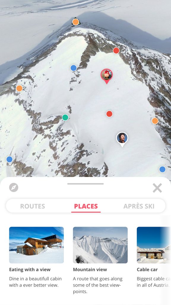
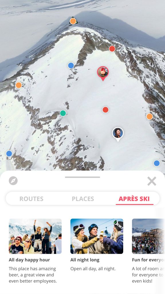
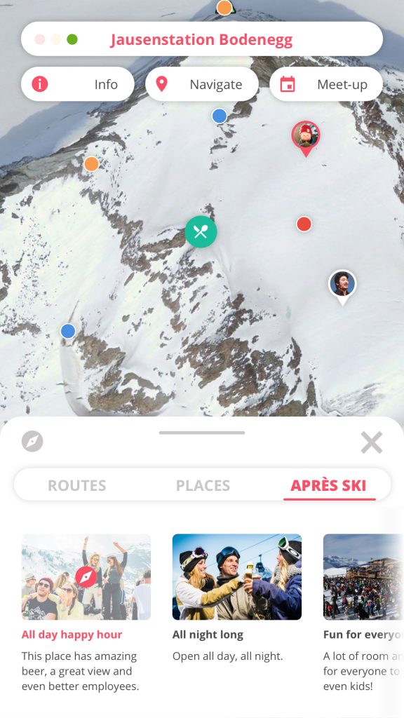
The map is the core feature of this product, this functions as the home screen for the user. Here the user will see a 3D map of the ski resort he will travel to / arrived at. The user will be able to use gestures to turn, zoom and inspect the map fully. There are Points of Interest on the map in four distinct categories, these are: lifts, eating & drinking, special (e.a. the peak, a stunt park, etc) and custom (the user can add these for themselves and their group). And the user can also filter these four POI types to show or hide them.
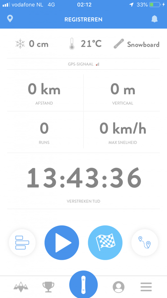
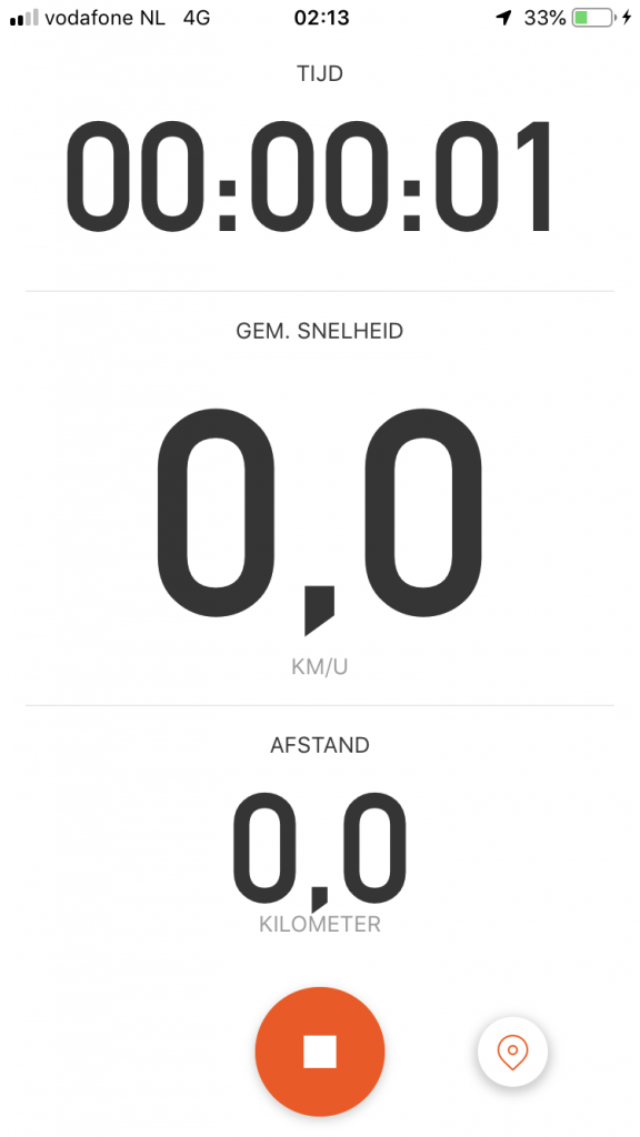
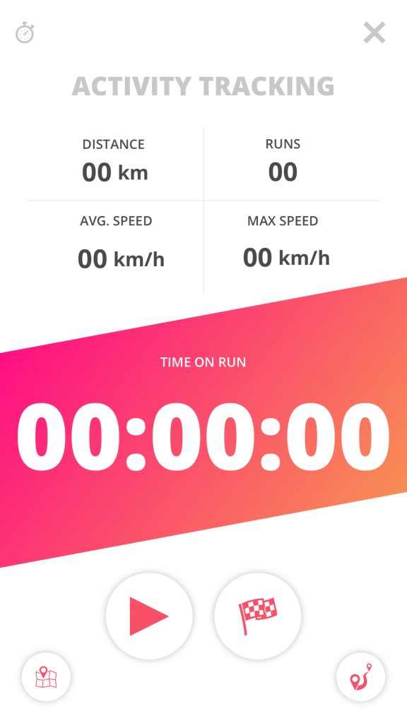
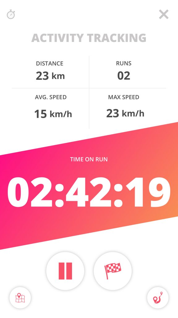
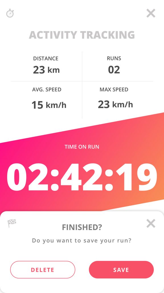
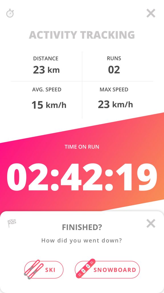
4. Activity tracker
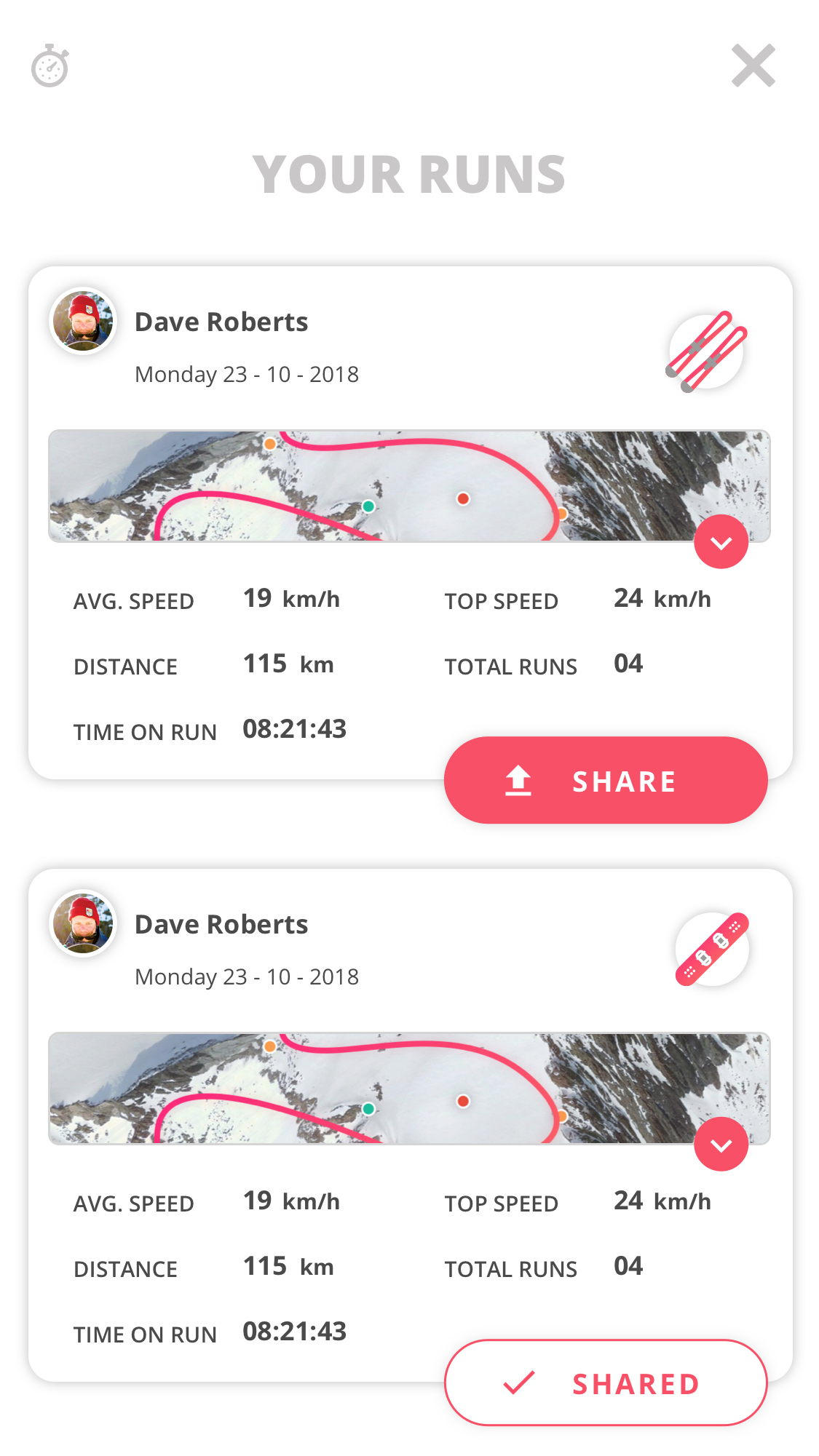
The activity tracker shows the users average and top speed, how many runs the user did, the distance they traversed and a timer that shows how much time has passed since starting the run. The user can also see previous runs and decide to share them to the activity feed.
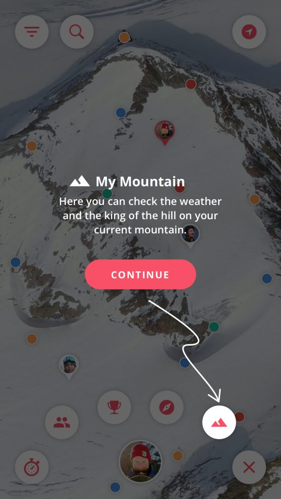
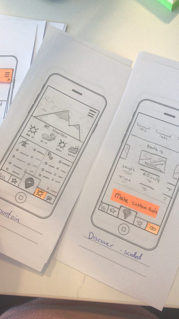
5. My Mountain
The ‘My Mountain came to be after realizing a lot of users have an internet page open that shows the weather and snow conditions from their current ski resort. This is exactly what this feature does, it shows the current weather, a weekly forecast and it shows who is currently ‘King of the Hill’. The King of the Hill is the user that has the most points in your current ski resort on your current month. This is a prestige title that only really active users can achieve. An extra achievement for all the hard work so to speak.
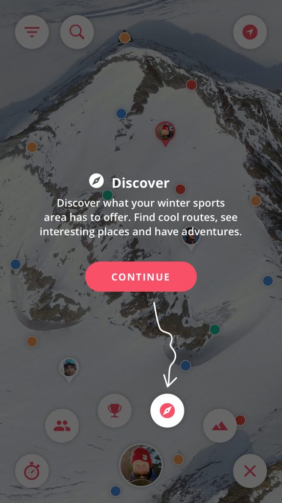
6. Discover
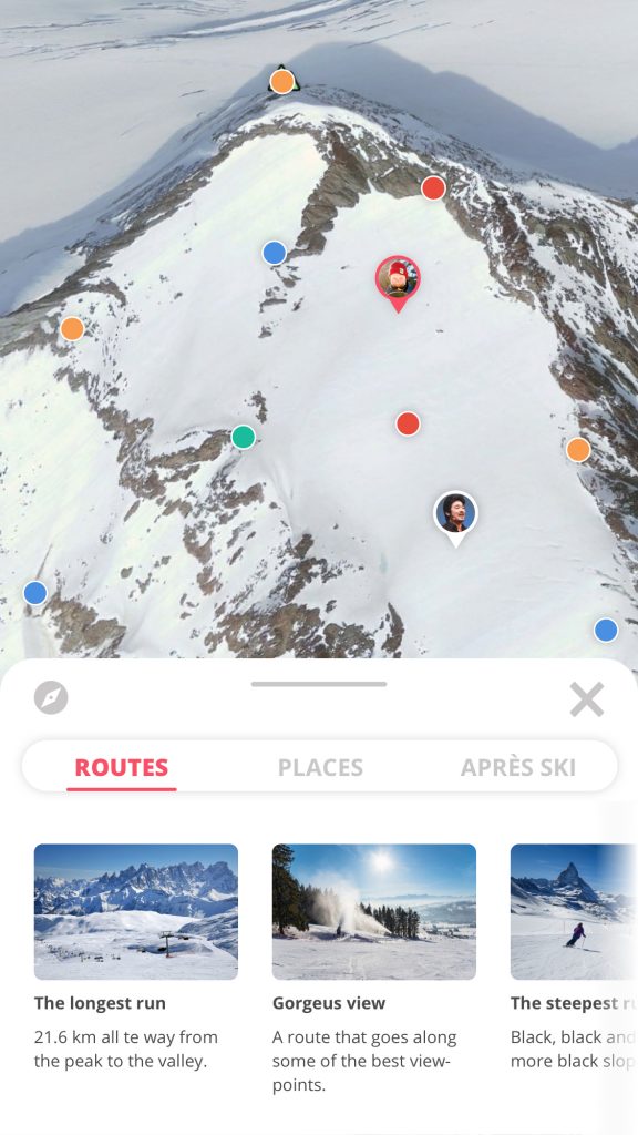
Discovery is a very important feature since this is where the user can be intrigued to investigate the mountain and visit POI’s or routes they normally would have missed. The user can see the map and get an overview of interesting locations or routes. New routes can be discovered like ‘the longest run’ from peak to valley. This is to give more contextual information about things to do in the area.
7. Achievements
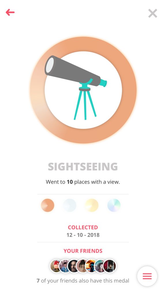
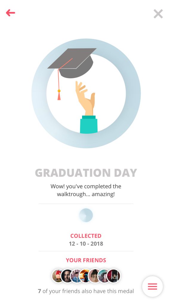
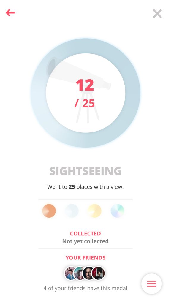
Achievements is the core behind the gamification methods used in this product. Gamification is usually started, but not limited by: PBL’s, Points, Badges and Leaderboards. This is where this feature comes in. In Achievements the user can find the medals he/she has collected and check his place on the leaderboards. The leaderboards always starts with your friends & points, but friends can also be replaced with ‘your current group’ or ‘worldwide’ and points can be replaced with ‘top speed’ and ‘distance’ for example. The user can collect and show off medals. The medals all have distinct illustrations and names, and come in Bronze, Silver, Gold and the prestigious Diamond. Some medals only have one type, for example: ‘Graduation Day’ – Complete the guided walkthrough, only has a Silver medal. While ‘Sightseeing’ – visit points of interest with a beautiful view, has a multiple stages medal from bronze all the way to diamond.
You can read the fully typed out feature list here:

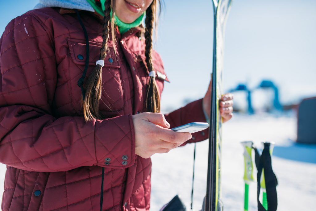
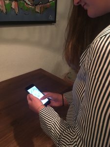
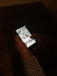
Female skier holds phone in hand.
The benefits
To assure future stakeholders of the importance of certain features, I have made a feature benefit matrix. In this matrix you will find all above mentioned features explained in short with the benefits for the users that will come from these features.
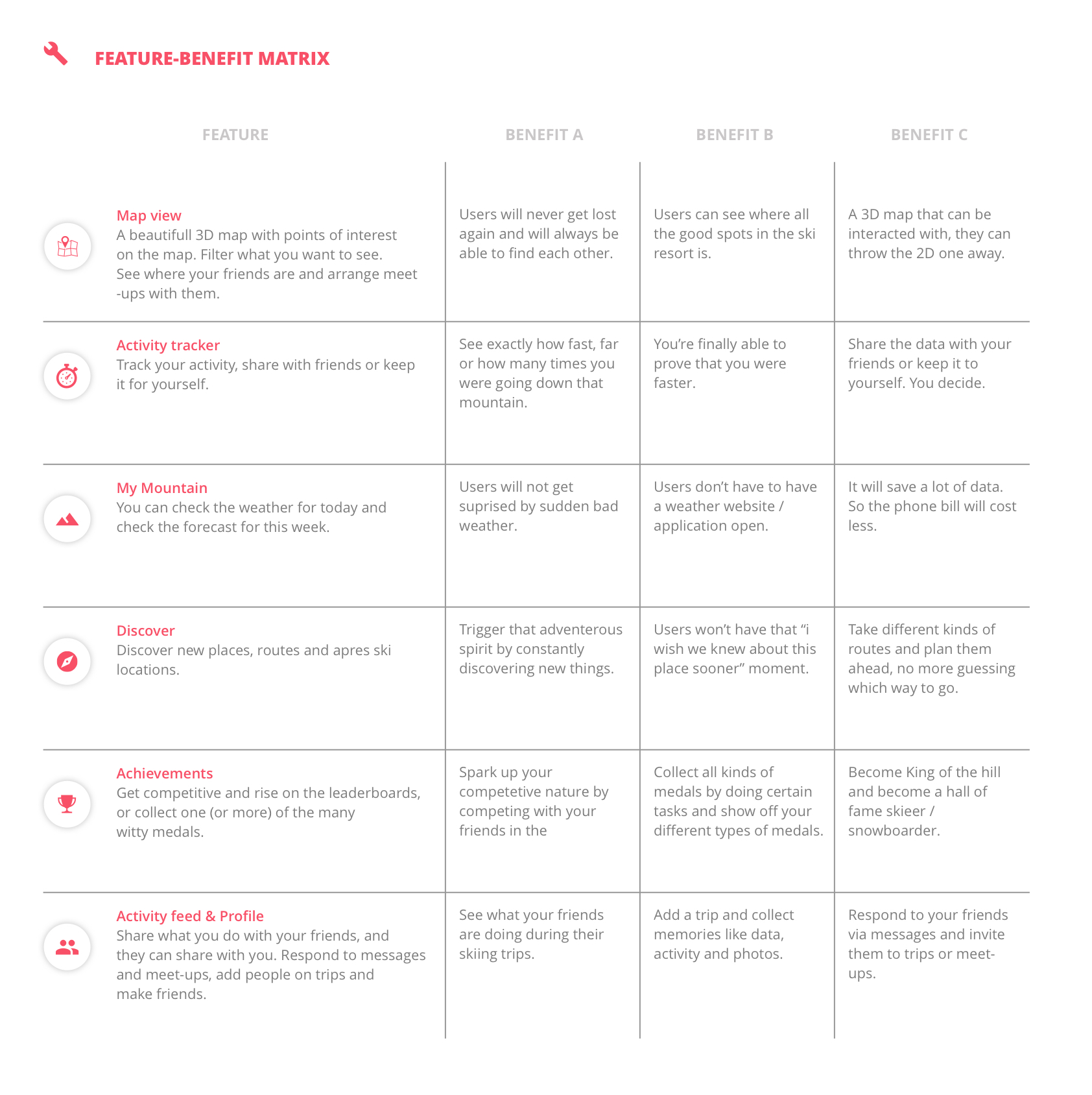
feature-benefit-matrix
MoSCoW
To determine which features are more important then others. I placed them in a MoSCoW matrix based on the features their importance and how much effort it is to make them. With these results I could determine the scope of my project and what I would implement.
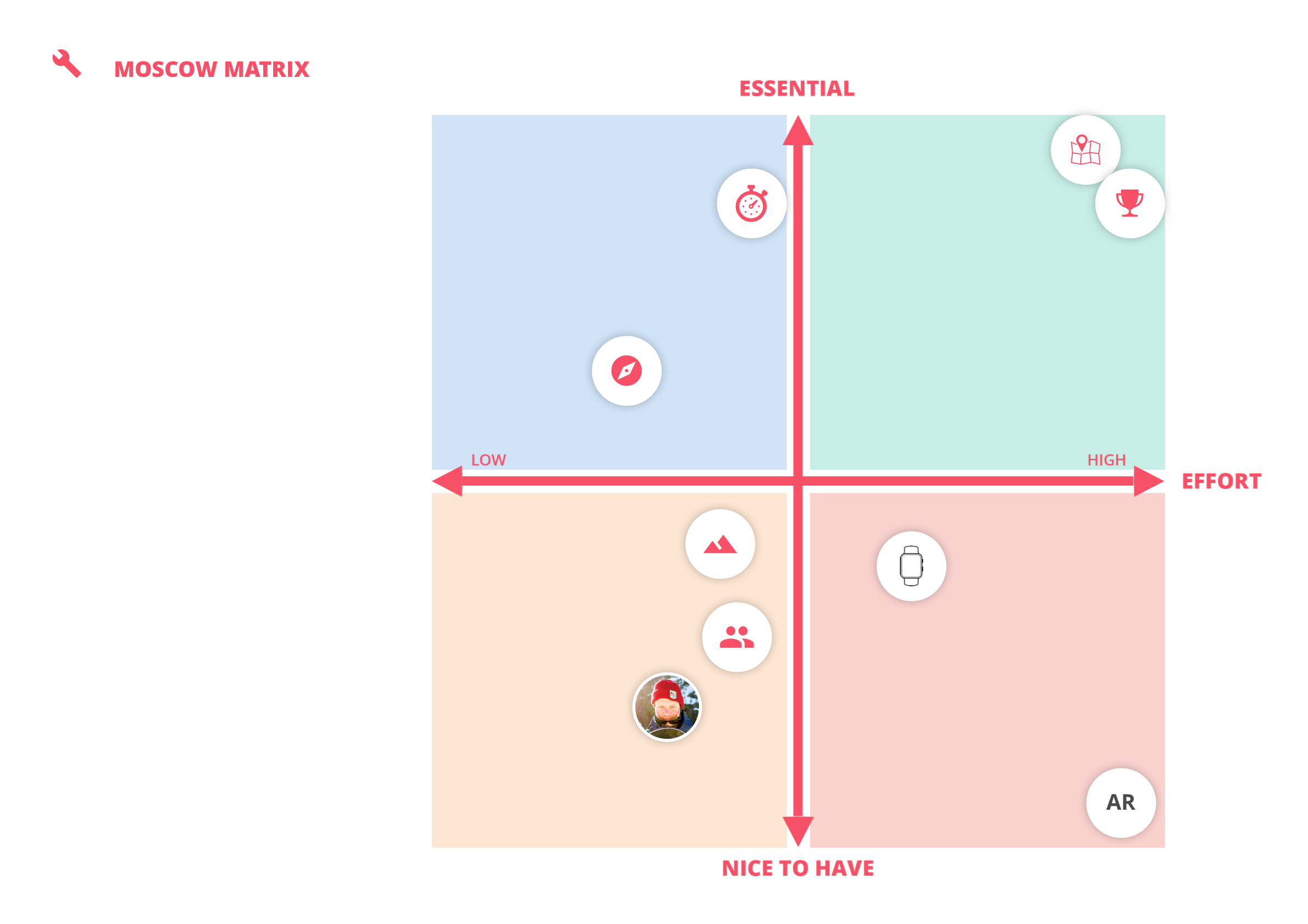
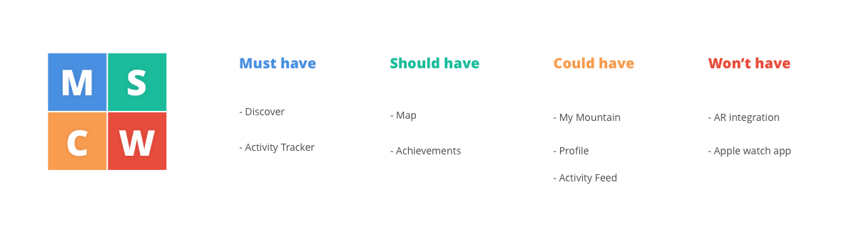
Conclusion
The results were different than I expected, but fair. The map and activity tracker are core features of the product but are not in the must have section. This is because they offer a greater challenge in developing and designing. I will use the data from this MoSCoW to establish a project scope.
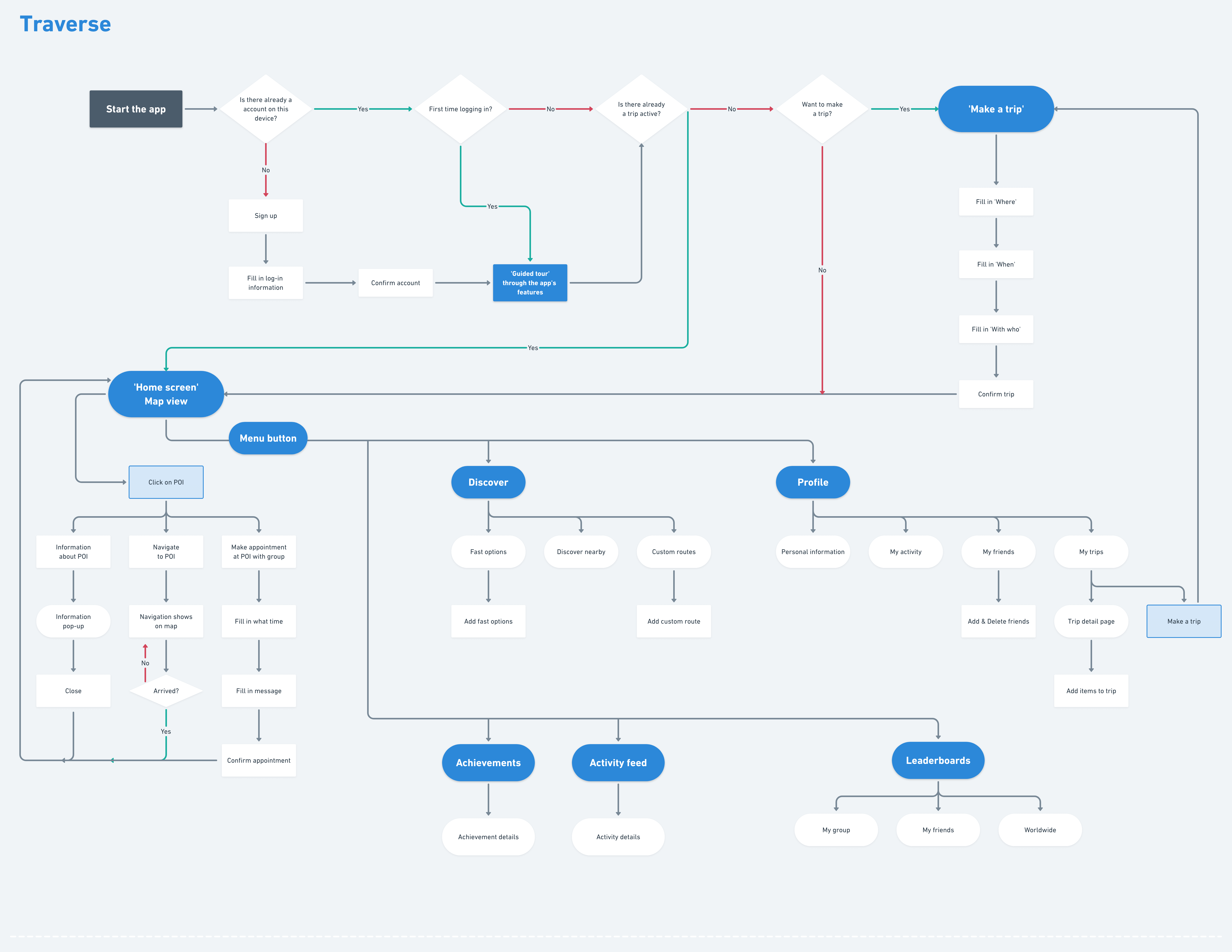
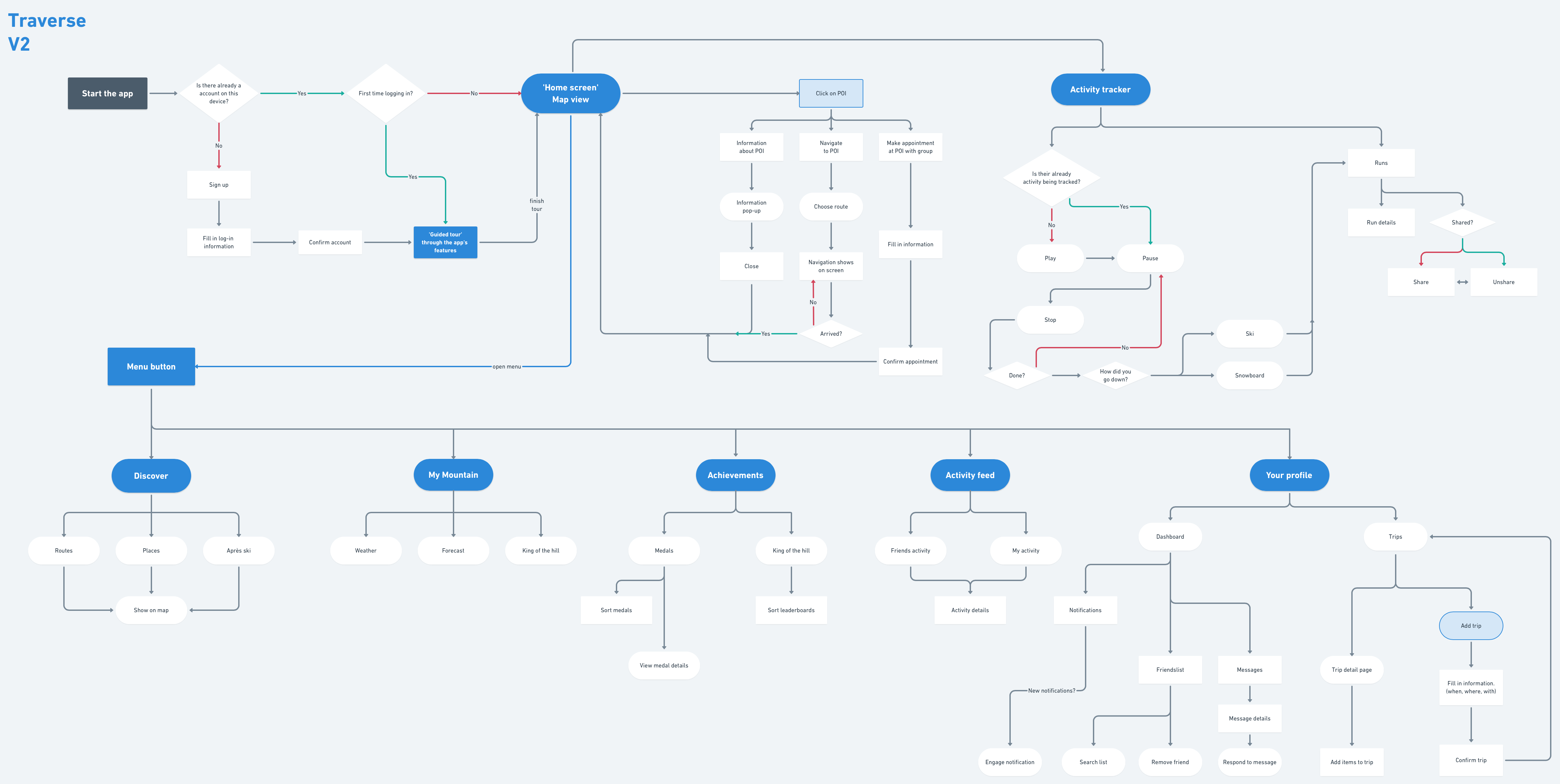
4.3.3. UX flow
Version 1
Version 2
4.4. Design challenge
Version 1:
“How can my interactive product make sure that winter sports enthusiasts can find their way around the mountain and better their orientation without exposing their smartphone to the cold and snow for too long”
Version 2:
“How can an interactive product help make skiers and snowboarders curious about exploring and make them enjoy, share and engage in their activities?”
Version 3:
“How can an interactive product help make winter sports enthousiasts exited about exploring while competing and sharing their activities with each other.”
5. Shaping the product
In this chapter You will find research that helped me shape the concept of the product. It explains my vision, the scope, some early inspiration and the main method used, gamification.
5.1. Concept & Vision
The Concept
“A winter sports application based on gamification that inspires its users to explore their mountains, challenge their friends and bring out the best version of themselves.”
The concept for this application is that it’s a 3D ski resort map and information application with gamification elements. The concept is an idea based of the fact that there is not one app that gives a ‘full winter sports experience’, there is always a need for another app or internet page to get all the ski resort information needed. Will it be finding friends, finding a place to eat or wanting to know tomorrows weather forecast, this app will give winter sports enthusiasts a reason to use one application only, this one.
The Name
traverse, verb
tra·verse | \trə-ˈvərs also tra-ˈvərs or ˈtra-(ˌ)vərs.
traversed; traversing
transitive verb
A: to go or travel across or over.
B: to move or pass along or through.
Product vision
“To inspire every skier and snowboarder to worry less and explore more”
Traverse is going to be the app every skier and snowboarder uses during their winter sports vacation. No one will ever be lost again, everybody will be able to find their friends and people will have more fun skiing and snowboarding than ever through the means of gamification.
5.2. Project scope
The scope
In the limited time that the project was realized, not everything could be implemented. Some details will sadly not be in the prototype, for example the detail view of a trip. There is also the issue of ‘who will be the admin of the app?’, this is an issue that I came across after the green light presentation. This has not been fully thought out, but there are a number of possibilities.
1. The ski resort assigns someone to fill in all the information.
2. The app is community based and users will fill the app themselves over time.
3. The app is filled in by Google.
While the third option is a good indication of what could happen, it will probably be a combination of options 1 and 2. With Google filling in most data from their maps, and some admin user of the resort filling in the blanks.
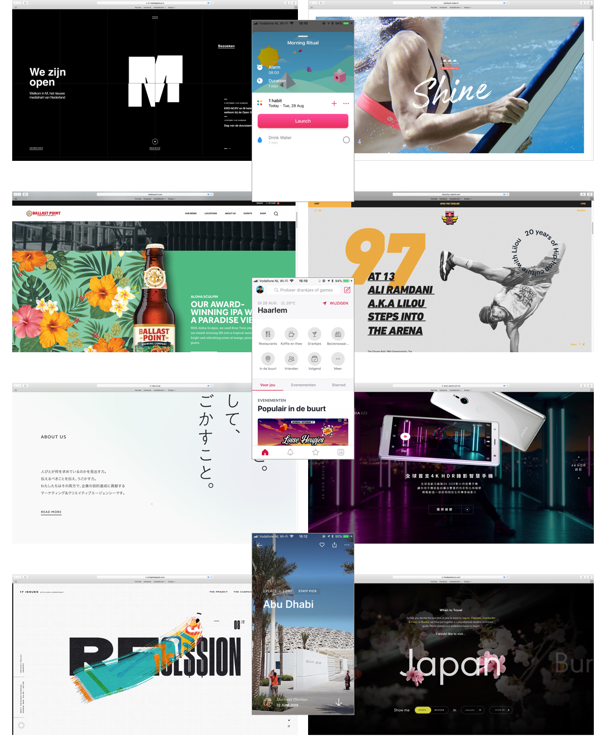
5.3. Inspiration wall
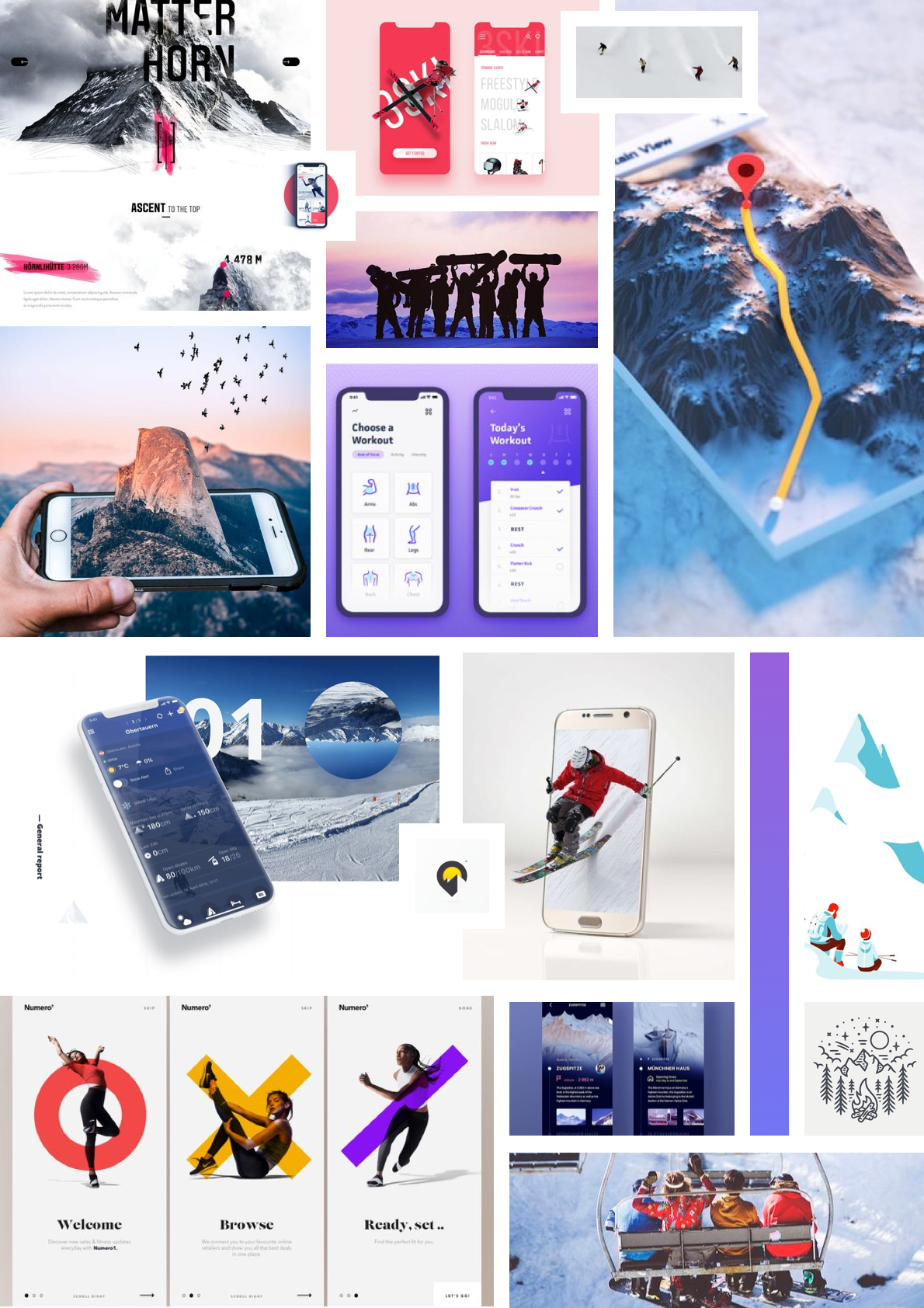
Inspiration wall
To keep the visuals I felt inspired by early on in the same place, I made this Inspiration wall. The inspiration wall conveys websites and applications I came across early on that had visual elements that stood out to me, like typography, colors or overall visual style.
5.4. Gamification
“Gamification is the craft of deriving all the fun and engaging elements found in games and applying them to real-world or productive activities.” – Yu-kai Chou
Yu-kai Chou, the gamification guru
Yu-kai Chou is a pioneer in gamification, using his hundreds of hours of playing videogames (mostly role-playing games) to set up a framework for implementing game aspects in real-world activities called the ‘Octalysis Framework’. Chou came to my attention after doing research on gamification and implementing it in my own project. He gives a 14-day course away for free, so obviously I joined in and tried to gain knowledge. Chou sends a email every workday for 14 days, in these emails he gives general information about gamification, the Octalysis Framework and in later days of the course he gives detailed information about the 8 core drives of gamification.
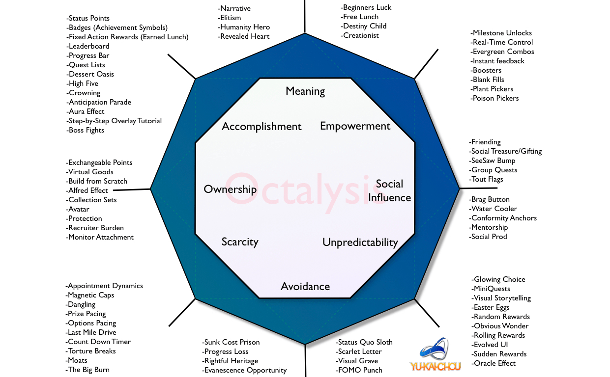
What is gamification?
Chou states that gamification is the craft of deriving all the fun and engaging elements found in games and applying them to real-world or productive activities. Gamification is a form of Human-focused design with an emphasis on human motivation instead of efficiency.
Some examples of gamification in apps and services are:
- Bounty Tasker, To-Do list with RPG elements like levelling up and having an avatar.
- Memrise, learning a language with alien avatars you can grow by levelling.
- Pain Squad, helping kids with cancer describe their pain through a gamified journal.
-
- Bounty tasker
-
- Memrise
-
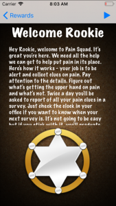
- Pain squad
The 14-day gamification course
During Chou’s course i’ve learned about the 8 core drives of human motivation, what these are, what they do, examples on how to use them, and how to implement them. I’ve learned that the motivators are divided in 2 groups, Extrinsic and Intrinsic motivators, Black hat or White hat gamification or Left and Right brain drives. I will try to balance these 2 types of motivators in my project but the White hat gamification methods will have the upper hand.
-
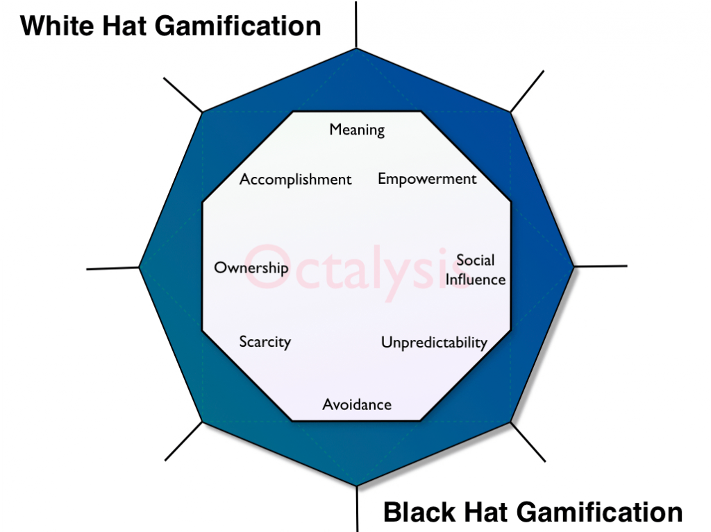
- White hat vs. Black hat
-
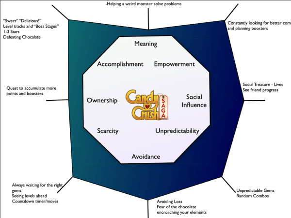
- Candy Crush in Octalysis
“Whether you know it or not, you’re playing a game right now.” – Yu-kai Chou
Implementing the framework
Sports apps are known to use gamification in their system for motivating their users. But not many use it like a real game. Chou says in his 14-day course that “just adding PBL’s” is not enough. PBL’s being points, badges and leaderboards. This will not motivate the user enough to keep using the product. This is why I used Chou’s Octalysis framework to explore all the gamification possibilities in my application. The first step was filling in the octagon to sum up all the gamification methods in the right core drives.
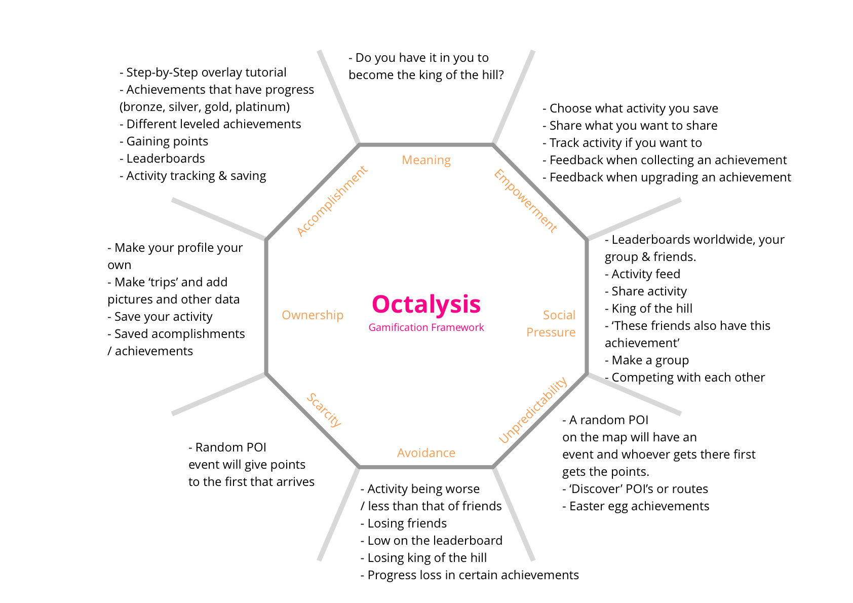
Balance
Now the Octalysis framework was filled in I could make the next one, which focussed on balancing the gamification. As you can see in the framework below, the gamification is pretty balanced as you can see by the left that is balanced out by the peak on the right.

Implementing drives
In the next chapter, chapter 5.4.1. you will read on how I implemented each core drive in my product and where the inspiration came from.
5.4.1. Gamify the experience
The 8 core drives of human motivation
Here I will explain per gamification feature where the inspiration came from and why it is implemented this way, giving you insight on my motivation and reasoning.
Epic Meaning & Calling
Epic Meaning & Calling will be used to make the user feel like they are the one that needs to get the job done. In the advertisement before downloading the app the user will be enticed to become the ‘King of the hill’.
1. Narrative
Epic meaning & calling is a drive often implemented in real word scenarios where they want to make people feel like true heroes. Charity or volunteering often use this method. A website to entice young children to go outside and do all kinds of sports activities with their parents called Zamzee uses this drive as well. The kids are being put on a pedestal and get great motivation by becoming ‘a sorcerers apprentice’ for example by doing all sorts of activities.
-
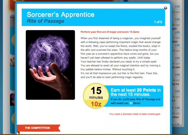
- Zamzee
-
- Charity
-
- Volunteering
My implementation:
“Do you have what it takes to become the king of the hill?”
-

- Traverse – king of the hill
Development & Accomplishment
Development & Accomplishment will be used to please the users internal drive to make progress, develop his/her skills and overcome challenges. The user will be gaining points during their activity and can get achievements. While some achievements are relatively easy to get some will be more challenging, giving the user the motivation and drive to show off his skills. Also a step-by-step tutorial will be used to give new users information about all the features. When the user is done, they will receive a shiny new medal.
1. Step-by-Step overlay tutorial
The step-by-step overlay tutorials are used for apps that want to explain their features (e.a. Pulse) or apps that have special gestures to interact with the elements on screen (e.a. Solar). The step-by-step tutorial is a great way to give users a sense of accomplishment since it is so easy to complete.
-
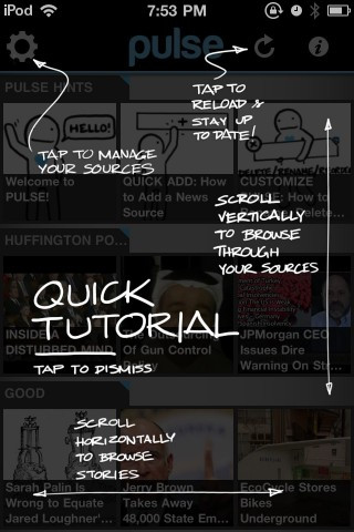
- Pulse – news app
-

- Solar – weather app
My implementation:
-
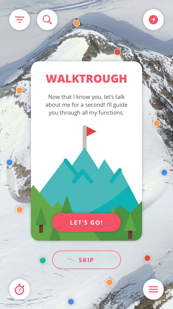
- Walkthrough – start
-
- Walkthrough – step
-
- Walkthrough – step
-
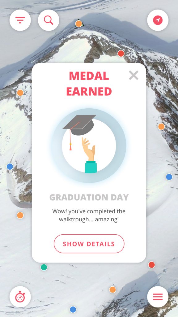
- Earning a medal
2. Badges
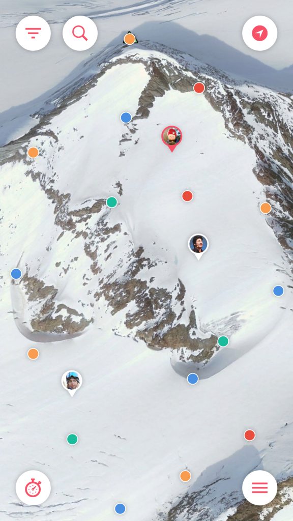
Badges are one of the core features in gamification and also 1/3 of the PBL’s. (Points, Badges & Leaderboards) Most apps that integrate gamification use these simple tactics to get people hooked and give them a sense of accomplishment. While Pokemon GO gives users medals with bronze, silver and gold levels so they can keep upgrading, Nike Run just gives users a one time achievable to show off.
-
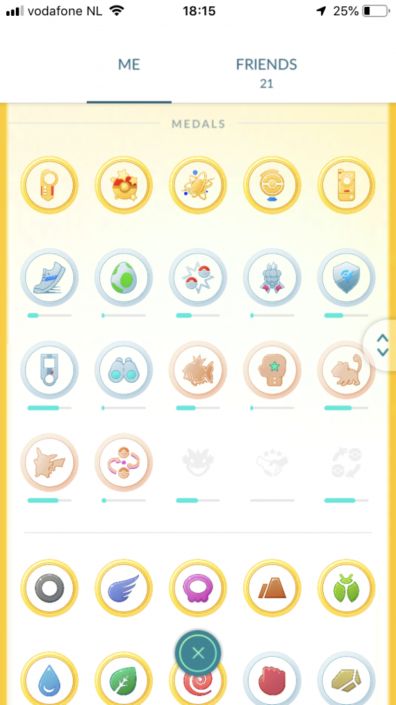
- Pokemon GO – medals
-
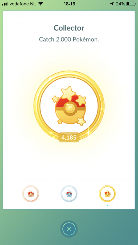
- Pokemon GO – detail
-
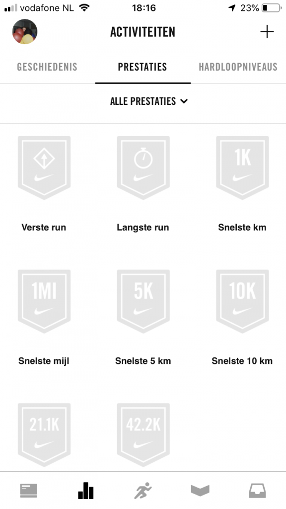
- Nike run+ achievements
-
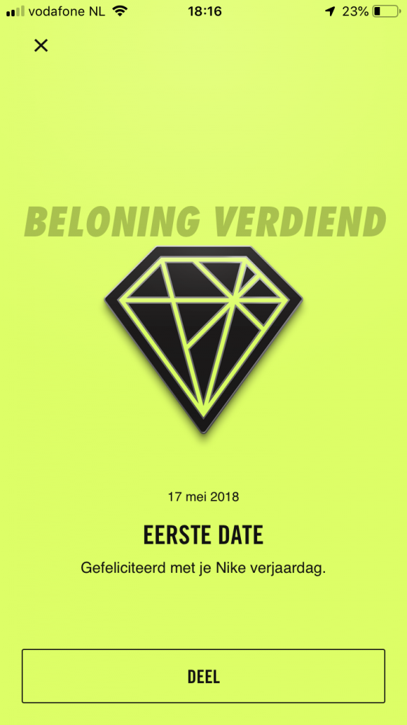
- Nike run – unlock
My implementation:
-
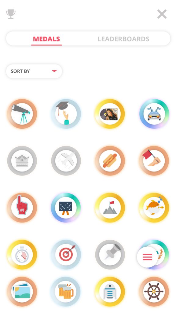
- Traverse – medals
-
- Traverse – medal detail
-
- Traverse – medal detail
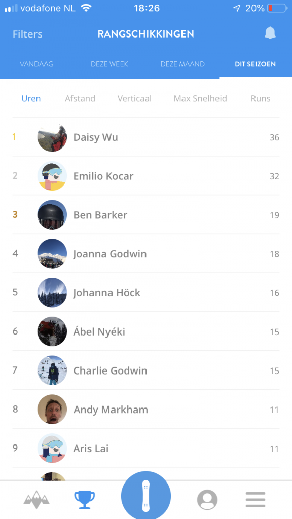
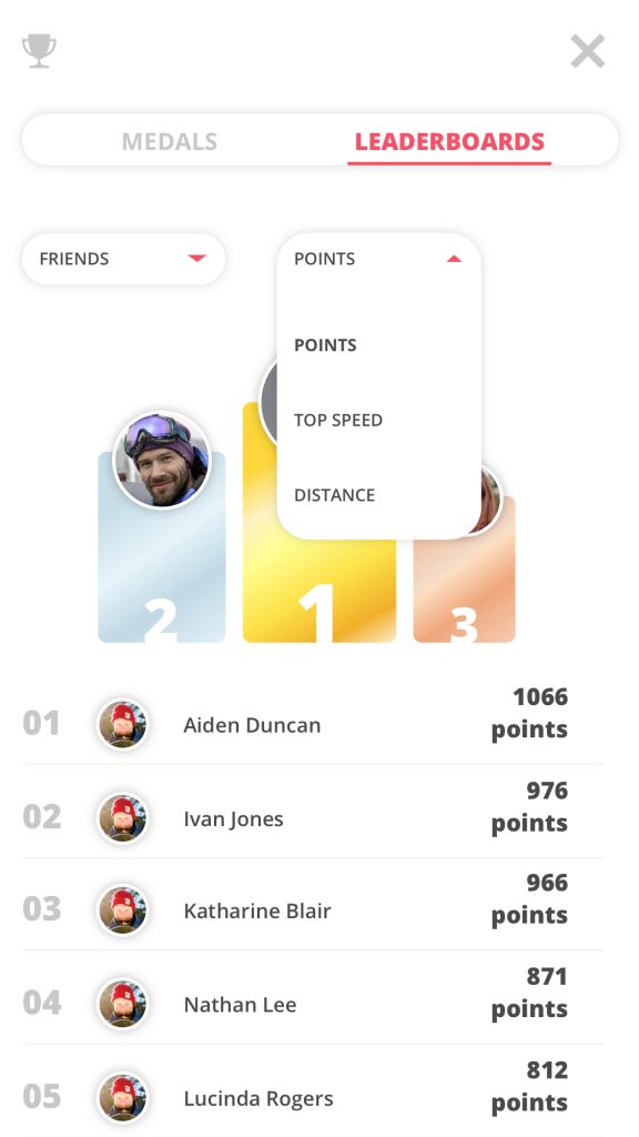
3. Leaderboards
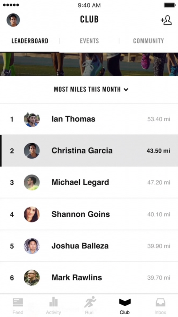
Another way for apps to give their users some more motivation are leaderboards, they want to climb higher and higher, especially if they compete with their friends. This drives on human nature to compete with each other.
-
- snoww – leaderboards
-
- Nike run – leaderboards
My implementation:
-
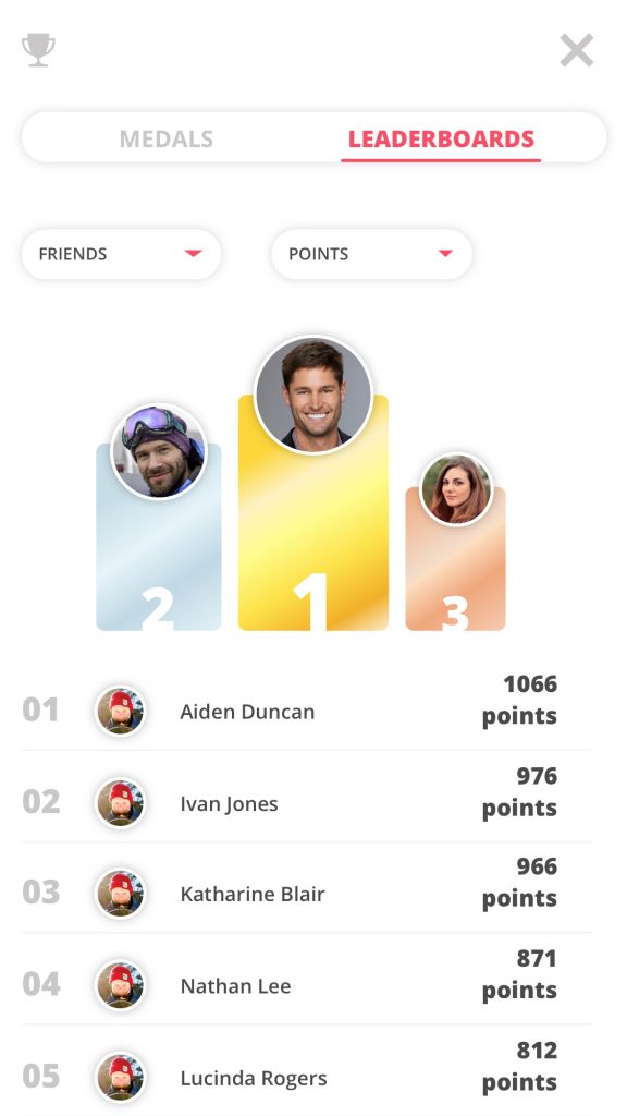
- Traverse – leaderboards
-
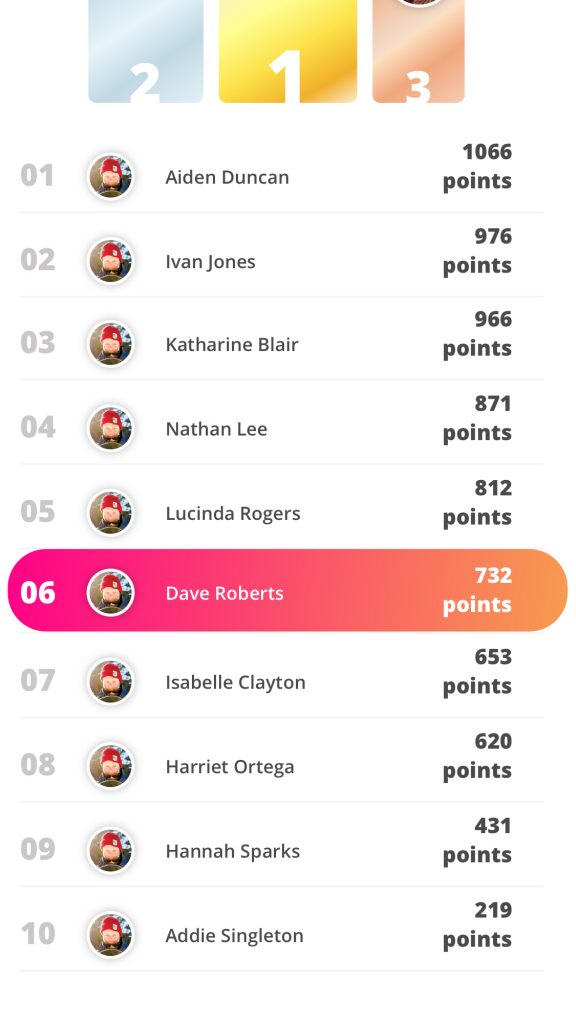
- Traverse – leaderboards you
-

- Traverse – leaderboards
-
- Traverse – leaderboards
Empowerment of Creativity & Feedback
Empowerment of Creativity & Feedback is actually implementing itself, the user was already planning to engage in winter sports activities but now with my product they get points, achievements and can track their activity. This helps a lot with feeling empowered. The user can share any info he/she wants, whenever he/she wants. The feedback element comes in play when collecting achievements or upgrading them from bronze to silver for example. An cool animation shows and you feel empowered by completing your quest.
1. Milestone unlocks & Instant feedback
Empowerment comes in play when receiving a medal or achievement. The screen fades, a big medal or achievement pops up and the app tells you ‘Congratulations! you have received a medal” or “Achievement Earned”. This is the case in a lot of gamified sports apps, like Nike Run for example.
-
- Nike run – unlock
-
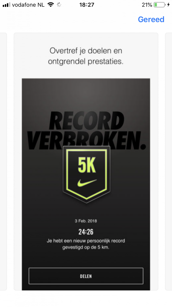
- Nike run – broke record
-
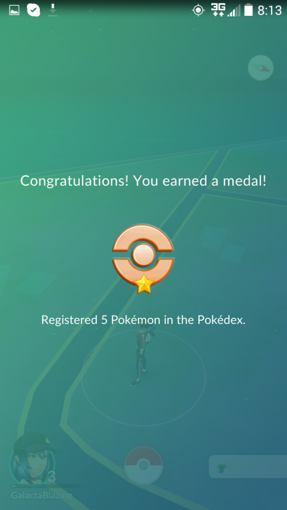
- Pokemon GO – medal
-
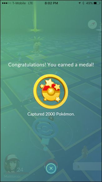
- Pokemon GO – medal
My implementation:
-
- Traverse – medal earned
-
- Traverse – medal shine
Ownership & Possession
Ownership & Possession makes the users motivated because they feel like they own the product. The user will accumulate points, achievements and will save their activity. The user can make a custom profile, join a group and make ‘trips’. These trips contain all kinds of data like activity, photo’s and friends. The user will feel this is a personal belonging.
1. Build from scratch
The user has built this profile from scratch, “it really is mine” is what they’re thinking. And this is true, a few noticeable examples are the fully customizable Tumblr profiles, custom app experience in Fabolous and your own trips in the Trips app. All these examples have had the user make something that represent them, something they don’t want to lose and something only this app can offer.
-
- Fabulous – custom experience
-

- Trips – trip intro
-
- Trips – trip customization
-
- Tumblr – profile creation
My implementation:
-
- Traverse – profile
-
- Traverse – friendslist
-
- Traverse – Trips
-

- Traverse – runs
Social Influence & Relatedness
Social Influence & Relatedness, this drive is one of the big ones in this project. The user adds friends, this makes it possible for friends to see your activity, but also for you to see theirs. The user will feel motivated to gain points and achievements because they can compare each other on leaderboards for points, speed etc. The user can also become ‘King of the hill’ if they accumulate the most points on the mountain they are on right now. And finally, the app will show who of your friends also have each shiny medal to motivate the user to grind harder due to that social pressure.
1. Bragging rights
When you earn a achievement in Nike, you can share it with your friends. Your posted trips in the Trips app van be liked and shared. Nike lets you know how many runners are joining a certain event, so why aren’t you joining? These are all variations of bragging buttons or bragging rights. People want to show other people how good they are.
-

- Nike – 150.000 other joined as well
-
- Nike run – unlock
-
- Trips – please share and like
My implementation:
-
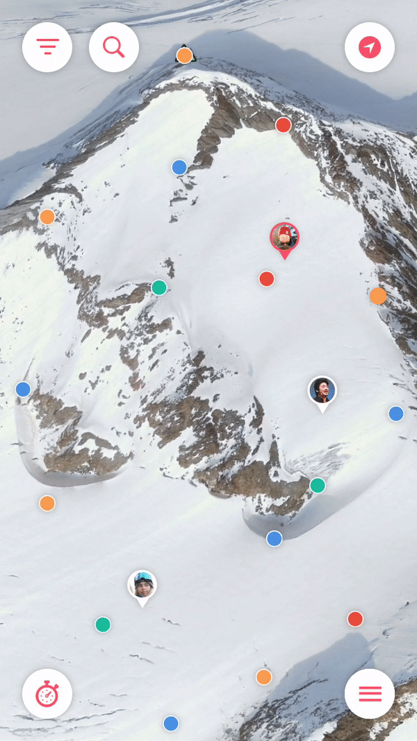
- Traverse – medal shine
-

- Traverse – activity feed
-
- Traverse – runs
-

- Traverse – king of the hill
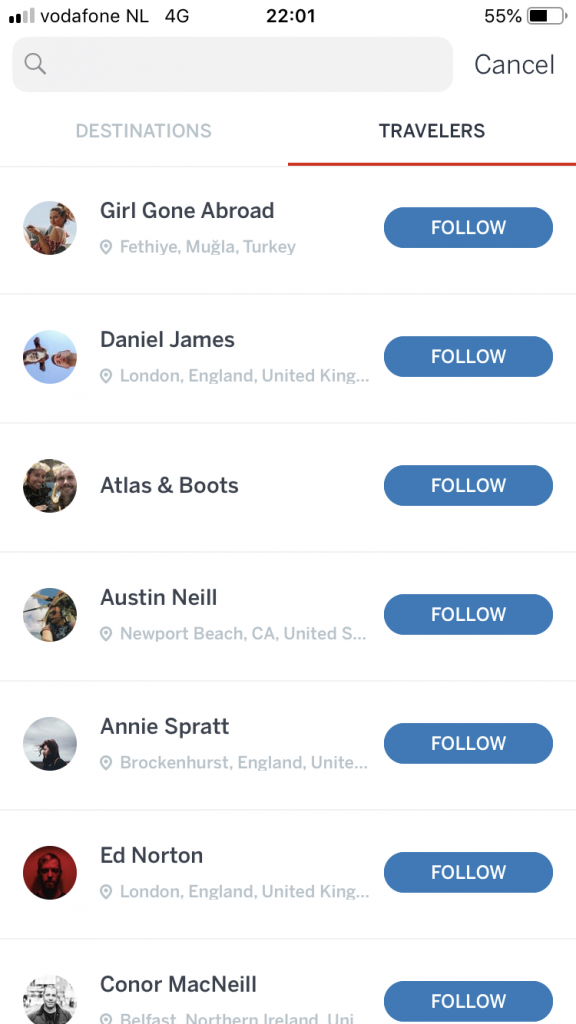
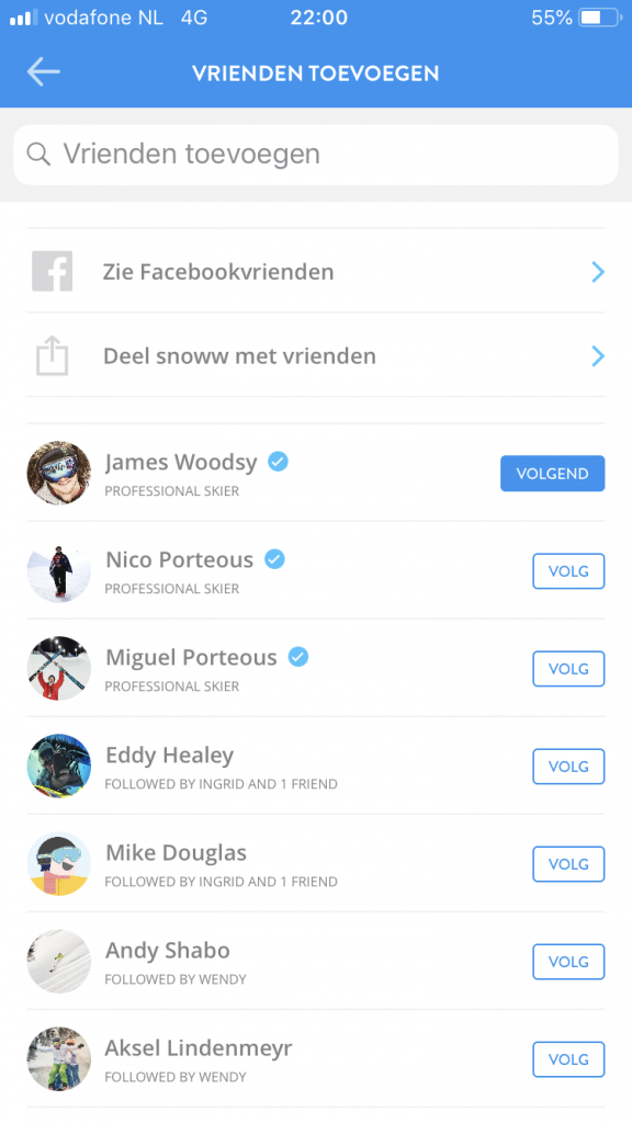
2. Friending
Adding friends gives access to a lot of social features. Not only does this open the door for the bragging rights, but also for sharing and competing with each other.
-
- Nike – more friends more motivation
-
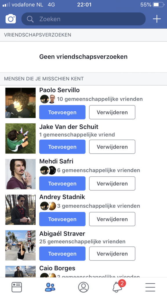
- Facebook – friends
-
- Trips – friends
-
- snoww – friends
My implementation:
-
- Traverse – accepting a friend
-

- Traverse – friendslist
Unpredictability & Curiosity
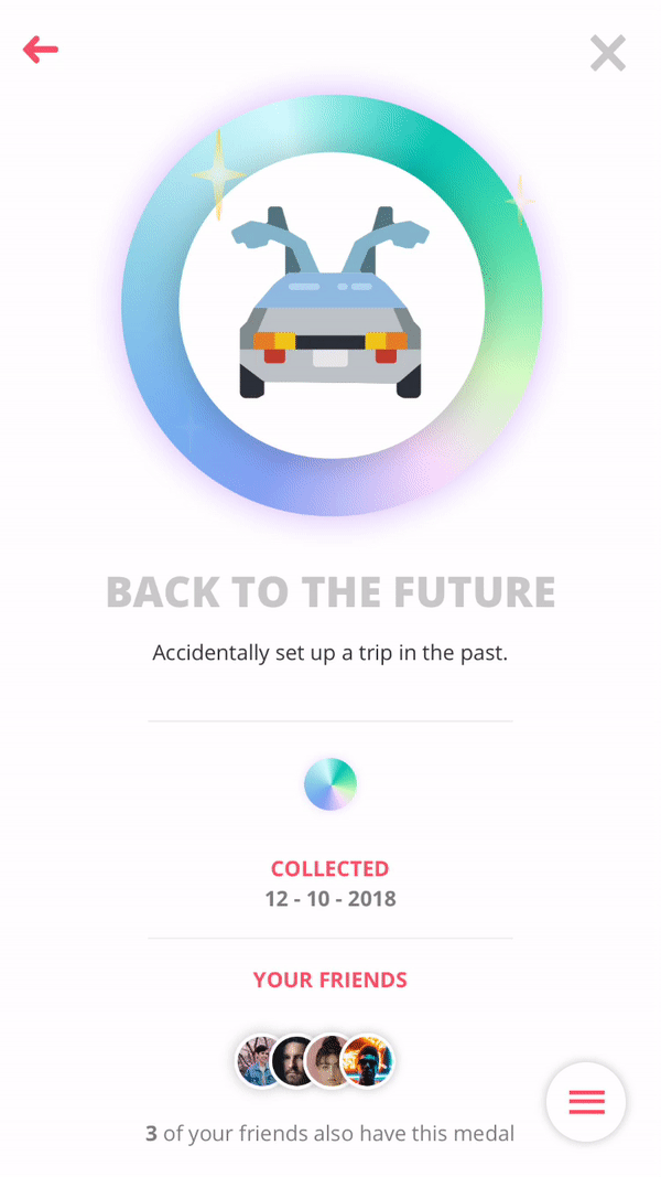
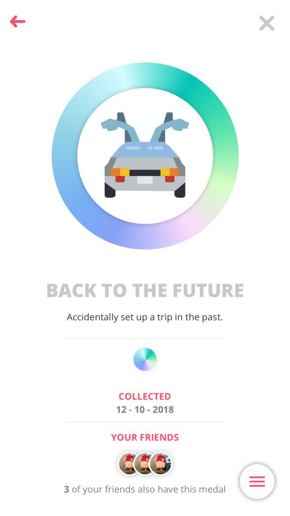
Unpredictability & Curiosity is usually a harmless drive, it sparks the curious nature of the user. This is mostly why people watch movies, the downside is that this is also the core drive behind gambling addictions. I will be using it in the addictive black hat way, but I will spark the users curiosity by having secret achievements. Little ‘easter eggs’ e.a. a achievement called ‘Back to the future’, this is achieved by accidentally starting a trip in the past. Also, the user can gain points by being the first at an event POI and ‘discover’ things on the map.
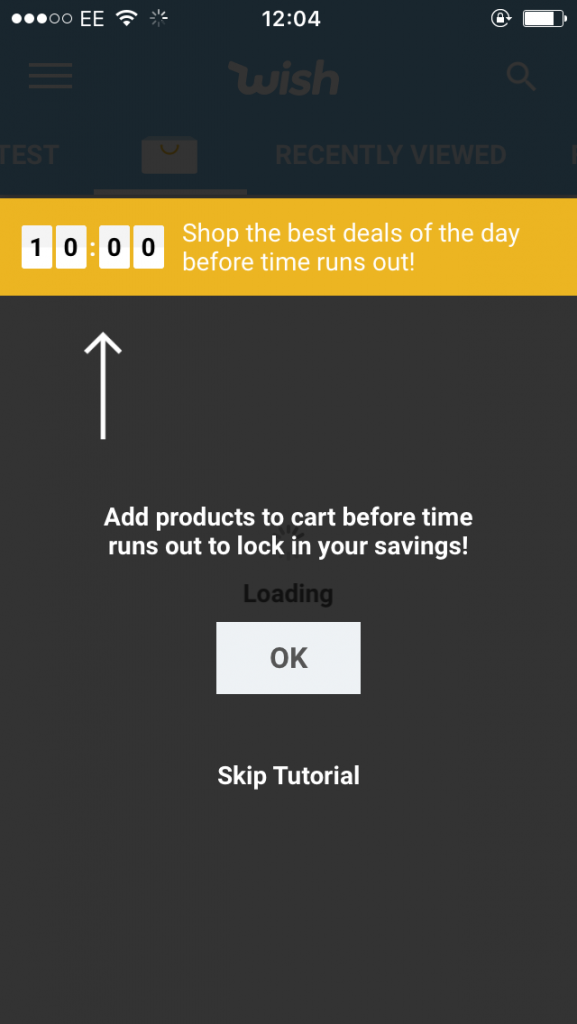
1. Glowing choice & Random reward
Not knowing when or what will happen, this can be implanted for good and evil purposes. The good ones, like McDonalds that give a free burger when you download their app or Wish that lets you spin a wheel for prizes and discounts. Their are also evil ones, think about products wanting to start gambling addictions by adding Loot boxes into their games or introduce children to the random nature of gambling by letting them buy Pokemon card.
-
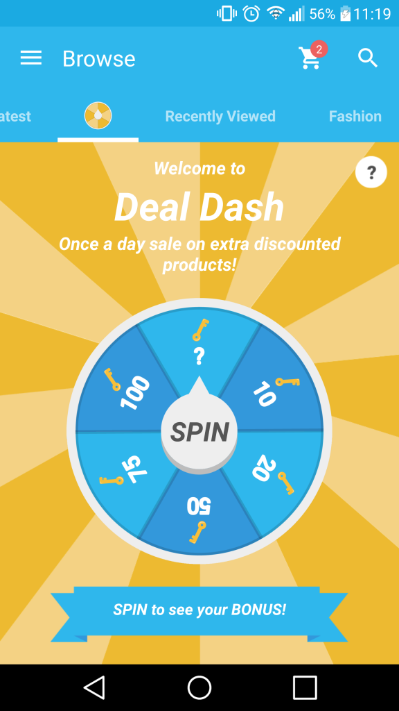
- Wish – deal dash
-
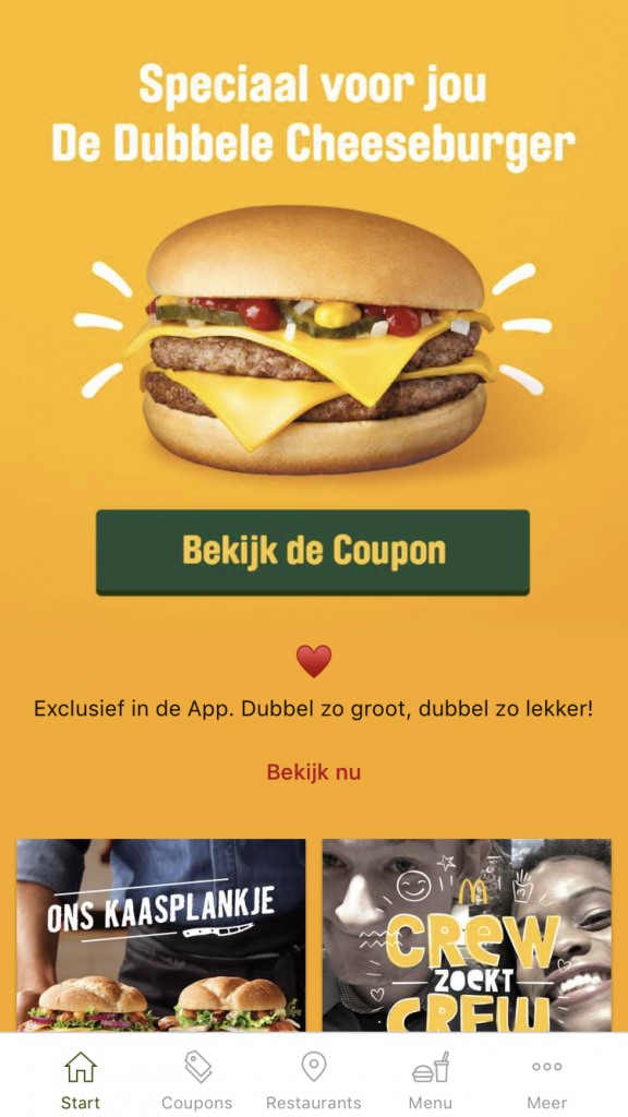
- McDonalds – free burger
-
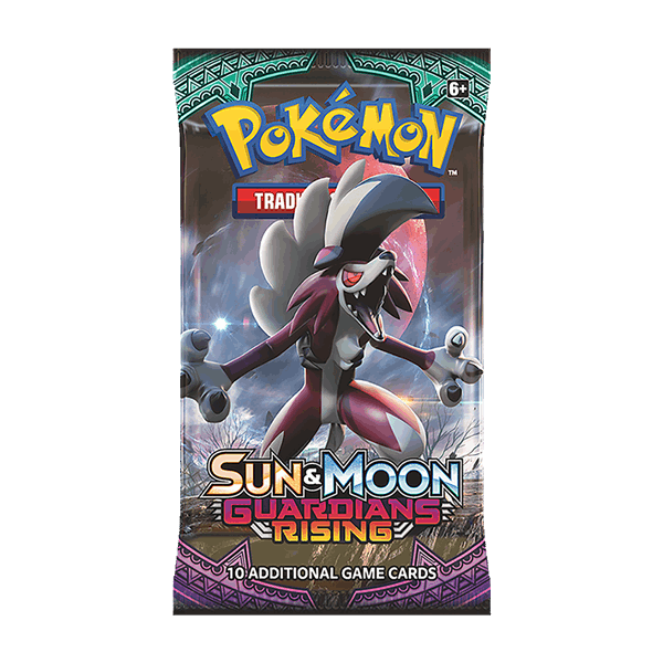
- Pokemon cards
My implementation:
-
- Traverse – random glowing reward
2. Easter eggs:
Easter eggs are little secrets that can appear in games. In real life scenarios, Google uses this the most. Sometimes when you search certain specific things on Google they will give you a hidden option, like a game of tic tac toe for example.
-
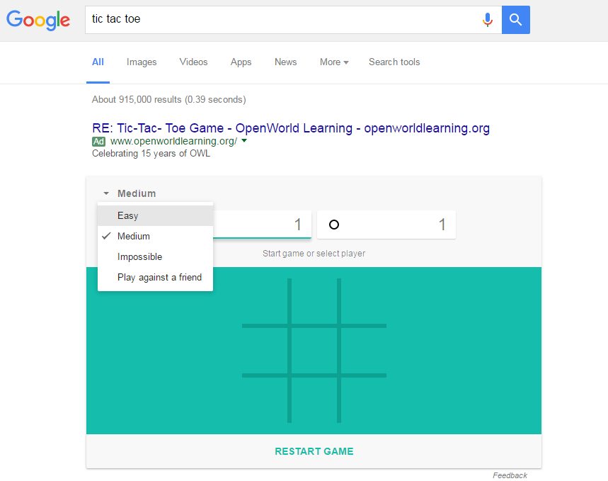
- Google – easter egg
-
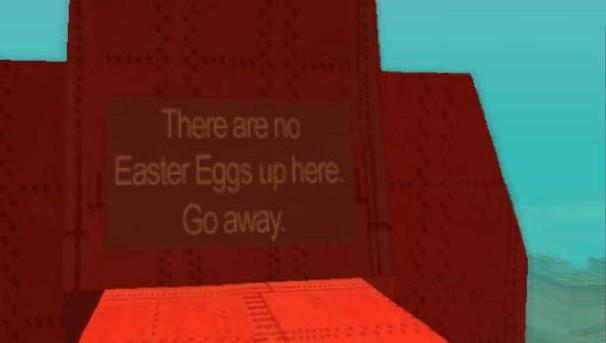
- GTA SA – easter egg
My implementation:
-
- Traverse – medal shine
Scarcity & Impatience
Scarcity & Impatience is one of the black hat gamification methods I will not really be using. The only element worthy of mentioning is that once in a while a random POI on the map will glow up due to an event. The first user that arrives here will get points and progress to an achievement.
1. Dangling & Timer
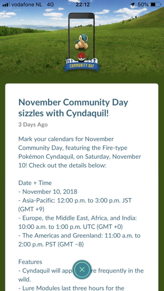
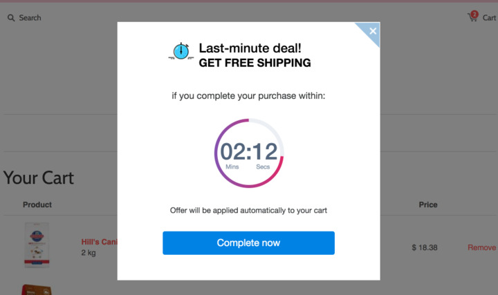
Dangling prizes in front of the user, or giving the user a timer to do a certain event. The latter happens a lot in shopping apps and sites, “this item will be in your cart for 10 minutes” or “order in 5 minutes to get 10% off”. Pokemon GO also has this, but in a milder form. Pokemon Go has ‘event days’ days where you need to play the game in order to get special rewards.
-
- Wish – deal dash
-
- Pokemon GO – limited time event
-
- Ecommerce – timer
My implementation:
-
- Traverse – random glowing reward
Loss & Avoidance
Loss & Avoidance is all about not wanting to lose progress or not wanting something negative to happen. A black hat method I will use in a minor form. The user can try and get an achievement like ‘Office hours – have a run that lasts 8 hours‘ or the example below: ‘Going up? – Spent 20 consecutive minutes in a lift.‘ If the user quits early, they will lose this progress and they will see the progress bar go down. Naturally the user also does not want to be in the bottom of the leaderboards or lose the ‘King of the hill’ title while they just got it.
1. Progress loss
Most of the apps that use this are mobile games where you have a certain amount of ‘energy’ to complete tasks. After your energy is depleted you will slowly gain it back, or you can buy a special currency to get it back to full again. A nasty example of this is a fairly new mobile game named Harry Potter: Hogwarts Mysteries. The player gets 25 energy and gets 1 energy back every 4 minutes. This creates a game loop where the user will start a task, it takes up more then 25 energy so the user has to wait. Now a few things can happen, the user will wait and get the energy back and finish the task. The user will forget, and he loses all progress. Or he buys new energy and spends an absurd amount of real money to get it.
-
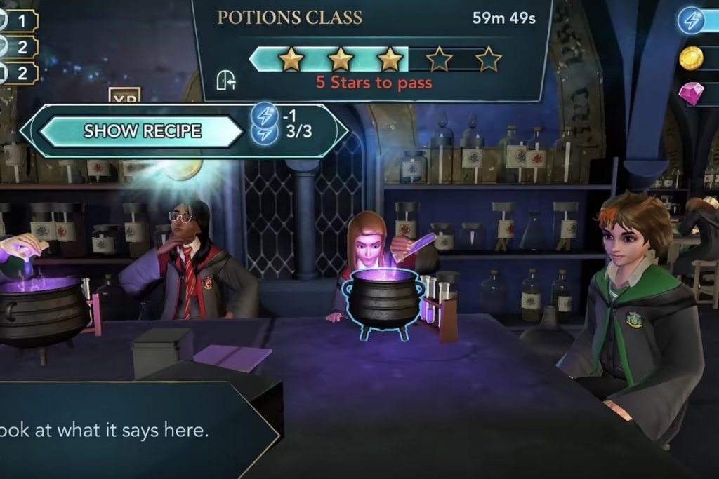
- Harry Potter mobile game
My implementation:
-
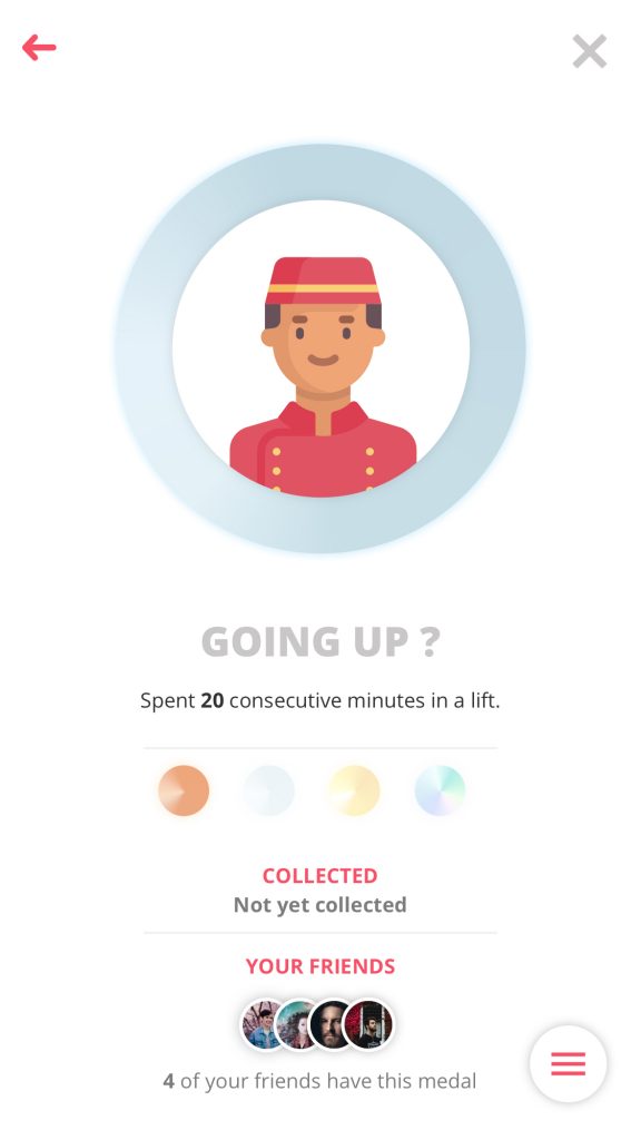
- Traverse – possible progress loss
6. Prototyping
In this chapter you will find the many iterations of the prototype and/or the design. Big changes are logged here, together with user tests and feedback sessions.
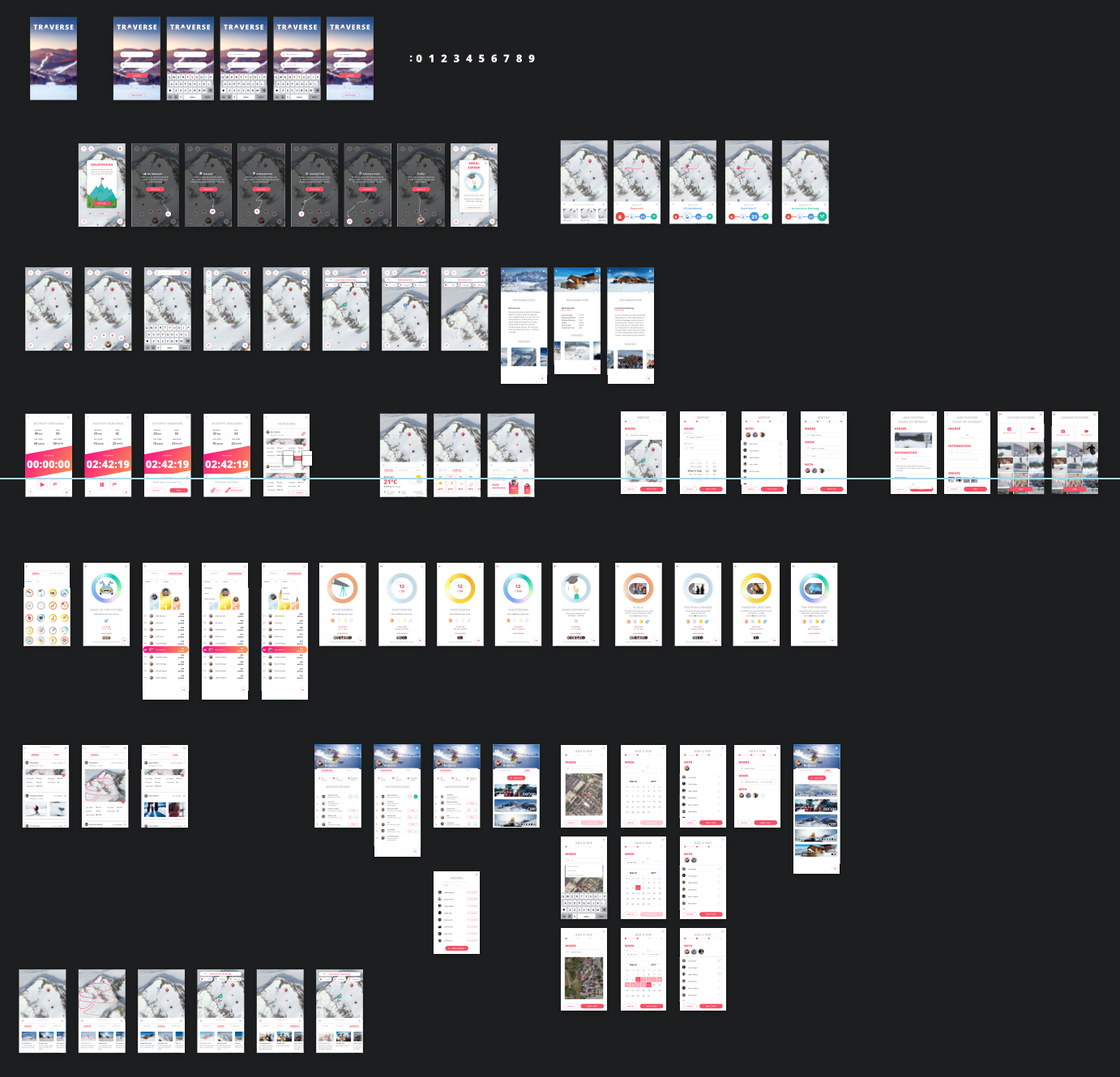
6.1. Prototype v0.1
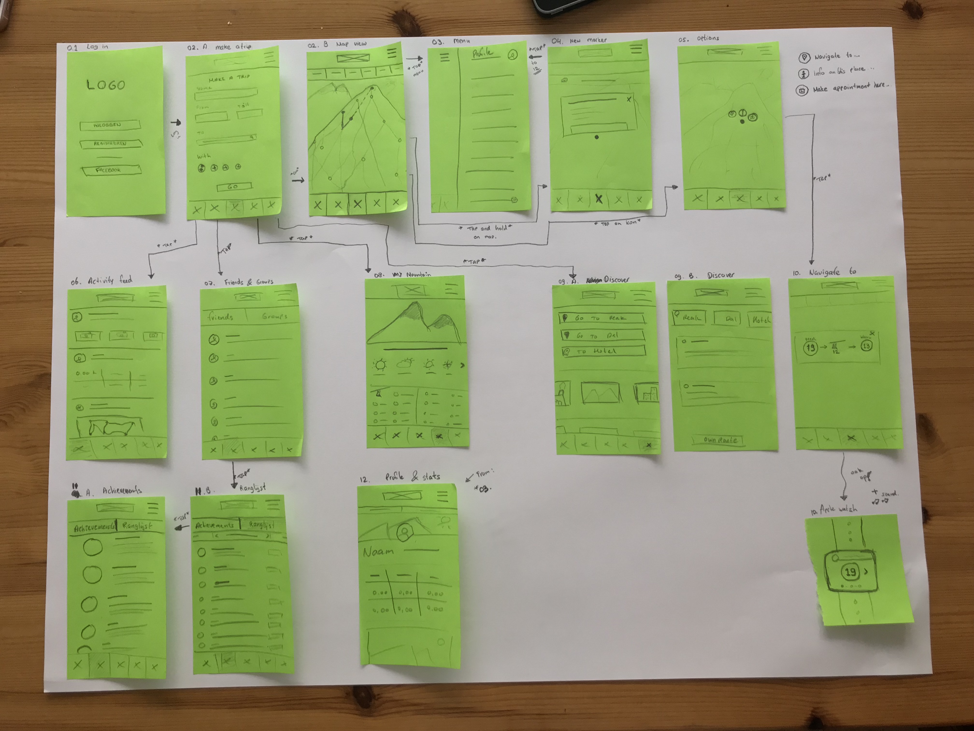
The first sketches
To map the project out, I started with these quick and dirty sketches. These sketches were for explaining my idea better. As you can see in the image below, the total project is not thought out yet but with this I could get a good birds eye view on the screens and start working on better sketches.
Goal
Have a first visual representation of the app to show to the users.
Click on the button below to the screens in more detail:

Co-reflection
I tested these first quick and dirty sketches with developers and designers of Creative Media Network. Another positive note was that some of the co-workers were winter sports enthousiasts themselves. I had set up a small pitch to convey my project, the context and the problem. This Co-reflection helped a lot with planning ahead and giving insightful ideas about where the project could go. First off I had let them take a look at the sketches and had them ask questions and write notes on sticky notes. After this I held a short pitch and went through the sketches. A discussion was held about the possibilities and the pain points.

Results
– Start planning out features thoroughly.
– Sketches were fine for first draft but improvement was needed for better understanding the idea.
– Idea was clear.
– Idea was liked.
– Recognized some of the problems.
– Maybe too much features, too much on one page.
– No iconography, so ‘clicking’ somewhere was not clear.
– 3 buttons after long press, not a good idea with small POI’s
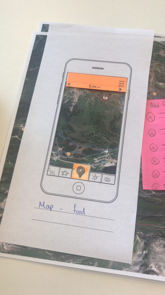
6.2. Prototype v0.2
Second sketches
For the second Lo-fi sketches I used mobile phone templates as a base. The feedback from the V0.1 was implemented and some design changes were made. The functions were worked out in detail and real(er) icons and text were used to make it more clear.
Notable changes:
– Bottom tabbar has more detail.
– Real words used.
– More detail.
– Interactions more thought out.
– Map part cut out, now the user could ‘drag’ the map around.
Goal
Have a paper prototype to test the first features with.
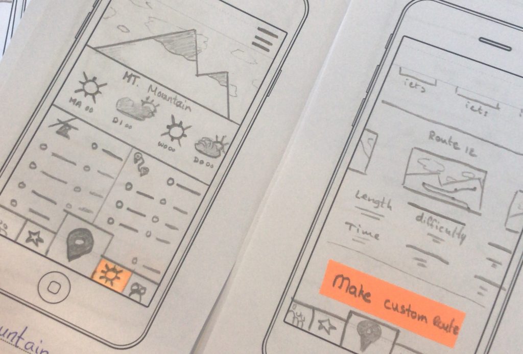
User testing
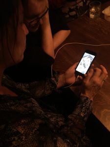
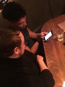
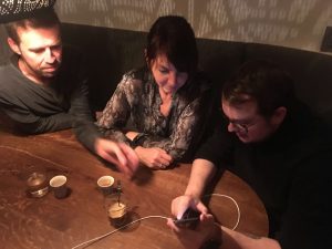
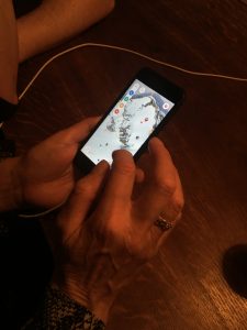
The test was conducted at the Creative Media Network office with developers and designers that go on winter sports vacations. I showed the changes from prototype v.01 to v.02 and let them test themselves while I layed down a new paper prototype screen as they clicked.
-
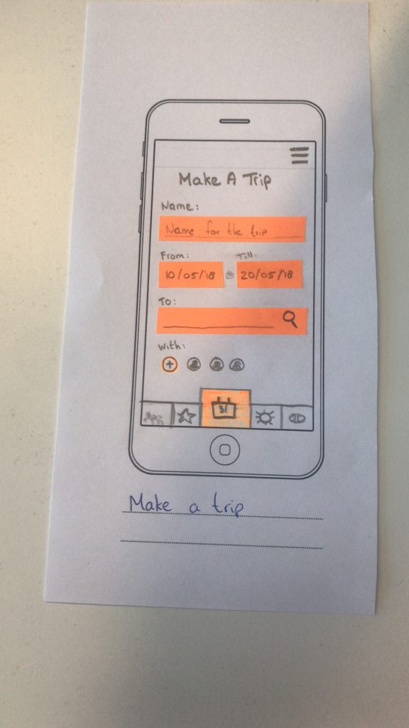
- make a trip

-
- map view

-
- My mountain & Discover

-

- map view
Results:
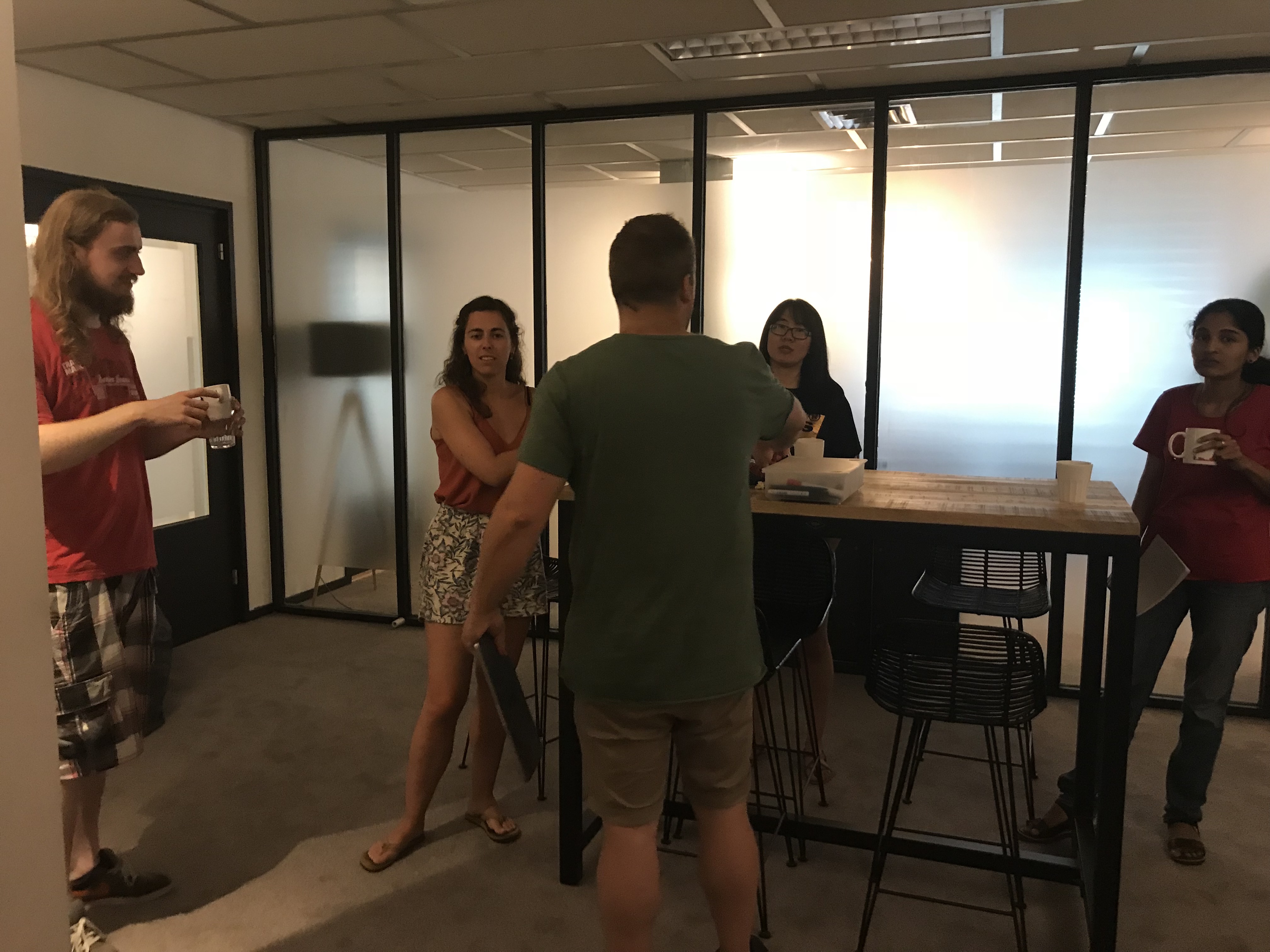
Testing at CMN
+ Design and idea was much clearer.
+ They appreciated the highlighted options.
+ Gamification was better implemented.
+ Actual map, thumbs up.
+ Paper prototype testing +++.
– Buttons cover a lot of space on screen?
– Start with make a trip?
– Hearing a lot of ‘custom’ is this needed?
6.3. Prototype v0.3
Wireframes
Every skier and snowboarder is at his own level, the ones I will be will be the average winter sports enthusiasts. Insideoutskiing.com has a handy guide to check what level you are, from here I can deduce that I want to be focussing on winter sports enthusiasts level 6 ‘Early Intermediate’ and up. These are the users that are done learning in classes and are just doing it on their own now. I want to focuss on this group because of their independence and willingness to learn more and grow.
Goal
Have a digital version to show at the Feedback Frenzy and test the user flow with highlighted options.
Click on the button below to the screens in more detail:
Feedback Frenzy
The presentation itself went well, just too bad I was so so so nervous. The feedback session itself went well, and people were positive and had good feedback.
You can listen to my presentation and feedback here:
Feedback:
– Too much features.
– Focus on MVP.
– ‘Too complete’
– Two menubars do NOT work.
– Low battery & sunlight?
– Service on the mountain.
– Testing is important.
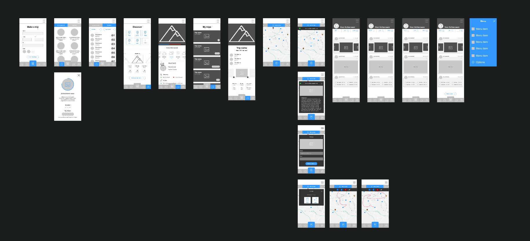
6.4. Prototype v0.4
First hi-fi prototype
These are the first designs made in Sketch and the first prototype in InVision. Making the prototype an InVision prototype was a deliberate choice, not only because InVision prototypes are easy to adjust and easy to share, it also has a plugin for Sketch. The ‘Craft’ plugin for sketch made it very easy to adjust and rework the prototype on the fly.
Notable changes
– Added the visual design.
– Removed the bottom tabbar navigation and moved the menu button to the bottom.
– Made a custom menu button and interaction.
– Removed top menu bar.
– Removed ‘make a trip’ from the beginning of the app. This interfered with people using the app who did not want to go on a trip, just see their statistics or achievements.
– Removed the ‘custom’ fast click options in the discover page.
– Made the Discover page smaller to overlay the map.
– Added the tabbed navigation to more pages.
Goal
Create a clickable InVision prototype with the visual design implemented to conduct user tests with.
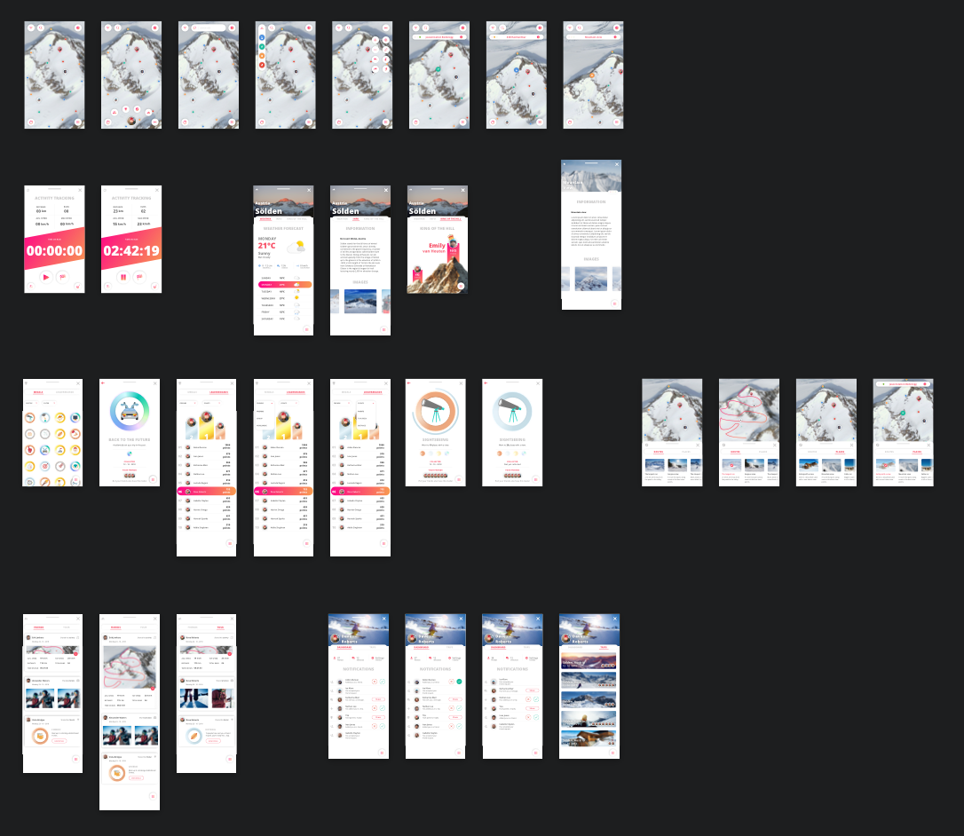
Click on the button below to the screens in more detail:
Here you can try out the prototype:
Craft by InVision
An InVision prototype can be shared easily, and with InVisions Sketch plugin Craft this became even easier. After activating the plugin, which has much more options then just prototyping, you can press the ‘c’ key while having clicked on a layer. This creates a blue arrow that indicates it can be linked with another screen. After linking it to another screen a menu pops up and you can schoose InVisions screen to screen animation type and the gesture. After this you can upload all your screens to InVision, with a press of the button all your screens are synched, a clickable prototype will be ready instantly.
-

- Visible links
-
- Linking a screen
-
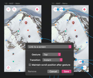
- InVisions link options
Choosing a menu
I really wanted a original menu, something not so predictable. I went with the one that had the best overall aesthetic, the users were positive during tests.
-
- Rounded option
-
- Zig Zag option
-
- Corner option
-
- Right side option
-
- Cluster option
User testing
The birthday of a good friend of mine was a good opportunity to test my prototype. The family was a family of winter sports enthusiasts. Not only did a lot of them ski, but there were also a lot of people willing to test it. The app was received well, they liked the design, this gave a good confidence boost.
Results
– Design was well recieved.
– They thought the icons with gradient were questionable.
– No indication how far you are with a medal, maybe add progress indication?
– There was no keyboard for the search option.
– The ‘my mountain’ page had information about the ski resort, this was not needed since you are already there.
– Some missed the option to search for ‘Apres ski’ in discover.
– Too much options under the map-options button.
6.5. Prototype v1.0
The final prototype
Designed in Sketch, prototyped in Principle. This fully fledged out prototype almost shows everything it could do if it really was developed. The prototype took about a full seven day week to produce. It not only has micro animations on every screen, but also screen to screen animations.
Goal
Finalize the prototype by making it in Principle so the complete user flow can be tested with actual users.
Sketch file overview
Click on the button below to the screens in more detail:
Notable changes
– Added the login step.
– Added a step-by-step walkthrough.
– Added a ‘earned medal’ screen.
– Added navigation & meet-up options.
– Added more medals.
– Revised the ‘My Mountain’ page, it is now smaller much like the ‘Discovery’ page.
– Added the option to add a custom POI.
– Added the option to add a trip.
– Added a friendslist.
– Added a après ski tab to ‘discovery’.
– Changed the icon color, no more gradient.
– Some smaller design changes.
Downloading the prototype
This prototype was made in Principle, this is a prototyping tool that converts the prototype into a Mac app. This means it can only be viewed on a Mac computer. To download the prototype, follow these steps:
1. Click on the download button below
2. When in Dropbox select ‘download’ in the top right.
3. After downloading it from Dropbox, your computer will ask you to trust it.
4. Click on ‘trust it’ in your ‘Security & privacy’ preferences.
5. Unzip the file.
6. Now you have a Mac app of the prototype, enjoy!

Prototyping in Principle
Before I started on the prototype, there were in my opinion three options for software. Principle, Flinto and Webflow. I hesitated to use Webflow, simply because it was a little too technical for me and learning a new technique from scratch was going to take too long to get used to. Flinto and Principle are very similar in usage, the real issue is that while Flinto focusses more on screen to screen animations, Principle focusses on animations on screens themselves. Flinto has a more user friendly workflow, with the screens being placed in a more UX flow type of way. And since Principle actually is used for smaller prototypes it has a ‘timeline’ which means all the screens are put next to each other, creating a very.. very long timeline. I decided to use Principle, not only because I have used Principle in the past and I know I can work my magic in this. Principle also focusses on on screen animations, micro interactions so to speak. Since this was one of my focus points, Principle was the one to go with.
The Principle prototype I have made has approximately one hundred screens, each with its own distinct animations. It has larger screen to screen animations like other screens sliding in from the bottom, gesture based animations like swiping a notification to the left for the options (like an email on IOS) to small animations like a button changing from a ‘plus’ to a ‘checkmark’ when clicked.
Principle timeline
Complete Principle timeline
Notable changes
Some changes were made after importing the Sketch file into Principle. these were the most notable ones.
– ‘close bar’ next to the close buttons removed on all screens.
– Missing pages made on the fly in Principle.
– In ‘make a trip’ map replaced by video.
– Minor visual details added/removed.
User testing
User tests were conducted with four skiers and snowboarders, I gave them a short explanation ond the problem and the concept. I gave them the application and gave them various things to do on the spot. Actions like: “You want to check the weather”, “You want to go eat somewhere”, “You want to know how many placed you need to visit for a gold medal” and “You want to experience the longest run on the mountain” ofcourse these are but a few examples.

Full prototype walkthrough
In this video the whole app will be explored.
Results
Since this was my final prototype, the things they gave feedback on were good to know but were not being fixed anymore. If this project gets developed after the graduation these will be the first things that will be looked at.
+ Overall enthusiasm about the product.
+ Map and all its options.
+ Adding the après ski in ‘discover’.
– A few things that the application did not allow you to do, for example: start navigation for a discovered route.
– No detail view for the trips.
– Not being able to see all the routes. (technical thing I could not solve)
7. Design
In this chapter I gathered all the elements that form the UI and UX design choices. It has research that depict the mood, the look & feel and gathers the inspiration for how it looks (visual design) and how it moves (motion design).
7.1. Moodboards
Visual design moodboard
This visual moodboard represents a lot of visual styles and elements that inspired me. The moodboard has colors, imagery, web design, app design, photography and illustrations that helped me collect my thoughts on the style direction I want to be heading in and it is a start of the look and feel of the product.
Typography moodboard
The typography moodboard on the other hand shows inspiring typography found online that I would really like to integrate in the visual style of the application. It shows a lot of sans serif style fonts mixed with some freeform and handwritten fonts on bold imagery or colors.
“Your choice of typeface is as important as what you do with it”
– Bonnie Siegler
7.2. Look & feel
Styletile
This is my styletile, it represents a lot of visual styles and elements like fonts, colors and interface elements that make up the style of Traverse. The style tile helps communicate the brand identity to possible future stakeholders and other interested parties.
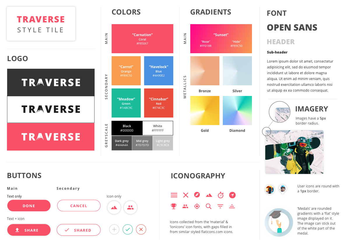
Color
White powdery snow and clear blue skies, when having to imagine skiing these two things pop up inside your mind easily. I guess this is the exact reason behind giving a winter sports app a white and blue color scheme, white representing snow and blue representing the skies. When searching for apps used during winter sports, may it be activity trackers, map apps or apps with ski resort information it is hard not to find one without this white and blue color scheme. About 95% of winter sports apps use these colors, which I consider not thinking outside the box. You can see examples of this in the images below.
-
- Ski Amade
-
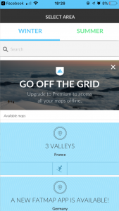
- Fatmap

-
- Slopes
-
- iSki tracker

-

- Trace
-
- Skiinfo
-
- bergfex Ski
-
- Ski Tracks

More energy
This is the exact reason I chose to experiment with different colors. Associating skiing or snowboarding with the colors blue and white and using that in a winter sports application is a logical step towards making something that looks like everything else. I chose to look into more energetic colors, colors that radiate energy. Sunsets during cold, snowy winter sports days are a beautiful thing to behold. I wanted to use the colors in this imagery as a step towards a more vibrant color scheme.
White and blue winter imagery
Sunsets on snowy mountains
A different vibe
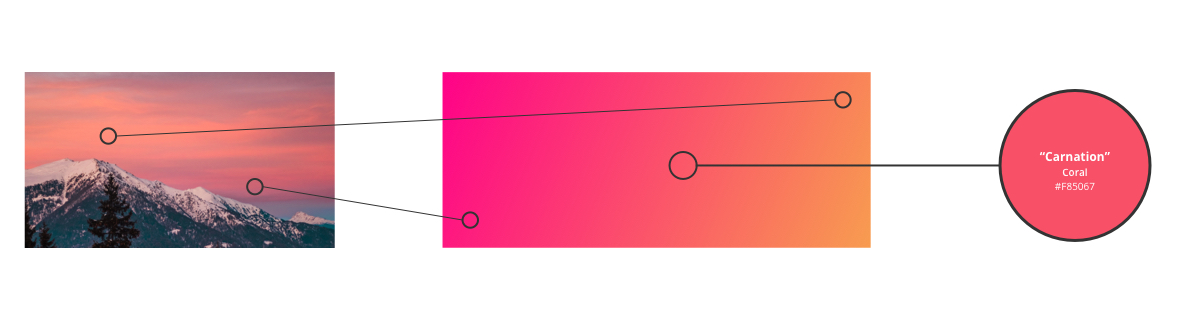
Sunsets and sunrises on snowy mountains often give an orange-y or pinkish glow to the pure white snow. I used this as a starting point for what later became my main gradient. As you can see in the image below, the main color of the application is a color called “coral”. Coral is described by Google as a ‘reddish or pinkish shade of orange’. And while my coral is more on the pink color spectrum as the orange one, it’s coral none the less.
The reason behind this color is my main gradient. I took the pink and orange tones in images of snowy mountain sunsets and blew these up to more vibrant versions of themselves. Somewhere around the centre of this gradient my shade of coral came to be. This is where is decided to use this as the main color in the application Various color psychology studies have come up with meanings behind certain colors, I took this into account while making my color scheme. Orange is often used to convey optimism, adventure and fun. Pink is used to communicate energy and playfulness. Two colors that represent the idea of the application very well.
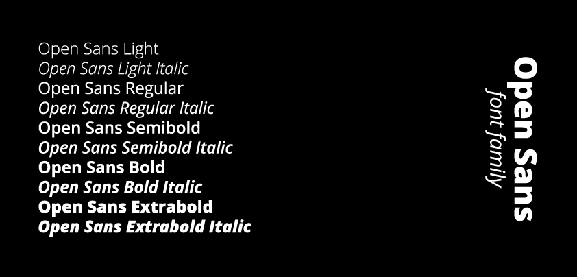
Font
For my typography I used Open Sans. Open Sans is an sans serif font family described as a font that has an open, neutral, yet friendly appearance. It works well with other sans serif fonts and is a pleasure to read on the web. It’s also a plus that it’s a free web font on Google Fonts used by many other online services like applications and websites.
Open Sans was designed with an upright stress, open forms and a neutral, yet friendly appearance. – Google
Open Sans styles
Logo
The Traverse logo is based on a customized version of the ‘Open Sans – extra bold’ font with a edited ‘A’ depicting a mountain with a snowy mountain top. The logo itself is a combination between a wordmark type logo and a logo mark, with the ‘A’ in Traverse being able to function on his own as a logo mark in possible future branding.
![]()
Tone of voice
While the visual style shows off one side of the branding, the tone of voice shows the other side. marketingtermen.nl describes the tone of voice as ‘the voice of the organization’. The tone of voice should compliment the visual style, and I tried to achieve this by having a tone that is serious with a touch of humor. The business side of the application, like the detail pages of the various eating establishments will be more serious. While the more ‘fun’ side of the application, like the gamification elements will have more humor and whits. For example, the user can be made fun of in a medal description like: “oh wow! you’ve completed the unskippable walkthrough.” or the user can obtain medals that have references to movies or music.
7.3. Visual design
Here I will explain per feature where the visual design inspiration came from and why it is implemented this way, giving you insight on my motivation and reasoning.
Introduction
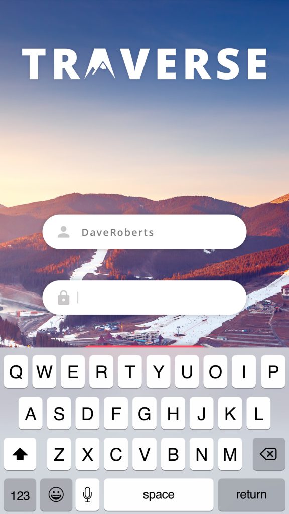
1. Login
The login page is a must for my application since the users can save certain data like trips and runs and add friends to make a majority of the gamification work. The user can make a profile and then start their journey. For inspiration, I looked at a lot of Behance, Dribbble and Pinterest designs for login screens. The things that stood out were the login screens with a picture background, I really wanted to use this to convey the snowy winter sports vibe right of the bat.
Inspiration:
-
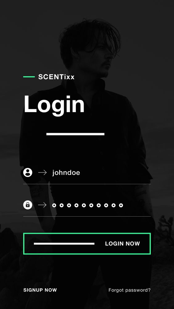
- SCENTixx – login
-
- Now UI kit – login
-

- Airbnb – login
-
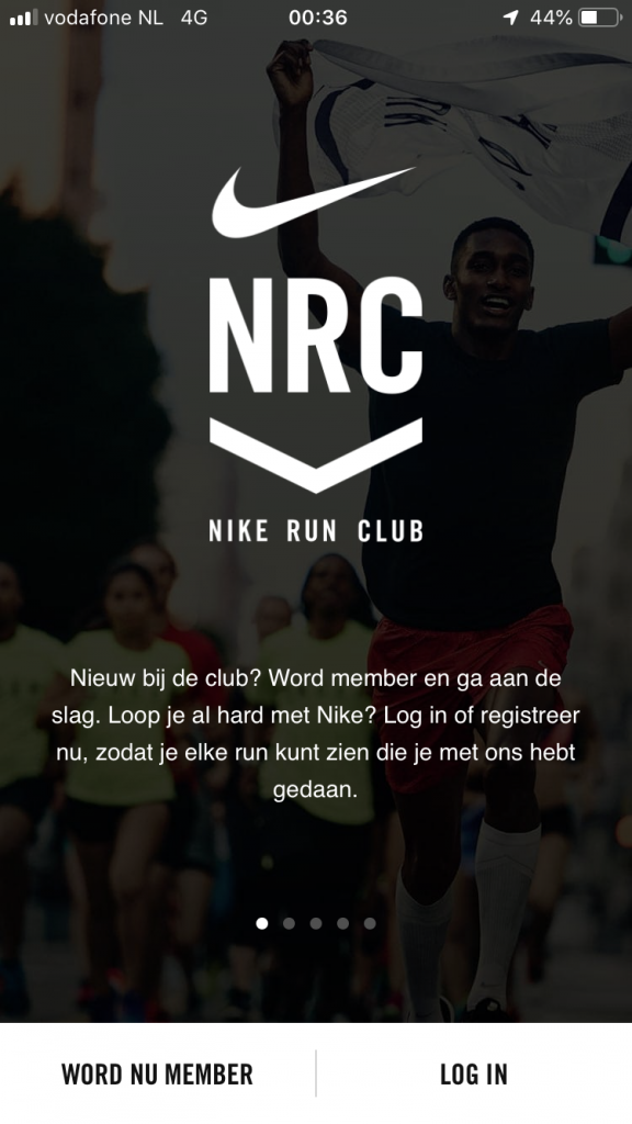
- Nike run – login
My design:
-
- Traverse – splash screen
-
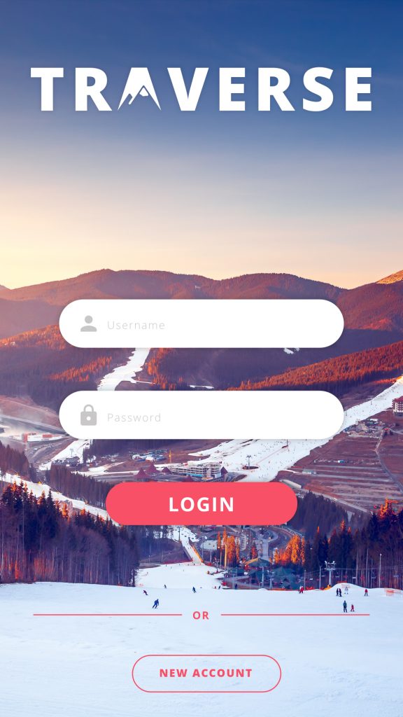
- Traverse – login
-
- Traverse – type
-

- Traverse – typed
Reasoning:
The background photograph is that of a snowy ski resort with a beautiful sunset over the mountains. The aesthetics of the colors and skiing vibe together with the actual main color and gradient derived from sunsets on snowy mountains, made this a perfect image to start the application on. I used the same iconography as the rest of the application and used the main color for the accents. You can see where the inspirations comes in play, namely in the background and clear form and button styles.
2. Walkthrough
Not only is the walkthrough a gamification tool, it is also a good feature to implement if you want to explain certain things in you application. In the inspiration you can see two distinct styles, step-by-step overlay tutorials that come in play after you get started, and illustrated style introductions before you log in.
Inspiration:
-
- Pulse – news app
-
- planner – example
-
- Introduction example
-
- Introduction example
My design:
-
- Walkthrough – start
-
- Walkthrough – step
-
- Walkthrough – step
-
- Earning a medal
Reasoning:
At first I could not decide on a clear strategy for a tutorial, but I quickly realized I could just do both. I combined both elements to make the styling complete. At first you will get the option to participate in the walkthrough in a more illustrated introduction style, if you decide to skip you will be able to find it in your settings. But if you continue the screen will darken and it will highlight menu features and explain them. The arrows used to point at the menu items are deliberately sketched in a ‘loose’ manner, this is to emulate a curvy ski route.
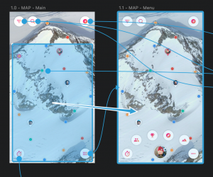
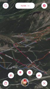
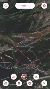
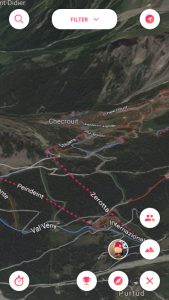
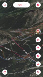
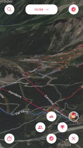
Map screen
1. The map
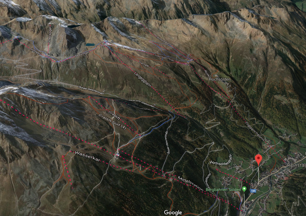
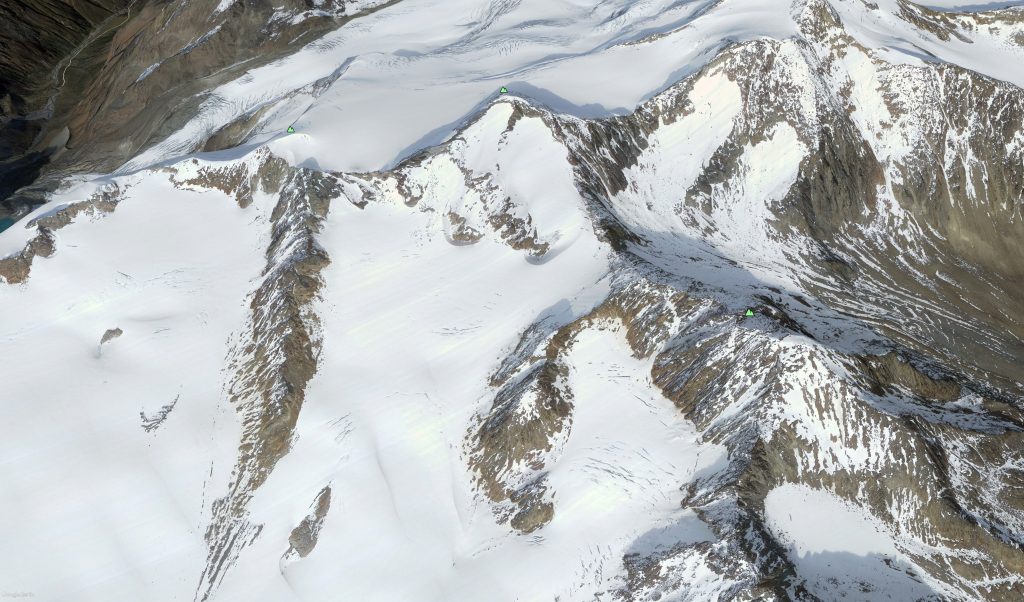
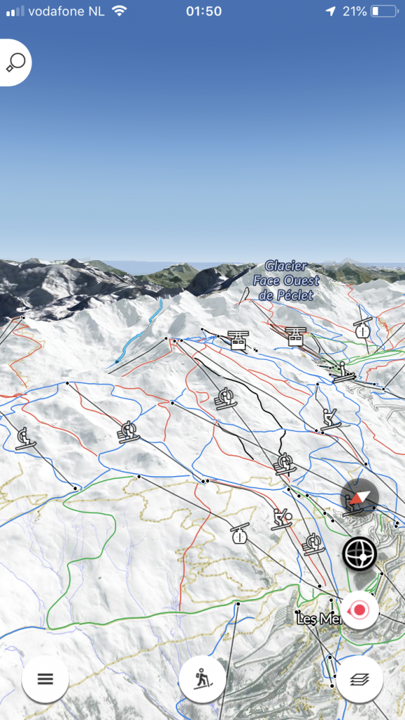
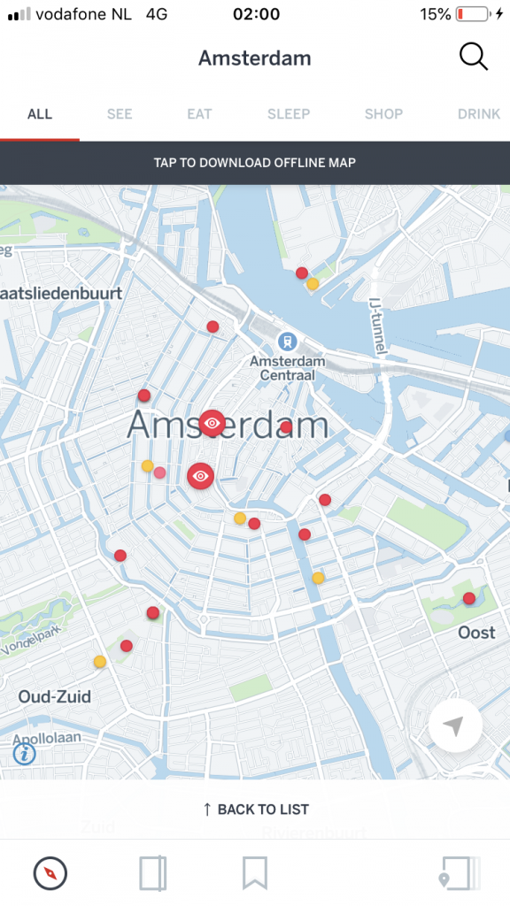
The map is the most important feature of them all. This also makes the look and feel of the map very important, in the options below you will see two versions of a map. One is Google maps, the other Google Earth. I came across a problem while designing the map, and that was that the Google Maps map did not have snowy mountains… anywhere. The good thing about the Maps map is that is displays the ski routes in their respective colors of blue, red and black while also showing lift routes in dotted lines. This was perfect since I needed this to base my ski resort on. On the other hand there was Google Earth, where I could download a beautiful 4K resolution map, but without ski routes on it.
Options:
-
- Google Maps
-
- Google Earth
Reasoning:
The reason I chose to use the Google Maps map was for the aesthetics. The Google Maps map had the routes, yes, but these (while important) can be missed. The snowy mountains on the other hand could not be missed. I experimented with both but the green map ruined the whole immersion of going on a skiing trip, and this was unacceptable. In the future I would have likely had made a custom 3D map with my own styling.
2. Map UI
To keep the UI as clean as possible I looked into inspiration from some great and memorable map applications. Fatmap, Pokemon Go, Google Earth and Local all have their UI elements pushed into the corners to give the map a lot of space. And while I do not agree with Google Earths button placement (left bottom, left top & right top. Instead of the obvious right bottom placement) these UI elements do not clutter the screen and are still accessible.
Inspiration:
-
- Fatmap
-
- Pokemon GO
-
- Google Earth
-
- Local by Facebook
My design:
-
- Traverse – Map
-
- Traverse – Menu
-
- Traverse – Filter
-
- Traverse – Map options
Reasoning:
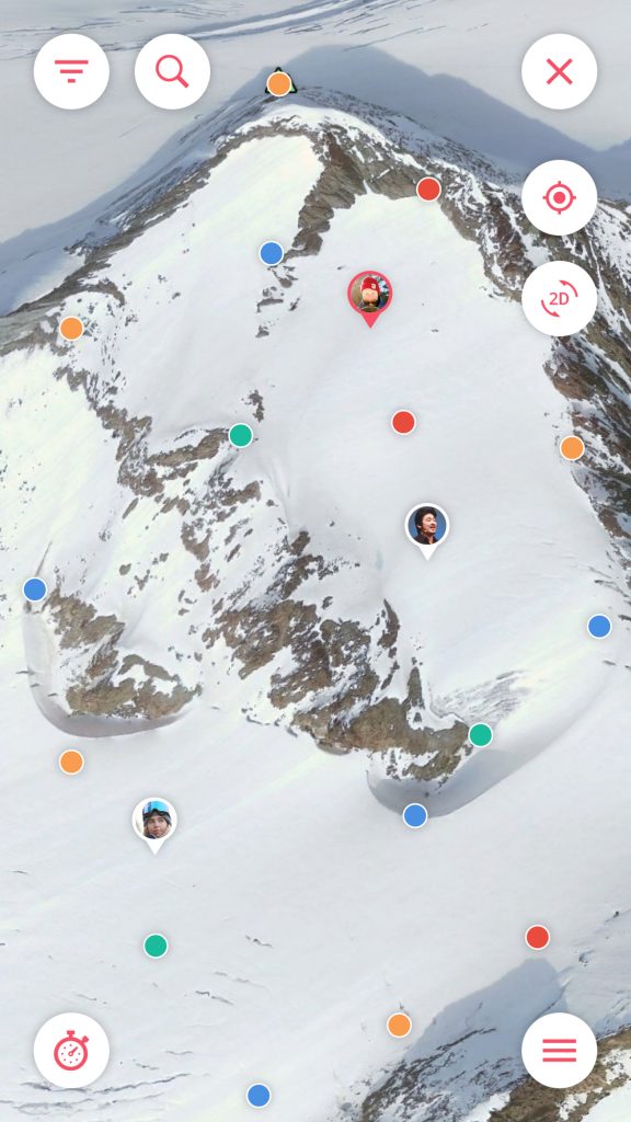
While the top row of the maps UI is made this way so it all has a set amount of room. For example: the searchbar extends in the middle part between the filter and options buttons, and the two outer ones expand downwards. This is so that all the buttons are easily clickable, even in cold weather when you have to take your glove off for a second. The menu on the other hand expands in a circular way, this is done to fill the bottom with menu items and complete a ‘half circle’ from the menu button to the activity tracker button.
3. POI’s
The one inspirational application that stood out on this subject was Lonely Planet’s Guides. In Guides you can download and check city guides of a number of cities, with each city having POI’s on the map. These POI’s are defined by color & icon and filtered on specific ones. When tapped that show a small information box that shows the name of the location, when tapped again it opens a detail view.
Inspiration:
-
- Lonely Planet – Guides
-
- Google Maps
-
- Waze
-
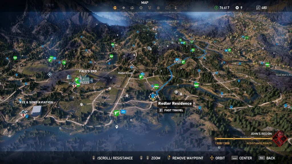
- Far Cry 5 (game)
My design:
-
- Traverse – Map
-
- Traverse – POI
Reasoning:
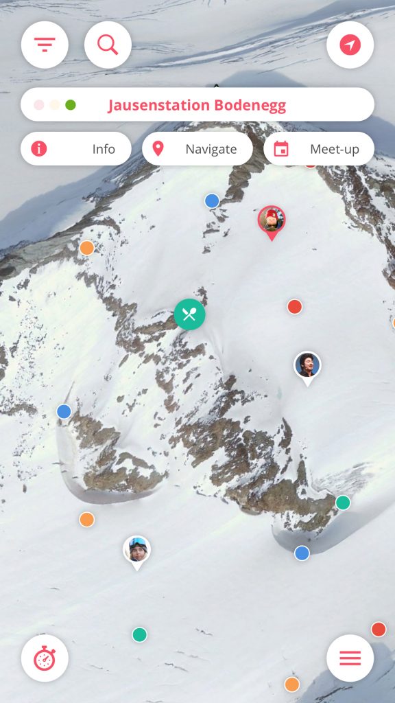
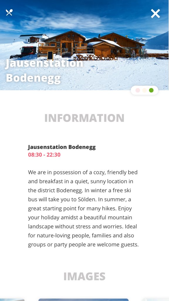
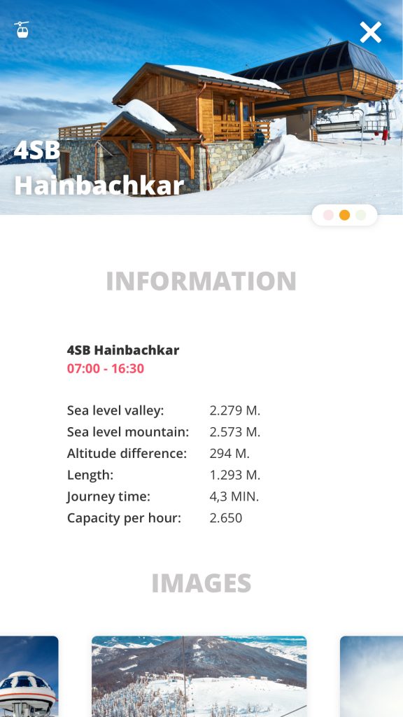
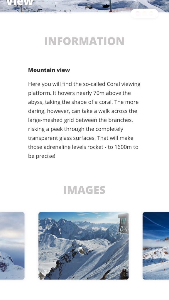
Each category POI has his own distinct color and icon. The icon is visible in the filter option and when the user clicks on a POI. The user can observe the POI’s and filter menu and deduct that these are the same, they will start to associate the color with the type of POI. When tapped on a POI a info bubble drops down that shows a number of things, the name of the location, a traffic light indicating how busy it is and three buttons. Information, which shows information about the POI like opening hours and photos. Navigation, which an be used to navigate to this location. And Meet-up, which arranges a meet-up here with your current group.
* POI stands for Point of Interest.
4. POI detail
Detail views in the Lonely Planet apps Guides and Trips are absolutely stunning. The Guides details start with a full screen high resolution photograph. The image contains a few elements like title, description, like button, share button and more. Starting with a big image was a trend a few more apps did as well, like Google Earth for example. Earth’s detail page starts on a large image, send button, title, description and a few lines of the information. The usage of beautiful imagery was certainly a big inspiration.
Inspiration:
-
- Lonely Planet – Trips
-
- Lonely Planet – Guides
-
- Lonely Planet – Trips
-
- Google Earth
My design:
-
- Traverse – detail
-
- Traverse – detail
-
- Traverse – detail
Reasoning:
Each detail page starts with a wide image of the POI, and it contains a few elements with crucial information. The title can be found in the bottom left corner, the icon displaying the POI type in the top left, a close button in the top right and the earlier mentioned traffic light in the bottom right. This was done to still give the image a little breathing room. I wanted to use a big image to start here, but I did not go through with it. The reason is that I want skiers and snowboarders to see the information as quick as possible, and while a big image can be beautiful, it is an extra step to see the information.
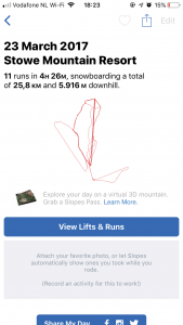
Activity tracker
1. Activity tracking
The one thing in common is that sports apps almost certain have a activity tracking screen. But the ones that stood out the most were those made by Nike, snoww and Strava. Nikes black and yellow screen has a very energetic and sporty look, it really makes you want to run even faster. snowws activity tracker is white and blue and does not entice the user that much, but it is a design that can fit a lot of information the user wants to see. The one made by Strava is very minimalistic, it does not distract you from the activity you are currently participating in.
Inspiration:
-
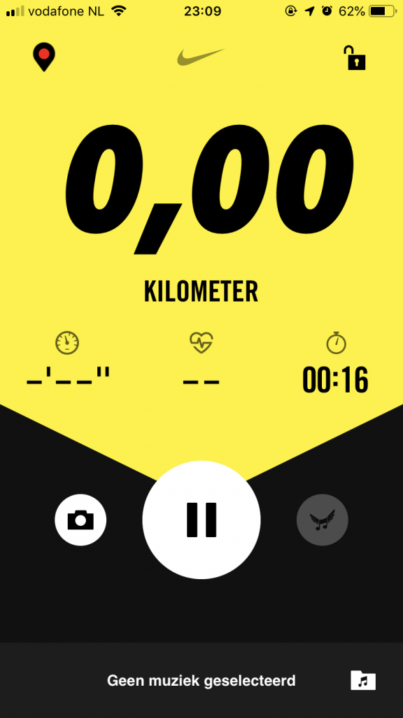
- Nike Run Club
-
- snoww
-
- Strava
My design:
-
- Traverse – Activity
-
- Traverse – Activity
-
- Traverse – Activity – done
-
- Traverse – Activity – type
Reasoning:
I wanted to have a sporty and energetic look like Nike, while showing enough information like snoww. So this is the design I came up with. The main gradient and the way the block is slanted are done to give that sporty and energetic feeling. This also gives the screen enough room to fit information about the run.
My Mountain
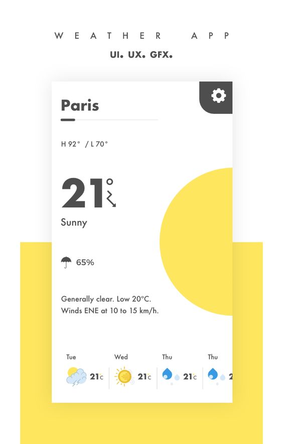
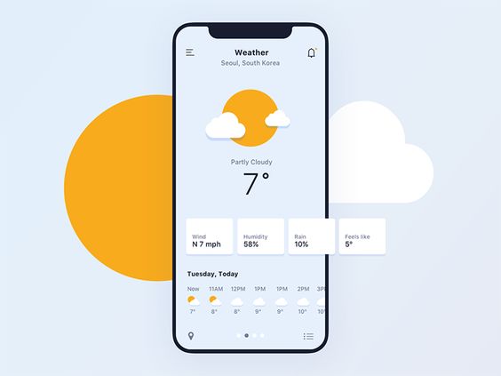
1. Weather & Forecast
The ‘My Mountain’ feature gives all kind of information about the mountain you are currently on, but the most prominent one is weather information. This is the reason I looked into weather app designs. Most of them are weather app designs from Dribbble. The first example shows a nice minimalistic weather view with card at the bottom for the forecast. The second does this as well with a more flat design icon approach. While the last one does only a big number to indicate the temperature. The IOS weather app is also here because of the micro animations in the backdrop.
Inspiration:
-
- Weather app – Dribbble
-
- Weather app – Dribbble
-
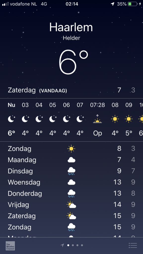
- IOS weather app
-
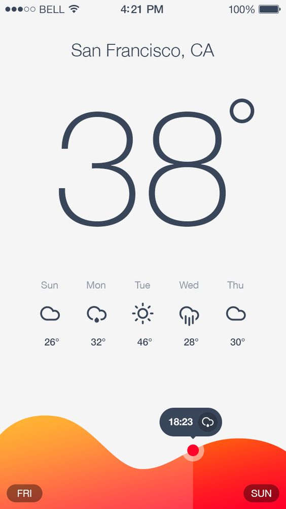
- Weather app – Dribbble
My design:
-
- Traverse – weather
-
- Traverse – forecast
Reasoning:
I did not want a full screen experience, since I wanted the map to still be shown. I got inspired by the second inspiration example to make a few of my own weather icons that are constantly moving a little. I used a card type view to show the weather and leave room for the map. On the second tab, the forecast, you see small card views to show the current weather and a forecast of the whole week. This was directly inspired by small cards all the Dribbble weather apps show at the bottom.
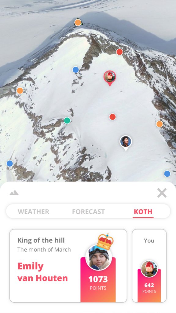
2. King of the hill
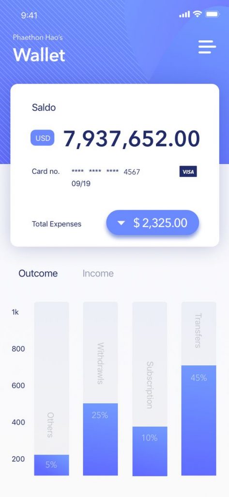
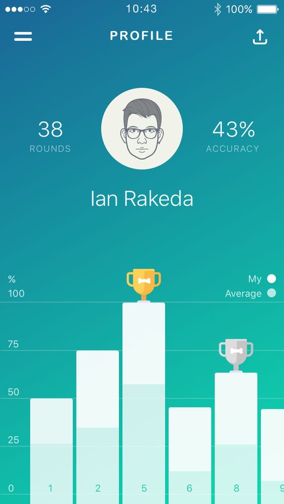
The King of the hill tab is like a miniature version of a leaderboard, but the bars indicating the points looked more like statistics. This is why statistic apps were my main focus of inspiration.
Inspiration:
-
- Statistics – Dibbble
-
- Statistics – Pinterest
-
- Leaderboard – Pinterest
My design:
-
- Traverse – King of the hill
Reasoning:
In the final design the bars with points look like statistic bars coming up. It shows two card views, one large one with the king of the hill displayed. And a smaller one with your points, this is to show where you stand in the race to become the king of the hill.
3. Tabbed navigation
I needed to fit a lot of information on certain feature screens, tabbed navigation is a good solution fro this. This prevented long pages, and helped the users see the right information at the right time. A lot of apps used tabbed navigation to show the same kind of screens filled with different information. The Nike Run Club, Strava and Lonely Planets Guides all use a tabbed navigation at the top because they have a menu bar at the bottom. The Local app by Facebook has screens that pop out from under the current screen so the tabbed navigation is on the top of that specific pop up. A great solution for the screens in my app that use half the view.
Inspiration:
-
- Nike Run Club
-
- Local by Facebook
-
- Lonely Planet – Guides
-

- Strava
My design:
-
- Traverse – weather
-
- Traverse – Discover
-
- Traverse – medals
-

- Traverse – Feed
Reasoning:
Tabbed navigation is a concurring element on my screens to go to a different page in a certain feature without the UI getting to confusing or cluttered. There are no more than three tabs in one tabbar to prevent clutter. The main color and a line are used for highlighting the current tab.
Discover
1. Discovery
The reason I looked into travel and map apps is because these often have a pre-detail page that shows a card of sorts that does not fully cover the screen to leave room for the map. Google Earth and Lonely Planets Guides did an amazing job creating a beautiful card that has the information in it, but it was not enough. I needed more room for clickable elements like a tabbar and route options. And while Google Earths Voyager showed potential space wise, the map was not shown. Local by Facebook has a ‘swipe up to see more info’ approach, which I really liked.
Inspiration:
-
- Google Earth
-
- Google Earth – Voyager
-
- Lonely Planet – Guides
-
- Local by Facebook
My design:
-
- Traverse – Discover
-
- Traverse – Discover
-
- Traverse – Discover
-
- Traverse – Discover
Reasoning:
The Discover page can not take up too much space on screen. This is so that the user can still see the map, very important if the user wants to discover things on said map. I decided to integrate a Google Earths Voyager meets Local option.
Achievements
1. Medals
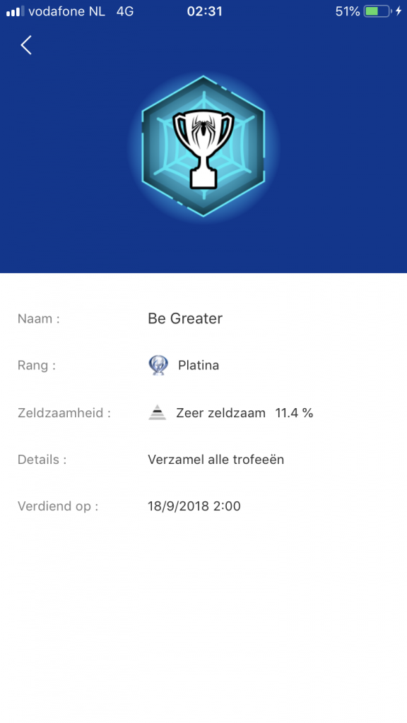
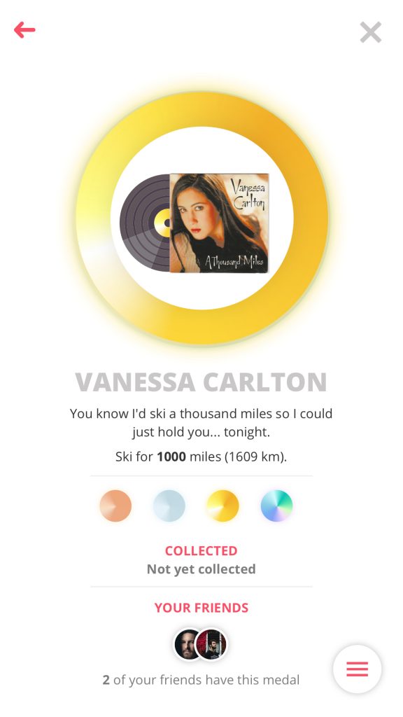
Medals are a big thing in the gamification implemented in my application. This is the reason Pokemon GO stood out this much. Pokemon GO has beautifully crafted medals that shine, with gold shining harder than bronze medals. The medals are displayed in a grid with the medal color, icon and progress bar showing what the medal is for and how far you are in completing the current one. The Playstation app goes in a little more detail in the detail view, which I surely appreciated. The Playstation apps detail view shows more than a name and a rank, it also steers toward a more information based approach, showing not only the title and rank, but also how rare it is and when you’ve achieved it.
Inspiration:
-
- Pokemon GO – detail
-
- Pokemon GO – medals
-
- Medal – Pinterest
-
- Playstation app
My design:
-
- Traverse – medals
-
- Medal – detail
-
- Medal – detail
-
- Medal – detail (not earned yet)
Reasoning:
I produced a solution thats a combination between Pokemon Go’s beautiful medals and Playstation’s trophy information. The medals all have a distinct bronze, silver, gold or diamond glow and the flat designed images in the center should give up the medals purpose but is still vague enough to keep the user guessing. I wouldn’t want it to be too easy. Inside the detail view of the medal you can see the medal itself, the title, a description on what you must do, the types of medals, when you’ve achieved this medal and who of your friends achieved it as well for a little bit of social pressure. This is because I wanted the medals to have a meaning beside ‘being pretty and collectable’.
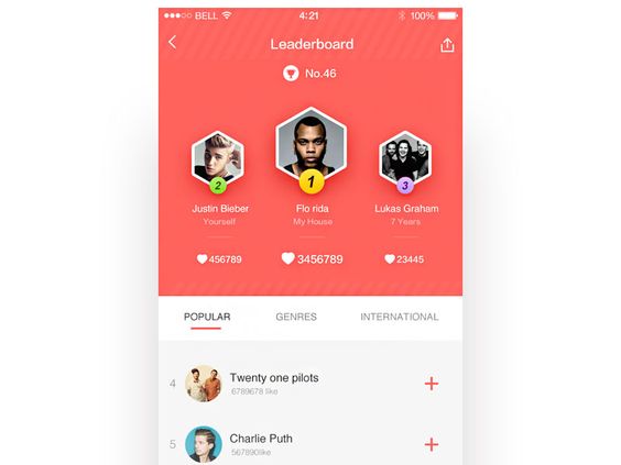
2. Leaderboards
The leaderboard must be visually pleasing enough for the top three to be satisfied. But not too over the top to demotivate the users at the bottom.
Inspiration:
-
- Leaderboards – Dribbble
-
- Leaderboards – Dribbble
-
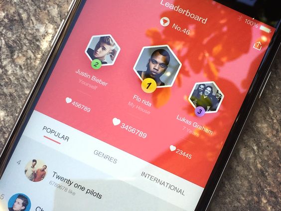
- Leaderboards – Dribbble
My design:
-
- Traverse – leaderboards
-
- Traverse – leaderboards you
-
- Traverse – leaderboards
-
- Traverse – leaderboards
Reasoning:
With the collected inspiration I have made a clean minimalistic leaderboard that shows the top three with the earlier made bronze, silver and gold gradients. While also highlighting the users position with the main gradient, this is so that the user can find himself quickly if his friendslist is long. The user can change the filter to show another leaderboard. The current designed filters are for people and type, for example, the current people filters are friends, group and worldwide. While the current type filters are points, top speed and distance. This is done to give the users multiple leaderboards they can compete on.
Activity feed
1. Feed
The feed is a place where the user can find runs, data, photos their friends posted and medals that they have earned, while also being able to find their own posted data. The examples shown down below are Strava, Instagram and snoww, with Instagram having a great feed but its not optimized for sports. Strava and snoww on the other hand have excellent feeds with more room for run data but also for pictures.
Inspiration:
-
- Strava
-
- snoww
My design:
-
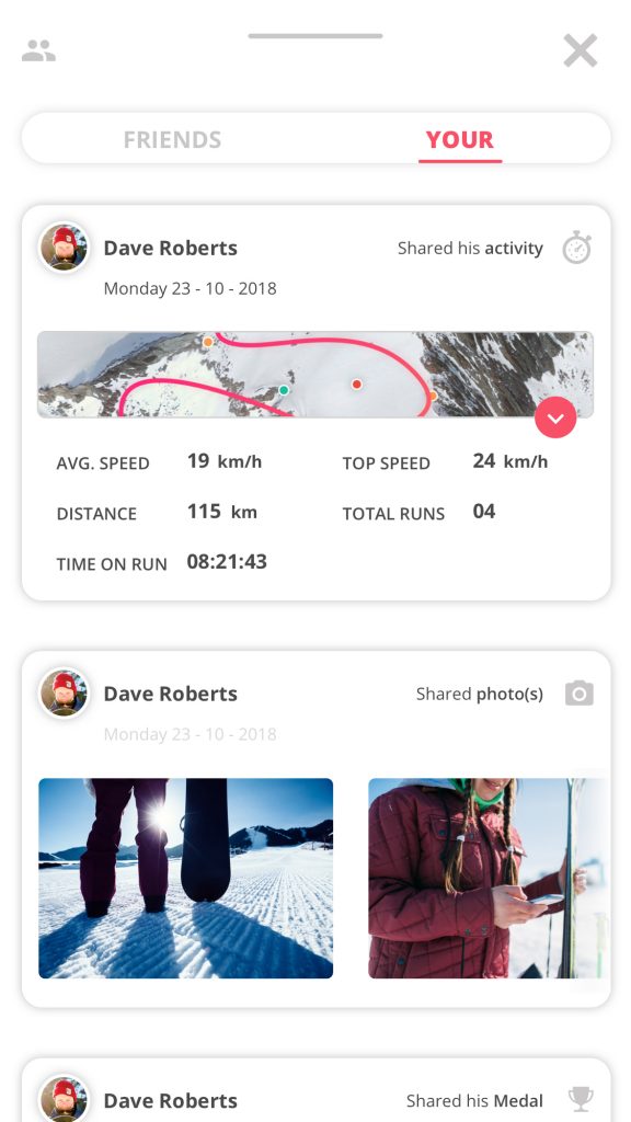
- Feed – You
-
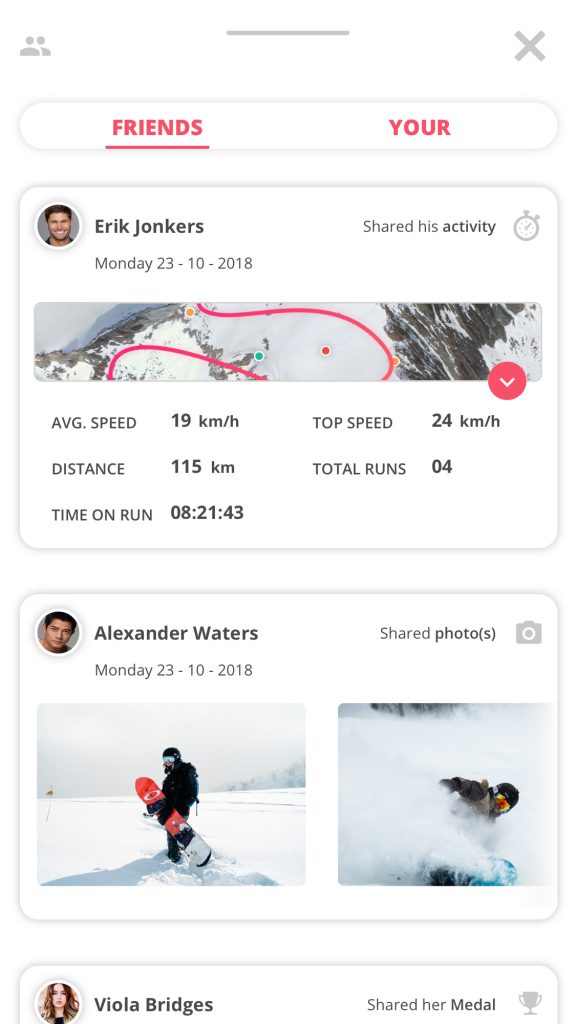
- Feed – Friends
-
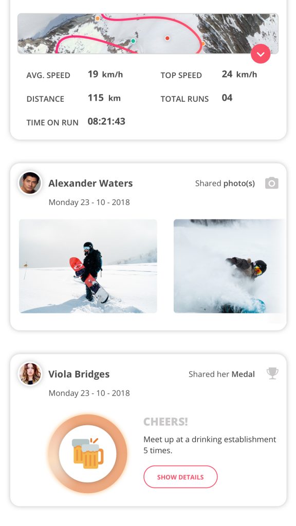
- Feed – scrolled
-
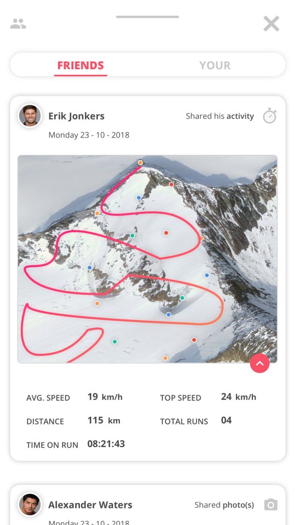
- Feed – opened
Reasoning:
I decided to ditch the condensed feel of snoww to give it the individual posts more room. It shows a lot of information on one post, but it is still clear to view. There are a few different posts being shown, a map of the run with data, a single picture, carrousel of pictures or a medal that someone has earned. A feature I purposely left out of the prototype is the ability to post something on the feed, this is because this sadly enough, ranged outside of the project scope.
Profile
1. Dashboard
The profile is a thing the user can customize with his/her own header image and profile picture. The profile should be a place where the user comes to respond to messages or looks at notifications, they can also view their private trips here. I looked into a lot of Dribbble, Behance, Pinterest type profile designs. The ones that stood out were the ones with header images at the top, this was because that already fit with the style of other screens.
Inspiration:
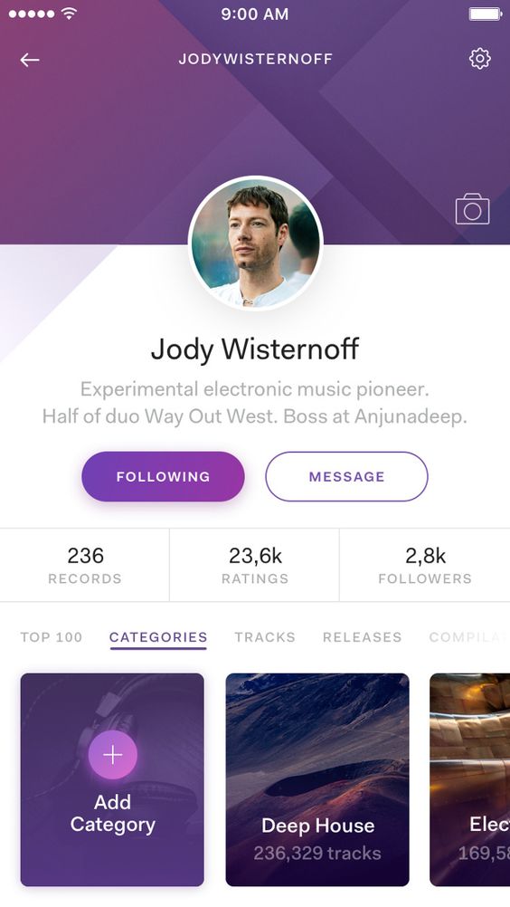
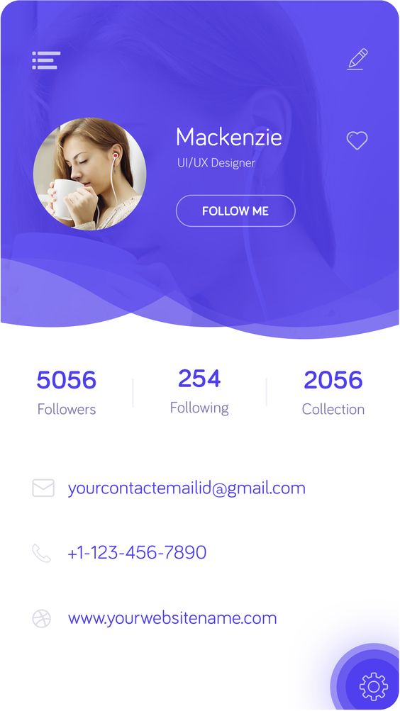
My design:
-
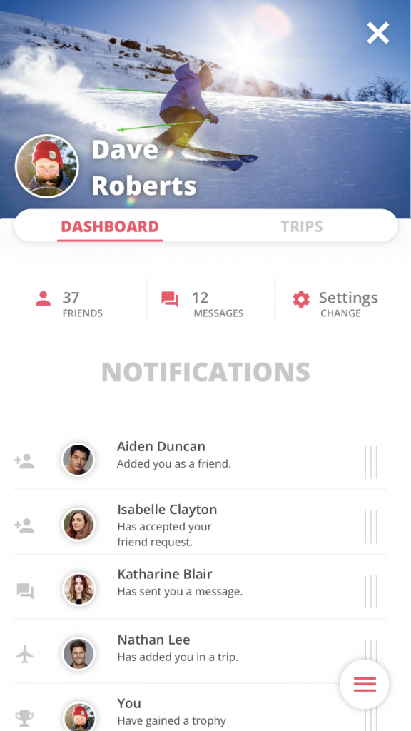
- Traverse – Profile
-
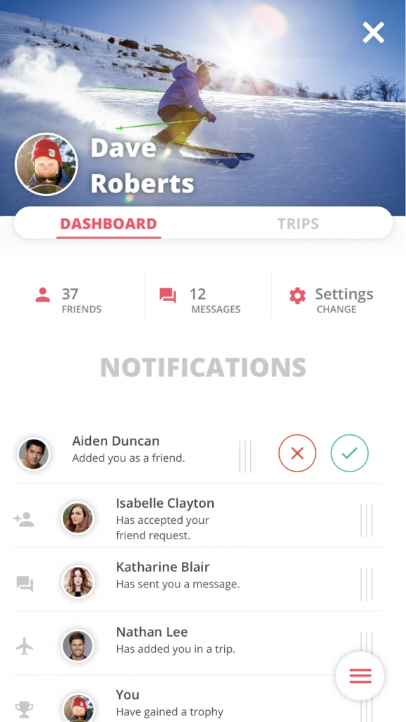
- Traverse – Profile
Reasoning:
The profile page is a page where the user can see his own personal stuff like notifications, messages and trips. The user can set a custom header image and profile picture. The style is similar to detail views of POI to keep the overall styling the same.
2. Trips
Trips is a page where users can find their own trips and look at them in detail. The inspiration came from the beautiful lists of the Lonely Planet apps, the Google Earth Voyager list and the coach options from the Nike Run Club. All of these were beautiful photographs with text in the image itself. Except for the trips in the Trips app, these were more like card views. This resulted in more room between each card which improved readability.
Inspiration:
-
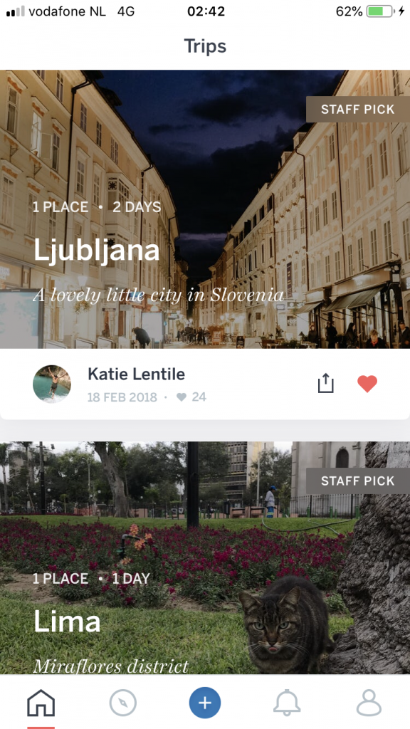
- Lonely Planet – Trips
-
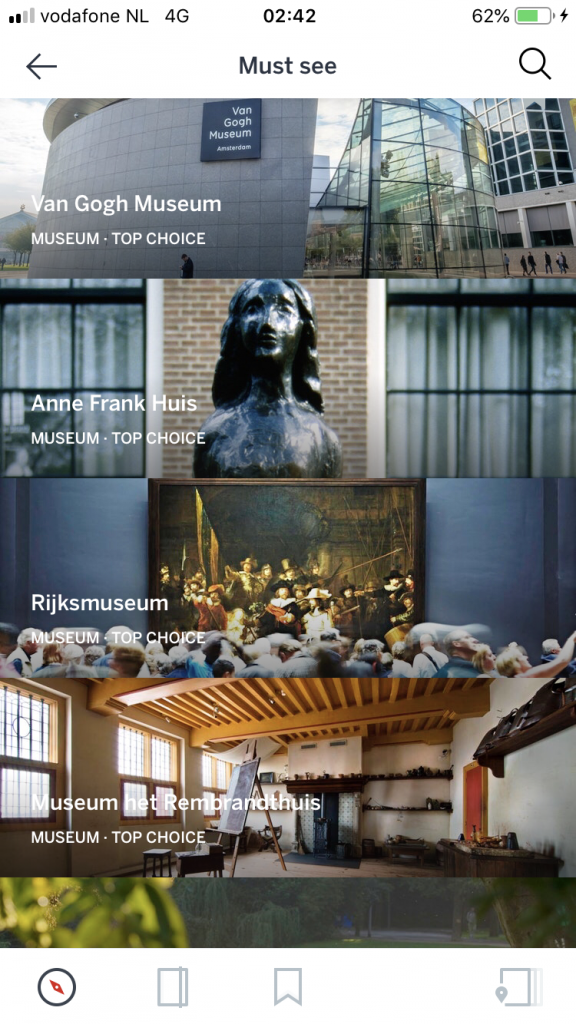
- Lonely Planet – Guides
-
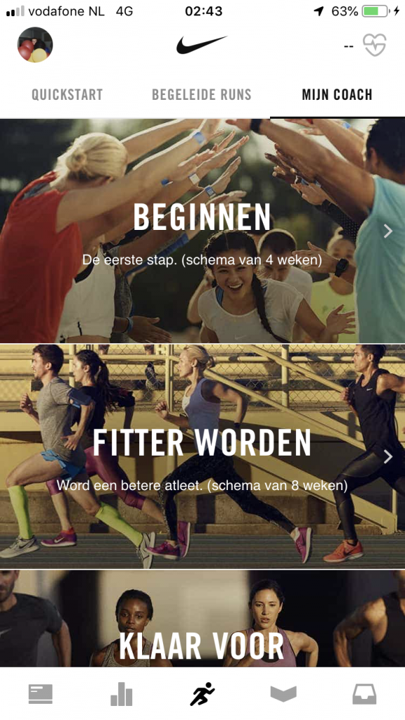
- Nike Run Club
-
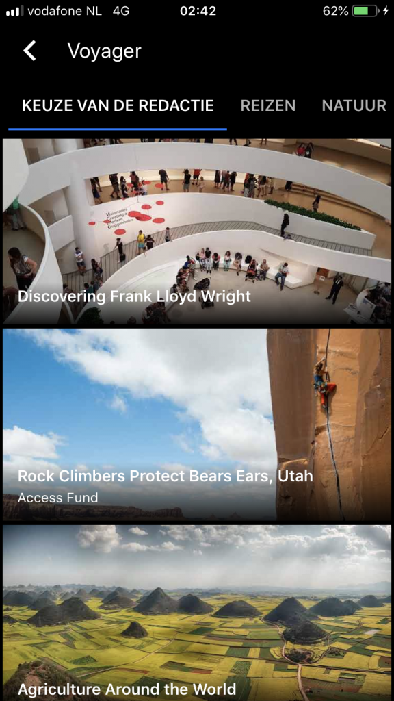
- Google Earth – Voyager
My design:
-
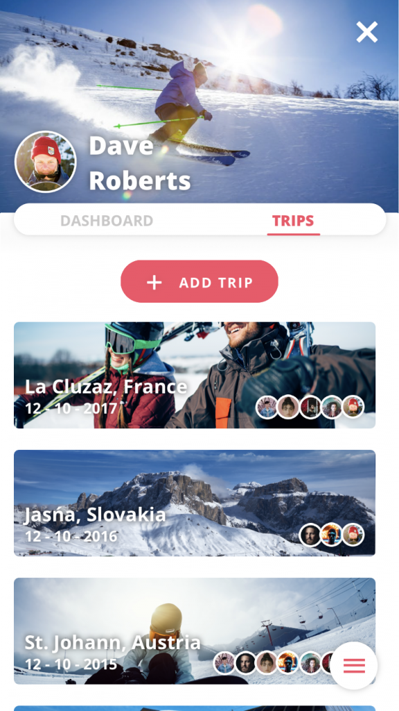
- Traverse – Trips
-
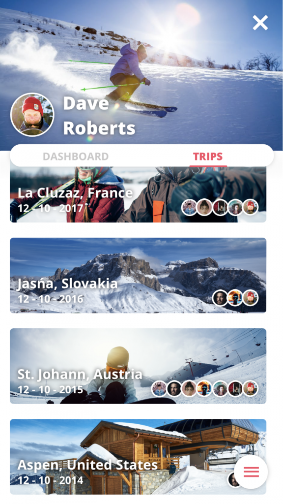
- Traverse – Trips
Reasoning:
For the Traverse trip page I fixed a solution that was a mix between the Trips app and the Guides apps by Lonely Planet. I made slim card views with text in the images just like Guides, but gave them room just like trips. This meant I could add more information in the images to help the user remember better which trip it was. The current cards have an image, the location, the date and profile pictures of the people that were also there. A feature I purposely left out of the prototype is the ability to look at the details of a trip, this is because this sadly enough, ranged outside of the project scope.
Others
1. Adding a trip & Arranging a meet-up
These two features were very similar in design because of their nature, setting up a event. This is the reason I looked at the Datumprikker application for the most inspiration.
Inspiration:
-

- Datumprikker – info
-
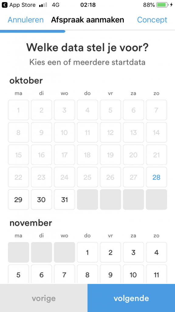
- Datumprikker – date
-
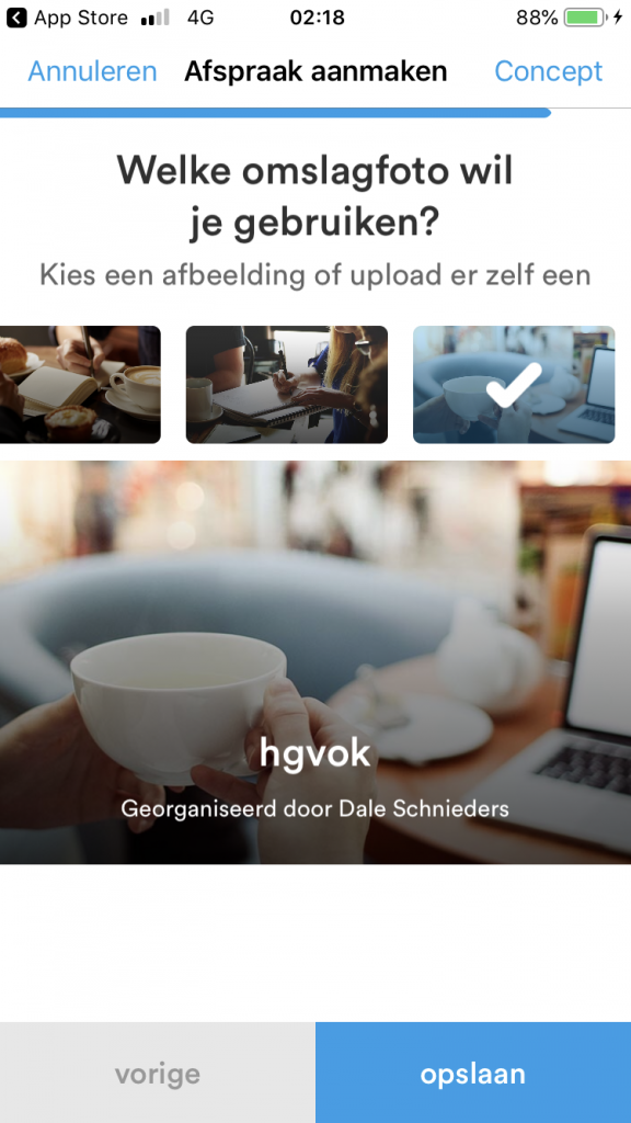
- Datumprikker – img
-
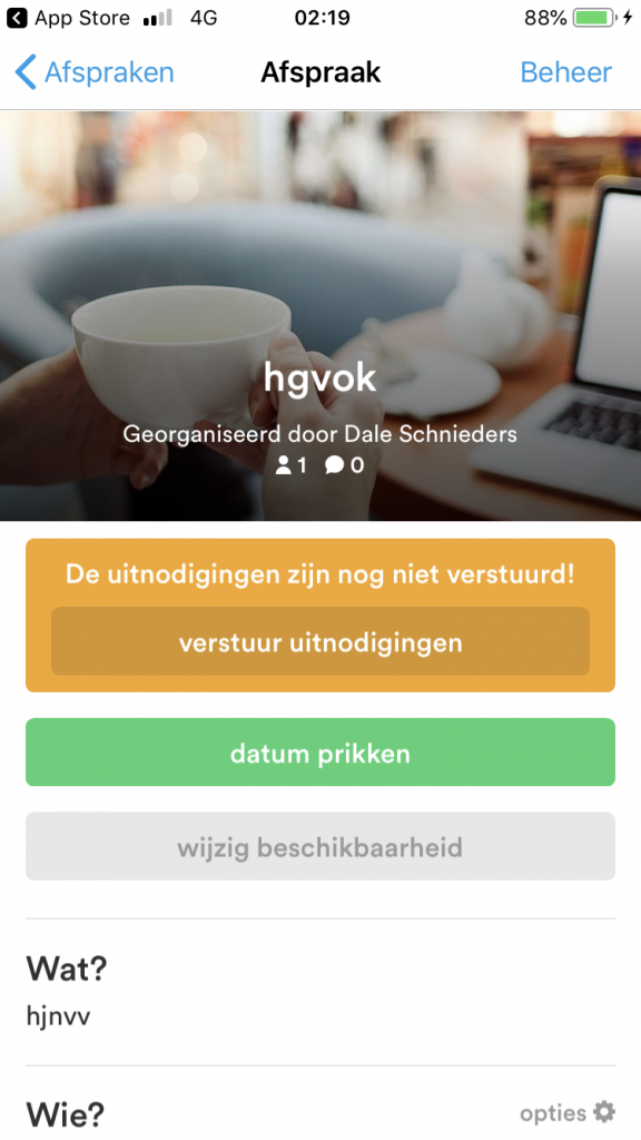
- Datumprikker – check
My design:
-
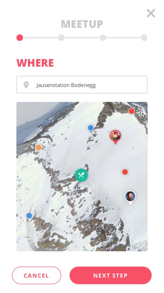
- Traverse – meetup
-
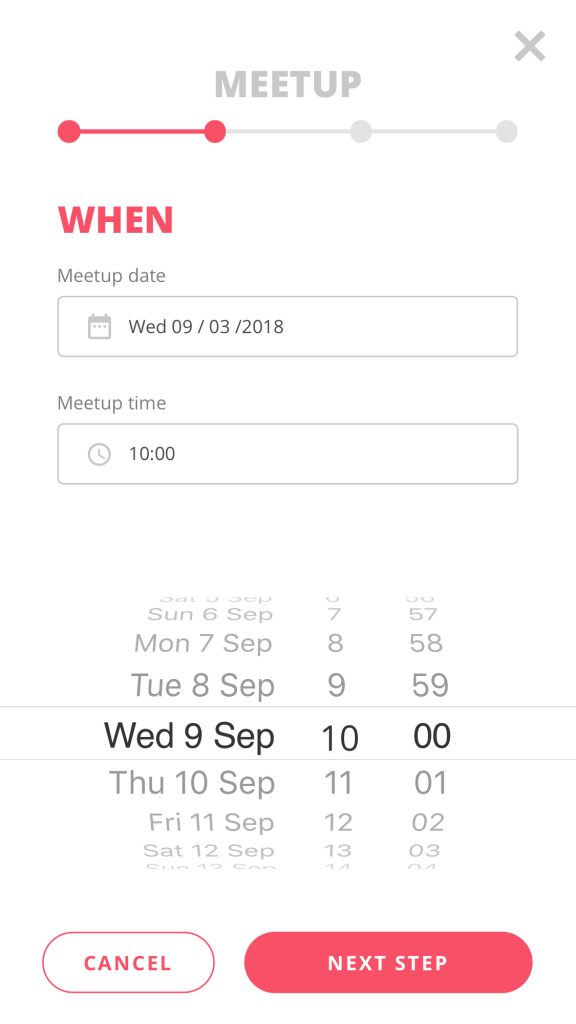
- Traverse – meetup
-

- Traverse – meetup
-
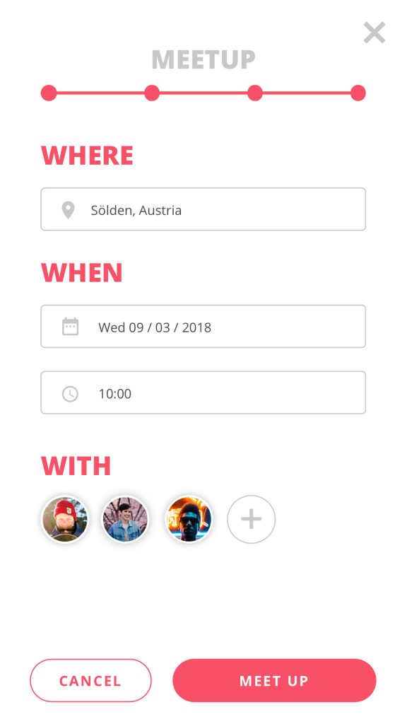
- Traverse – meetup
-
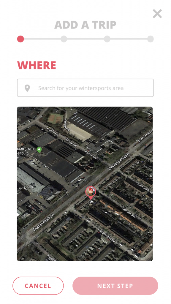
- Traverse – add trip
-
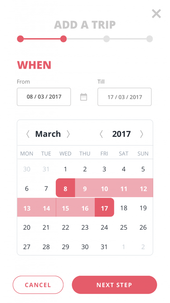
- Traverse – add trip
-
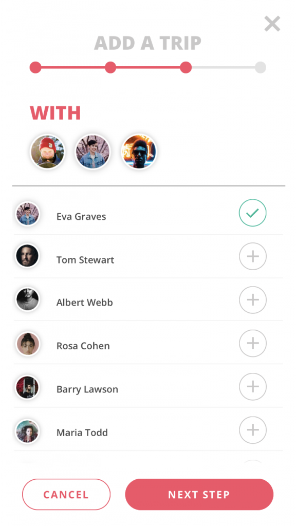
- Traverse – add trip
-
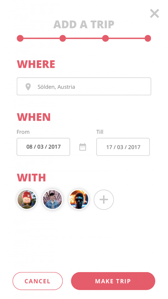
- Traverse – add trip
Reasoning:
At the top of both features you will see a progress indicator. This is implemented so the user will know how far they actually are with the planning. They have to fill in forms, add the date, time, pictures and people to progress to the final step. Which is a page to check and maybe add information you have missed. The main color is used her to highlight the important bits of content.
2. Navigation
I wanted to keep the navigation as simple as possible. The user, who is skiing or snowboarding when he looks at his phone or Apple Watch to check the route. This could indicate that they will get in dangerous situations. I want the user to have a quick glance and see what he needs to see. This is the reason I looked into navigation on the Apple Watch, since these solutions often focus on glances to the Apple Watch. Which results in very quick but clear instructions.
Inspiration:
-
- Google Maps – phone
-
- Google Maps – apple watch
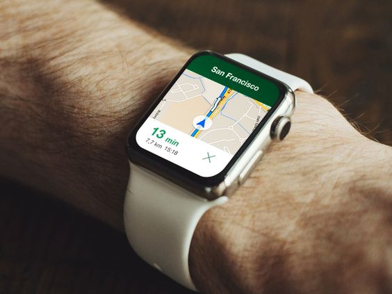
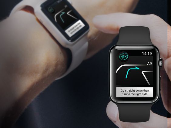
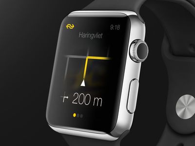
My design:
-
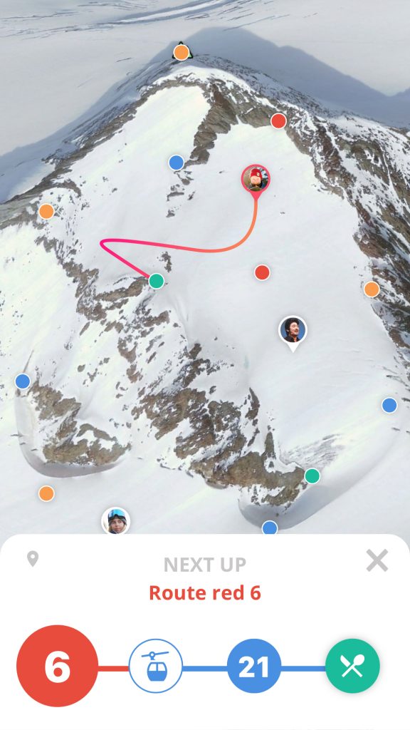
- Traverse – navigate
-
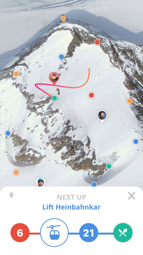
- Traverse – navigate
-
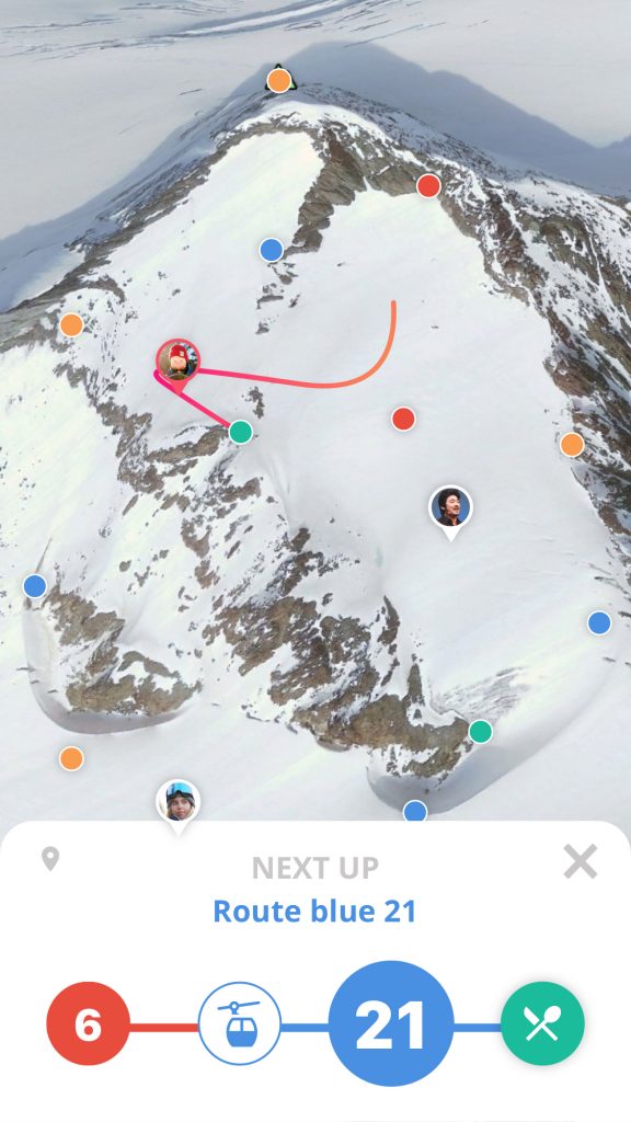
- Traverse – navigate
-
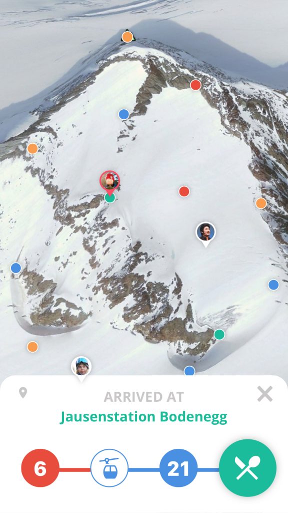
- Traverse – navigate
-
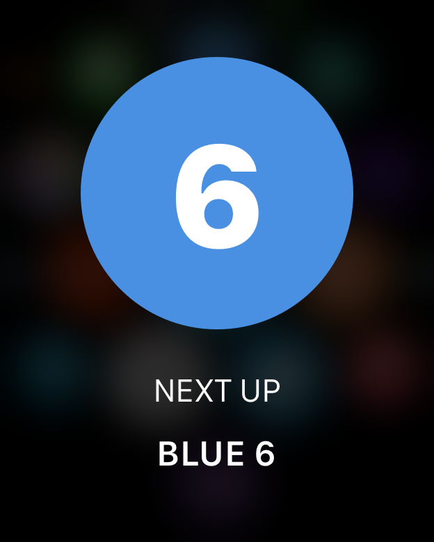
- Traverse – watch
-
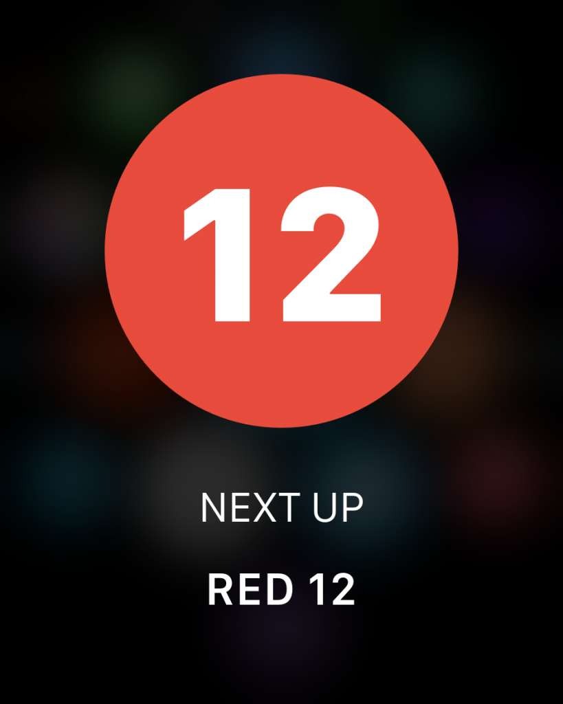
- Traverse – watch
-
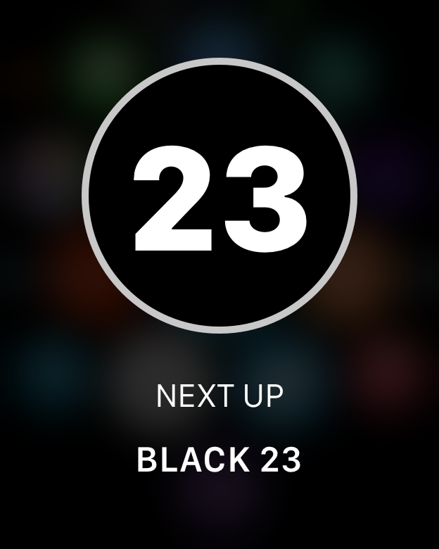
- Traverse – watch
-
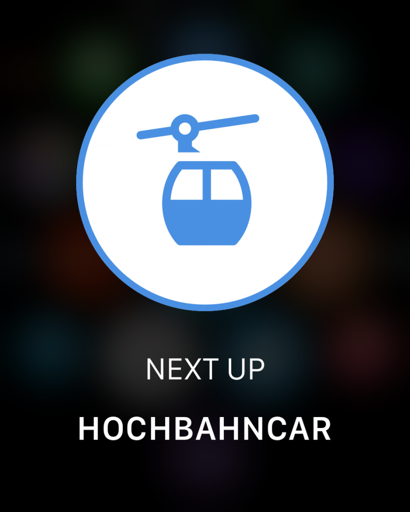
- Traverse – watch
Reasoning:
On screen the user will see a simple timeline of the navigation and the route. Whenever the user needs to make a turn or take another route the apple watch and phone will give a notification. The user glances and they see a big colored round circle and a number. This is done because these indicate a route color and the number, these are the same colors and numbers used for the routes and can be found on the side of said routes. The user will associate this color and number combination to the poles and instantly know what to do.
7.4. Motion design
Here I will explain per micro interaction what the motion design does and why it is implemented this way, giving you insight on my motivation and reasoning. The page was too big and it made my whole biography load slow, this is why it is on a separate page.
Disclaimer: This page features a lot of GIFs, please let it load for a minute.
Click here to go to the motion design page in another tab:

8. Final product
Promotional video

Downloading the prototype
This prototype was made in Principle, this is a prototyping tool that converts the prototype into a Mac app. This means it can only be viewed on a Mac computer. To download the prototype, follow these steps:
1. Click on the download button below
2. When in Dropbox select ‘download’ in the top right.
3. After downloading it from Dropbox, your computer will ask you to trust it.
4. Click on ‘trust it’ in your ‘Security & privacy’ preferences.
5. Unzip the file.
6. Now you have a Mac app of the prototype, enjoy!
Full prototype walkthrough
In this video the whole app will be explored.
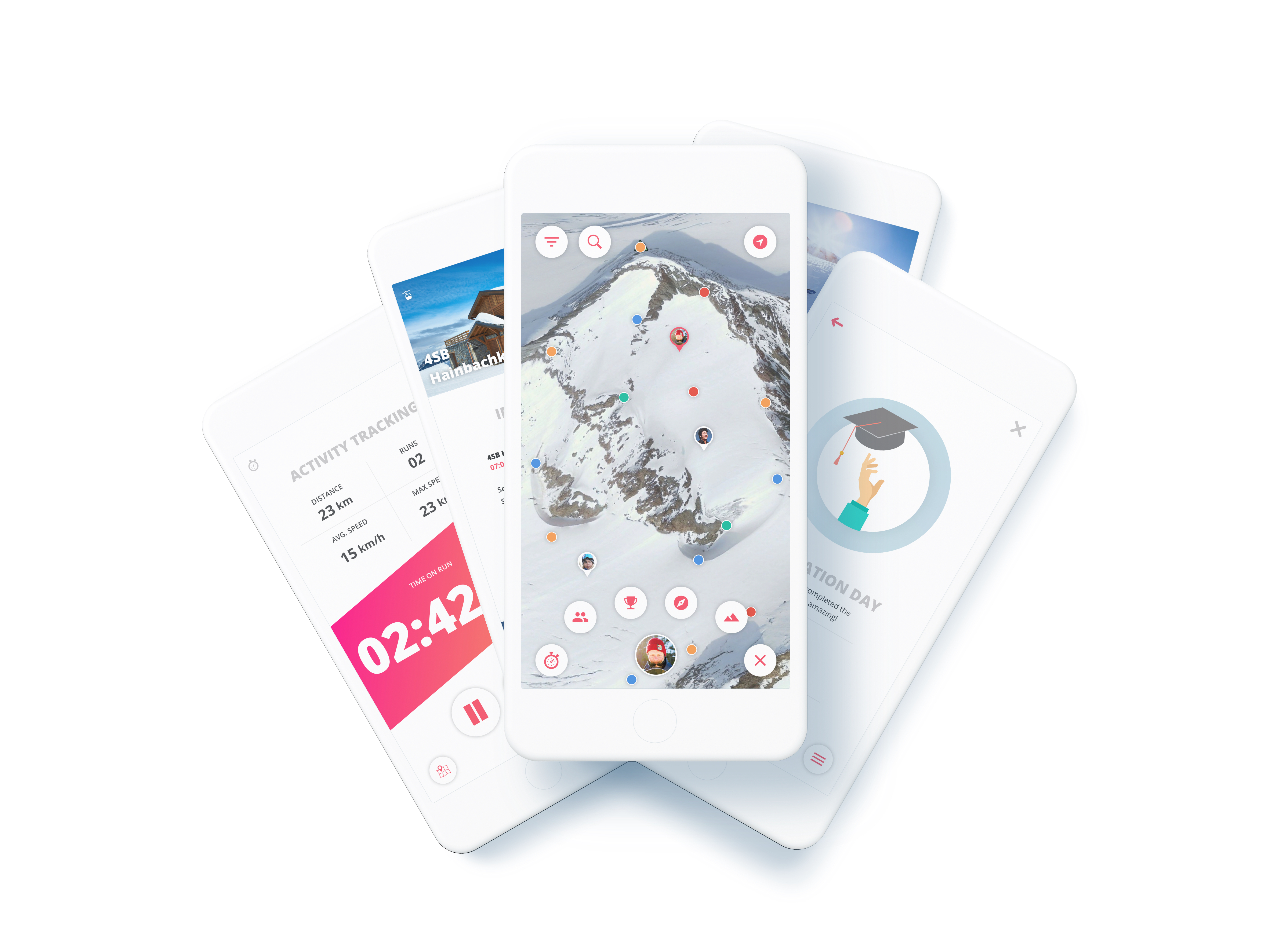
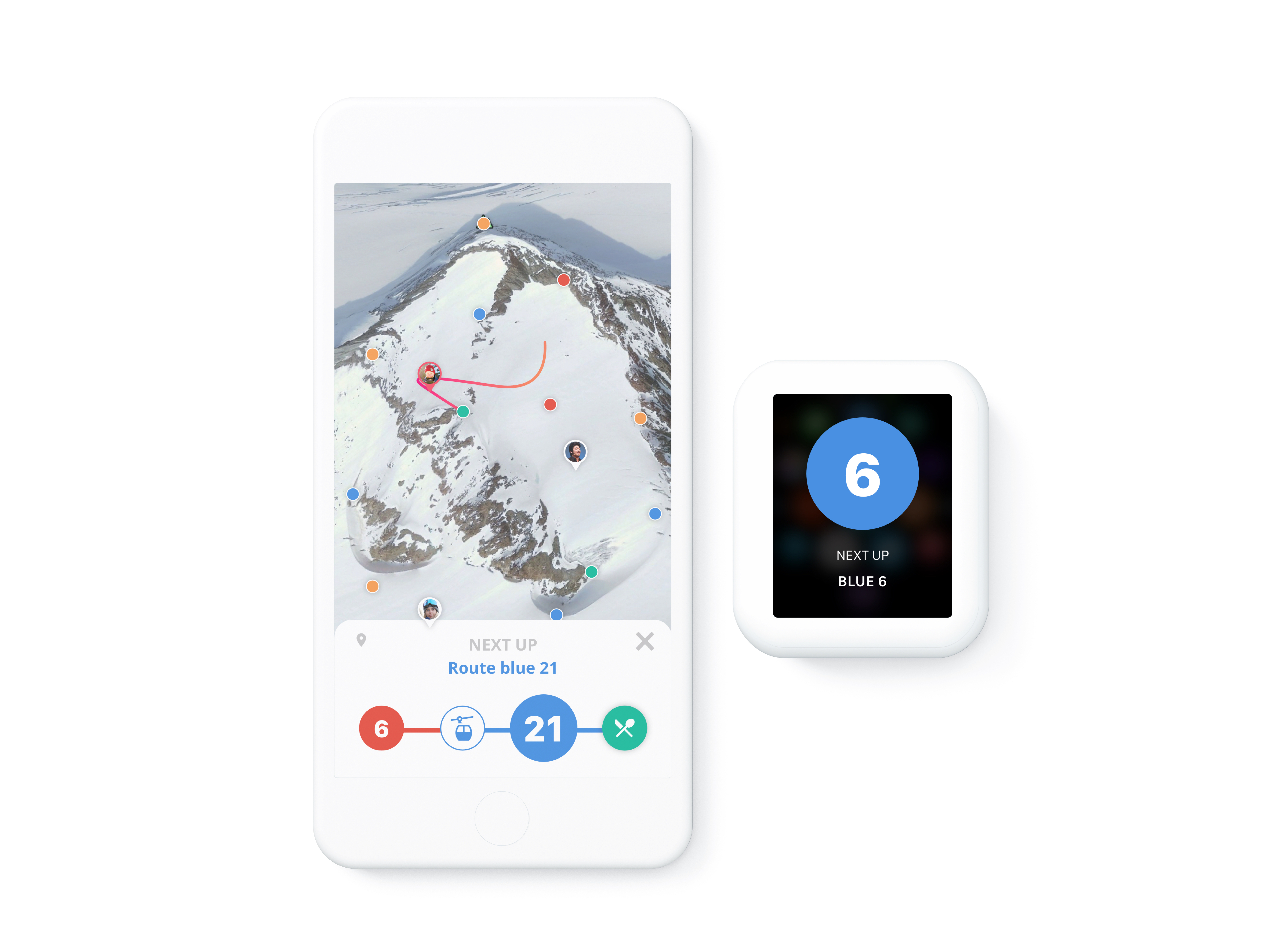
Navigation

Discover & My Mountain
9. Conclusion
“How can an interactive product help make winter sports enthousiasts exited about exploring while competing and sharing their activities with each other.”
– Design challenge
Did this project solve the design challenge?
Traverse is a winter sports application for snowboarders and skiers based on gamification. The snowboarders and skiers will be able to use this application before, during and after skiing trips to not only have insights on their performance, but also compete with each other for points and achievements and make and share memories with friends and family.
During various tests users described their interest in the product after recognizing most of the problems. The features that are implemented not only solve the issues that were described but also gave the project an extra twist to stay ahead of competitors. The 3D map and informational features give the users a good deal of useful ski trip data, while the fully implemented 8 core drives from the gamification make this project fun to use for the whole family.
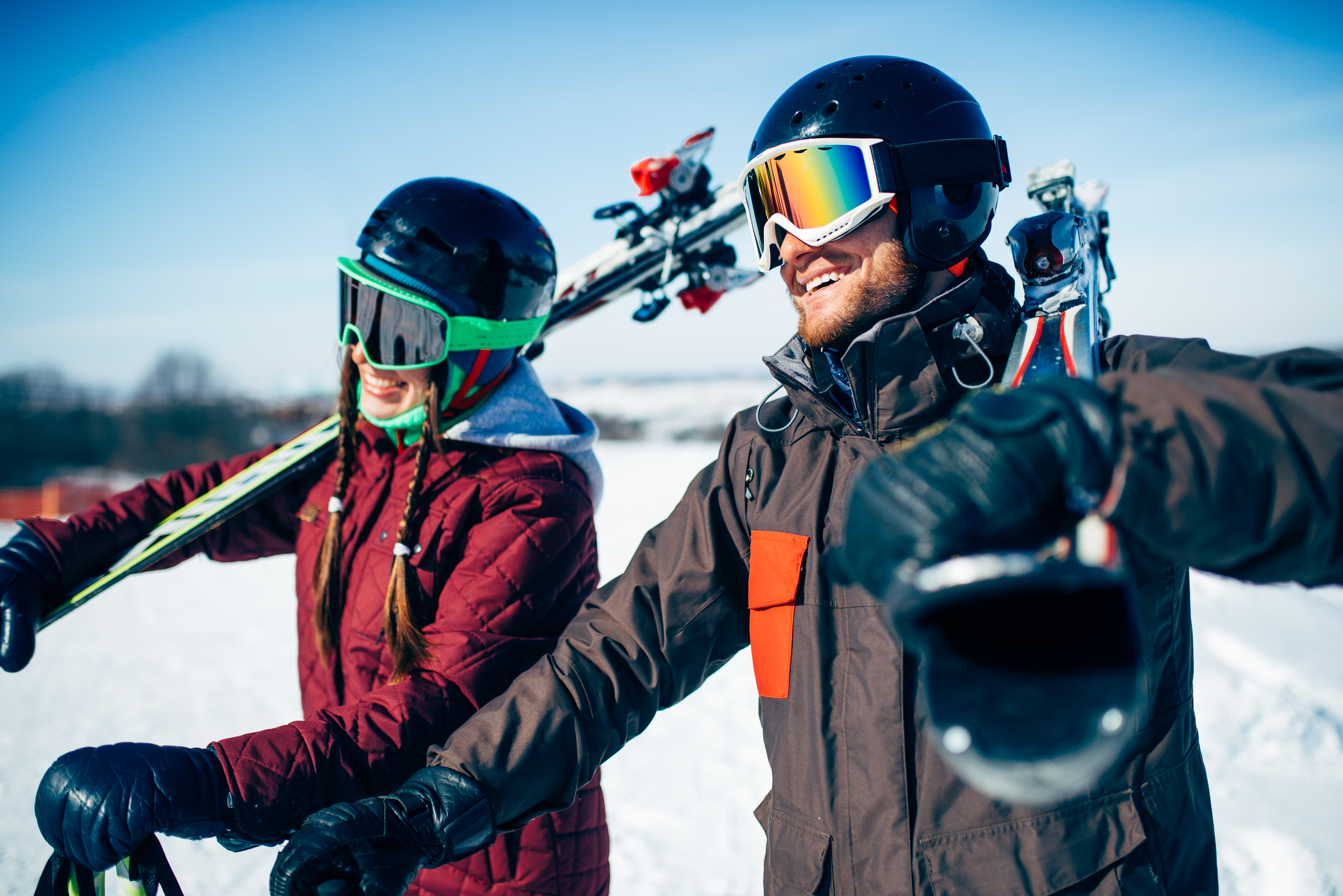
Male and female skiers poses with skis and poles in hands, blue sky and snowy mountains on background. Winter active sport, extreme lifestyle. Downhill skiing
10. Sources
Boulet, G. (2016, 23 juli). Gamification And Motivation: It’s The Content That Matters, Not The Container [Blogpost]. Geraadpleegd op 15 april 2018, van https://elearningindustry.com/gamification-and-motivation-content-matters
CBS. (2015, 30 december). Strandvakantie in de winter bijna even populair als wintersport [Dataset]. Geraadpleegd op 30 maart 2018, van https://www.cbs.nl/nl-nl/nieuws/2015/53/strandvakantie-in-de-winter-bijna-even-populair-als-wintersport
CBS. (2016, 22 december). Wintersport vooral populair onder hogere inkomens. Geraadpleegd op 30 maart 2018, van https://www.cbs.nl/nl-nl/nieuws/2016/51/wintersport-vooral-populair-onder-hogere-inkomens
CBS. (2017, 1 meia). Vakanties; kerncijfers [Dataset]. Geraadpleegd op 30 maart 2018, van https://opendata.cbs.nl/statline/#/CBS/nl/dataset/70232NED/table?dl=8136
CBS. (2017, 2 meib). Wintersportvakanties; achtergrond- en vakantiekenmerken [Dataset]. Geraadpleegd op 30 maart 2018, van http://statline.cbs.nl/Statweb/publication/?DM=SLNL&PA=37282&D1=0,13-22,47-53,72,75,78,84,89-90,96,99-104,111-115&D2=24-25&HDR=G1&STB=T&VW=T
CBS. (2017, 2 mei). Wintersportvakanties; achtergrond- en vakantiekenmerken [Dataset]. Geraadpleegd op 30 maart 2018, van http://statline.cbs.nl/Statweb/publication/?VW=T
CBS. (2018, 24 februari). Minder skiën en meer wandelen tijdens wintersport. Geraadpleegd op 30 maart 2018, van https://www.cbs.nl/nl-nl/nieuws/2018/08/minder-skien-en-meer-wandelen-tijdens-wintersport
Chou, Y. K. (z.d.). The 14-day Gamification Course [Cursus]. Geraadpleegd op 18 juni 2018, van https://yukaichou.com
De beste wintersport-apps voor iPhone en iPad. (2018, februari). Geraadpleegd op 30 maart 2018, van https://www.iculture.nl/gids/wintersport-beste-iphone-apps/
Loayza, J. (z.d.). The 10 Best Productivity Apps that use Gamification in 2018. Geraadpleegd op 19 juni 2018, van https://yukaichou.com/lifestyle-gamification/the-top-ten-gamified-productivity-apps/
M. Kumar, J., & Herger, M. (2013). Chapter 5; Motivation. In J. M. Kumar, & M. Herger (Reds.), Gamification at Work: Designing Engaging Business Software (pp. 59-68). Geraadpleegd van https://www.interaction-design.org/literature/book/gamification-at-work-designing-engaging-business-software/chapter-5-58-motivation
P. Johnson, C. (2016, 13 mei). Gamification in Adventure and Wilderness Sports: A literature review of game-based mechanic’s ability to increase attraction, engagement, and retention in outdoor sports. Geraadpleegd op 16 april 2018, van http://thesportjournal.org/article/gamification-in-adventure-and-wilderness-sports-a-literature-review-of-game-based-mechanics-ability-to-increase-attraction-engagement-and-retention-in-outdoor-sports/#more-3747
Top 10 Wintersport apps. (z.d.). Geraadpleegd op 30 maart 2018, van https://www.anwb.nl/vakantie/reisvoorbereiding/de-beste-reisapps/wintersport
What’s my level. (2018). Geraadpleegd op 30 maart 2018, van http://www.insideoutskiing.com/level.html
Babich, N. (2016, 29 februari). Microinteractions: The Secret of Great App Design. Geraadpleegd op 18 september 2018, van https://uxplanet.org/microinteractions-the-secret-to-great-app-design-4cfe70fbaccf?gi=6b2dc25332bc
Hughes, N. (2018, 28 februari). Apple Watch a hit on the mountain. Geraadpleegd op 28 maart 2018, van https://appleinsider.com/articles/18/02/28/apple-watch-a-hit-on-the-mountain-25-of-slopes-app-skiers-and-riders-start-tracking-via-wrist
Rog, G. (2018, 4 september). 5 tips for better microinteractions in InVision Studio. Geraadpleegd op 4 september 2018, van https://www.invisionapp.com/blog/microinteractions-invision-studio/?utm_campaign=Weekly%20Digest
Svarytsevych, D. (2015, 6 juli). 7 Secrets for Enhancing UX with Micro-Interactions. Geraadpleegd op 30 augustus 2018, van https://www.webdesignerdepot.com/2015/07/7-secrets-for-enhancing-ux-with-micro-interactions/
Howes, A. (2016, 22 augustus). RideOn Ski Goggles Bring Augmented Reality to the Slopes. Geraadpleegd op 13 augustus 2018, van https://www.highsnobiety.com/2016/08/22/rideon-ski-goggles-augmented-reality/