1. Index
General information
| Name | Dale Schnieders |
| Student number | 500717503 |
| Educational institution | Amsterdam University of Applied Sciences |
| Course | Communication & Multimedia Design |
| Graduation project | ‘Traverse’ |
| Graduation supervisor | Roey Tsemah |
Contact information
| Name | Number | |
| Dale Schnieders | 06-15033080 | Design@DoorDale.nl |
Product biography
You can read the product biography by clicking the button below. The product biography is an extended version of this design rationale.

2. Introduction
In this document you can read about the research and design choices for the application ‘Traverse’. The application has been designed, prototyped and tested based on CMD methods. This document will provide insight into the thought processes and the choices that have been made.
What is Traverse?
Traverse is a winter sports application for snowboarders and skiers based on gamification. The snowboarders and skiers will be able to use this application before, during and after skiing trips to not only have insights on their performance, but also compete with each other for points and achievements and make and share memories with friends and family.
The project
This is a graduation project for the Communication & Multimedia Design course on the University of Applied Sciences in Amsterdam. The project lasted 20 weeks, with weekly feedback from an assigned graduation supervisor. The feedback sessions were shared with a group of four fellow students.

3. The context
This chapter gives context to the situation of the project, describing the problems people face while on a skiing trip, where the idea for the project came from, who the stakeholder are and who the audience is that is being targeted.
The problem
Close your eyes and imagine…
You are on a beautiful snowy mountain, wind blowing through your hair and some ski’s strapped to your feet.
You wave your two friends goodbye because they have gone ahead. They planned on taking a black route, but you just wanted to some blue ones because you’re not that good yet. You brought a map of the ski resort from down the valley and you take it out of your pocket. Just wat you need, it’s soggy. You throw the map in the trash and think to yourself: “whatever I will just go and see where I’ll end up.”
You’re cruising down the mountain and you remember that your friends wanted to meet up at 12 at a Cabin for some food. You check the time and realize it’s already 11:45, better get going. You take the chairlift up and check the big map on the slope. “This is not clear at all” you think to yourself.
When you finally arrive at your destination, you’re 20 minutes late. Your friends laugh at you being late. You sit there and think to yourself, there has got to be a better way.
That’s where my project comes in.
Conclusion
Winter sports enthusiasts do not have a good insightful map, this creates a bunch of other problems. Users often can’t find each other when split up and not having a map makes it hard to find great locations on the mountain where you normally would not have came across.
-
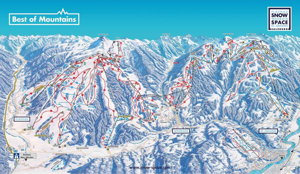
- Example of a ski resort map
-
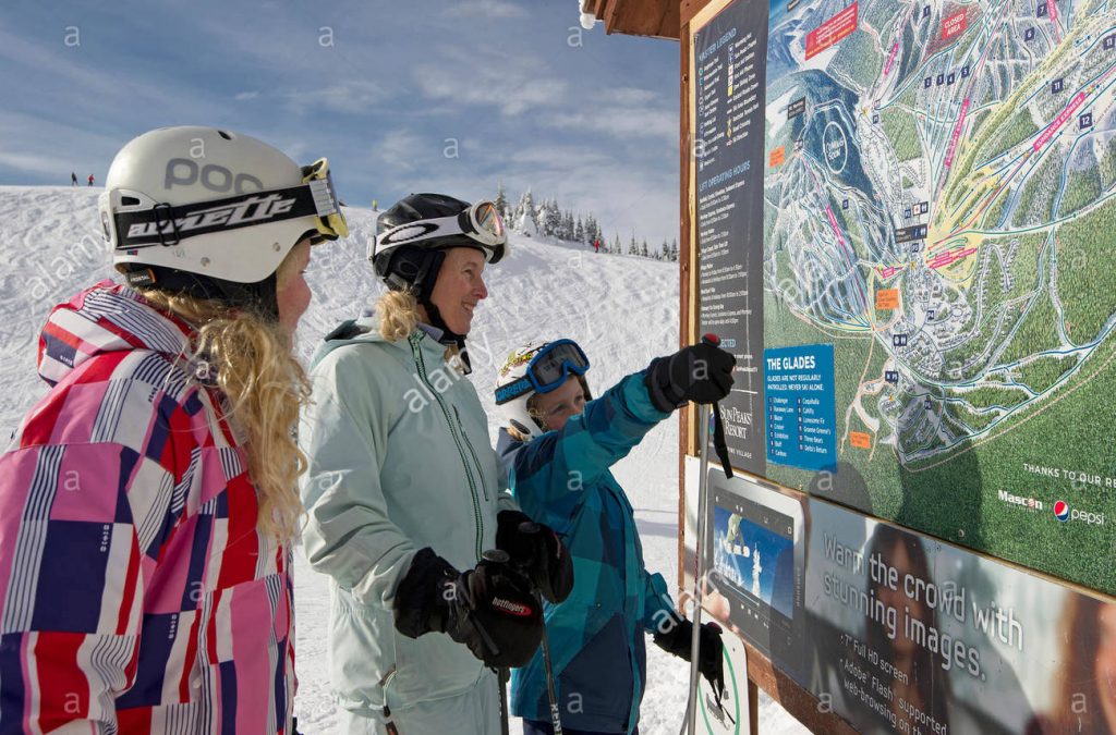
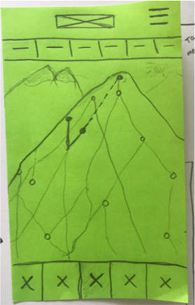
- Example of a map on the mountain
The stakeholders
After conducting research on the stakeholders I concluded that three of these stakeholders are directly involved in the problem. These stakeholders are:
1. The winter sports enthusiasts
2. The owner of the ski resort
3. The owners of the eating establishments on the mountain
The winter sports enthusiasts are the ones I will be focussing on because they experience the problem first hand and will be the ones that use the application.
More about the stakeholders and the research on this subject,
please read 3.2. Stakeholders in the product biography.
The target audience
The users I want to be focussing on are the winter sports enthusiasts that are over their ‘I just go for the après ski’ fase and are serious about their respective sport, will it be skiing or snowboarding and are always willing to challenge themselves. The winter sports enthusiasts can be male or female between 20 and 35 and are average or above at their respective sport.
To get to know my target audience I’ve conducted desk research, surveys and interviews. These methods helped narrow down the stakeholder to a specific target audience and with these I created persona’s
More about the target audience and the research on this subject,
please read 3.3. The target audience in the product biography.
-
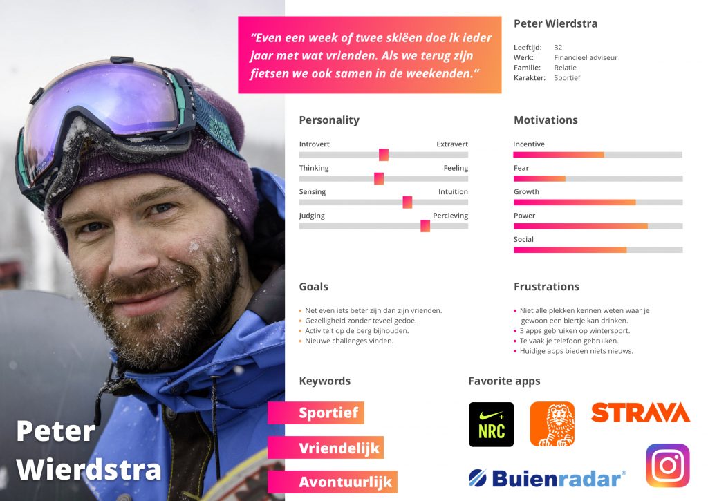
- Persona 1
-
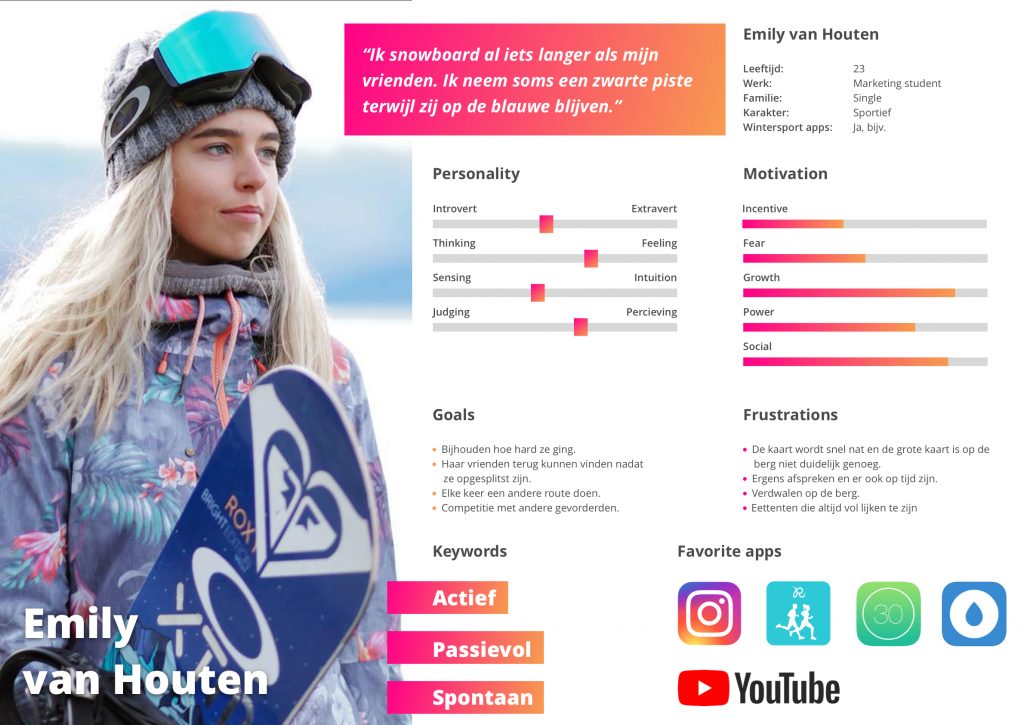
- Persona 2
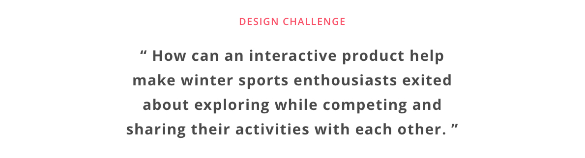
The design challenge
The design challenge was made to have a good grip on the problem, the user and the possible solution. The design challenge must be faced to complete the project.
4. The concept
In this chapter you will find the research and reasoning behind the concept of the application.
Traverse
The concept for this application is that it’s a 3D ski resort map and information application with gamification elements. The concept is an idea based of the fact that there is not one app that gives a ‘full winter sports experience’, there is always a need for another app or internet page to get all the ski resort information needed. Will it be finding friends, finding a place to eat or wanting to know tomorrows weather forecast, this app will give winter sports enthusiasts a reason to use one application only, this one.
The name of the product comes from the literal definition, ‘to go or travel across or over’ and to ‘move or pass along or through’.
More about the concept and vision can be found
in 5.1. Concept & Vision in the product biography.
Similar products
The wheel does not have to be reinvented, this is why I researched products that had interesting features or were similar to my solution. Due to this research I came across two applications that caught my eye, namely Fatmap and snoww. Both apps similar to mine, with solutions to mobile maps.
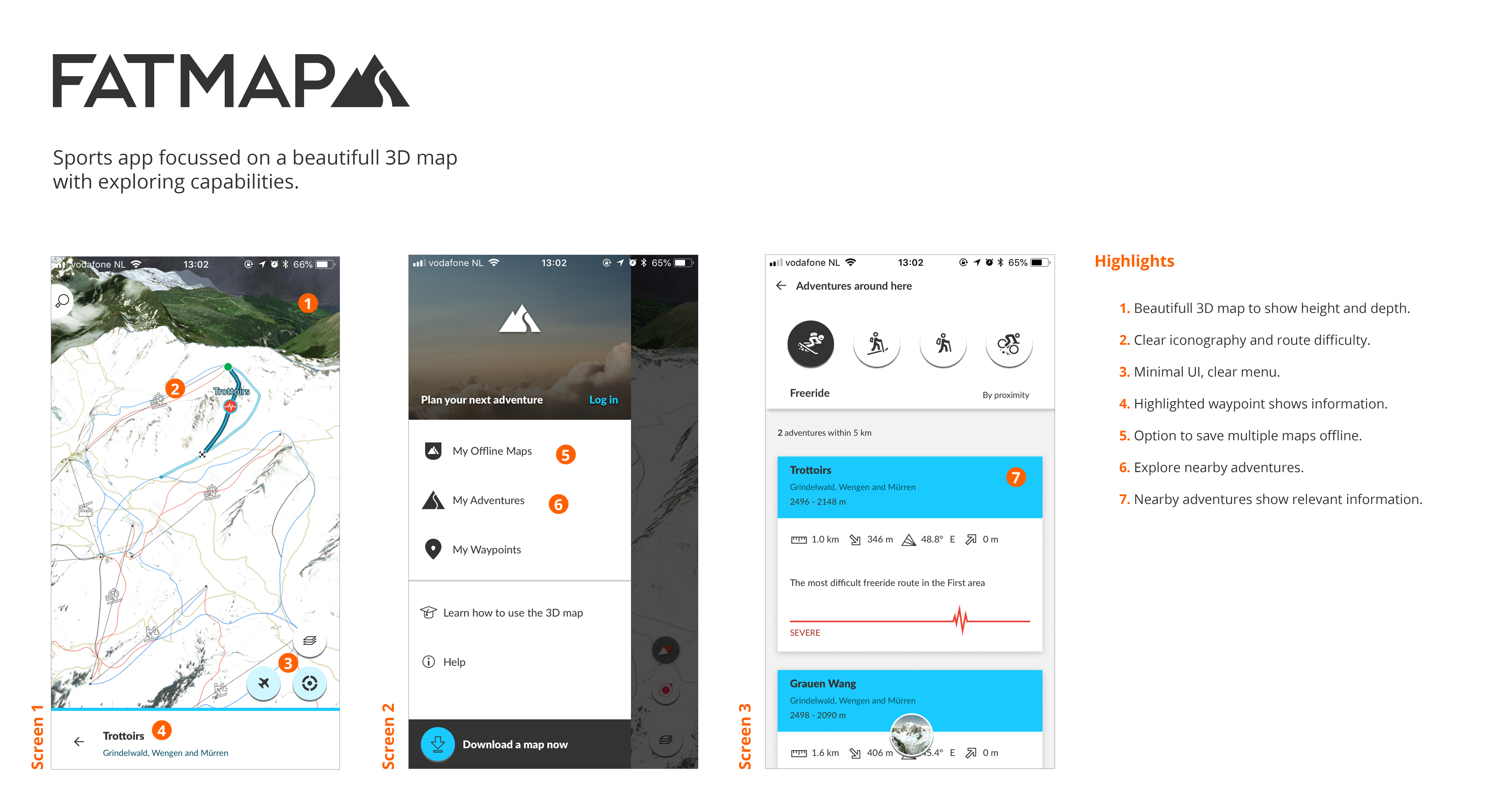
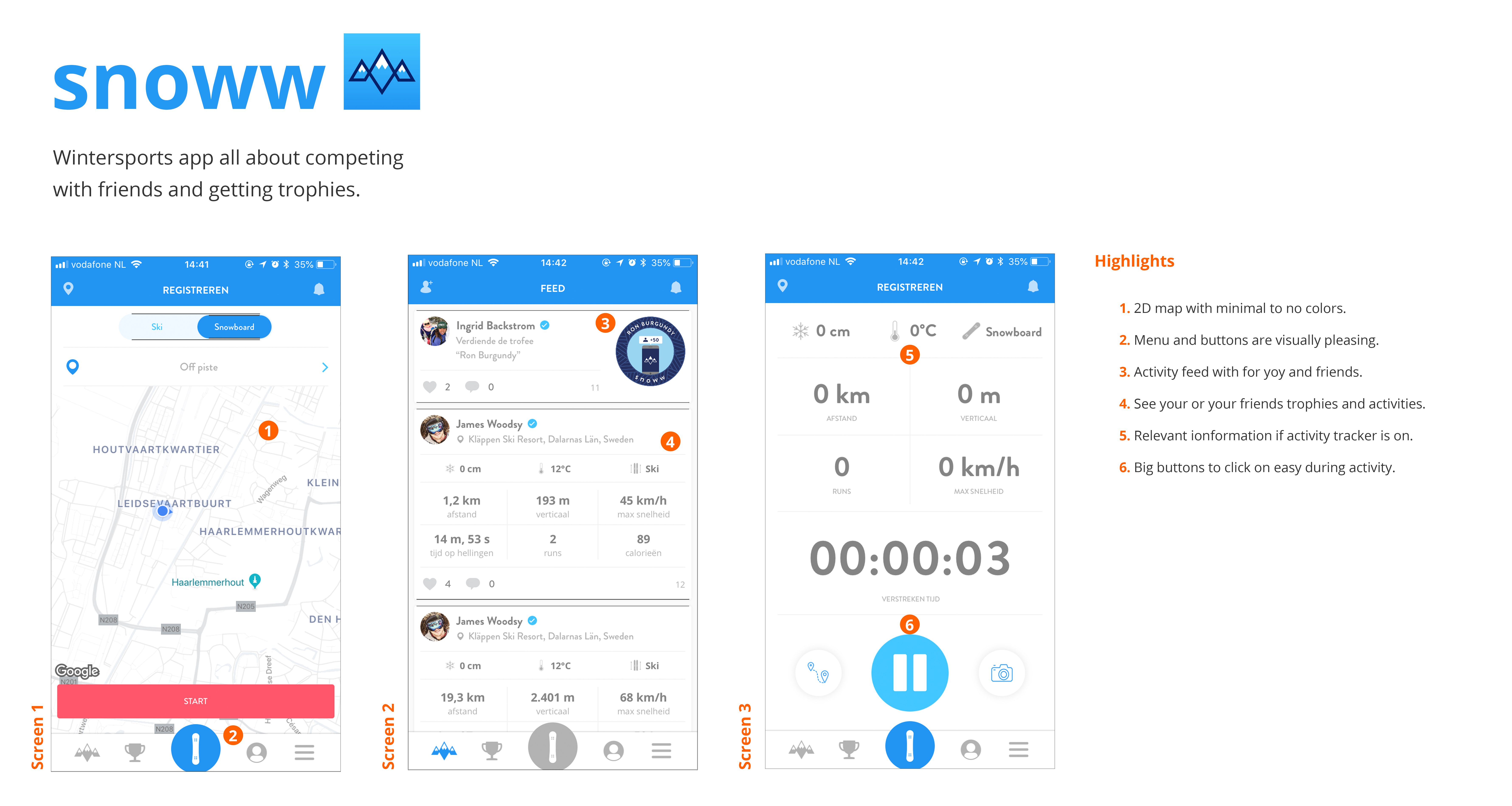
More information about the similar products research can be found
in 4.3.1. Similar products in the product biography.
The features
The similar products and the user research were stepping stones to create the features that were going to be implemented. To see what the benefits were for each feature I assessed them in a feature-benefit matrix and placed them in a MoSCoW to see which ones were crucial to the project.
The features that were created were:
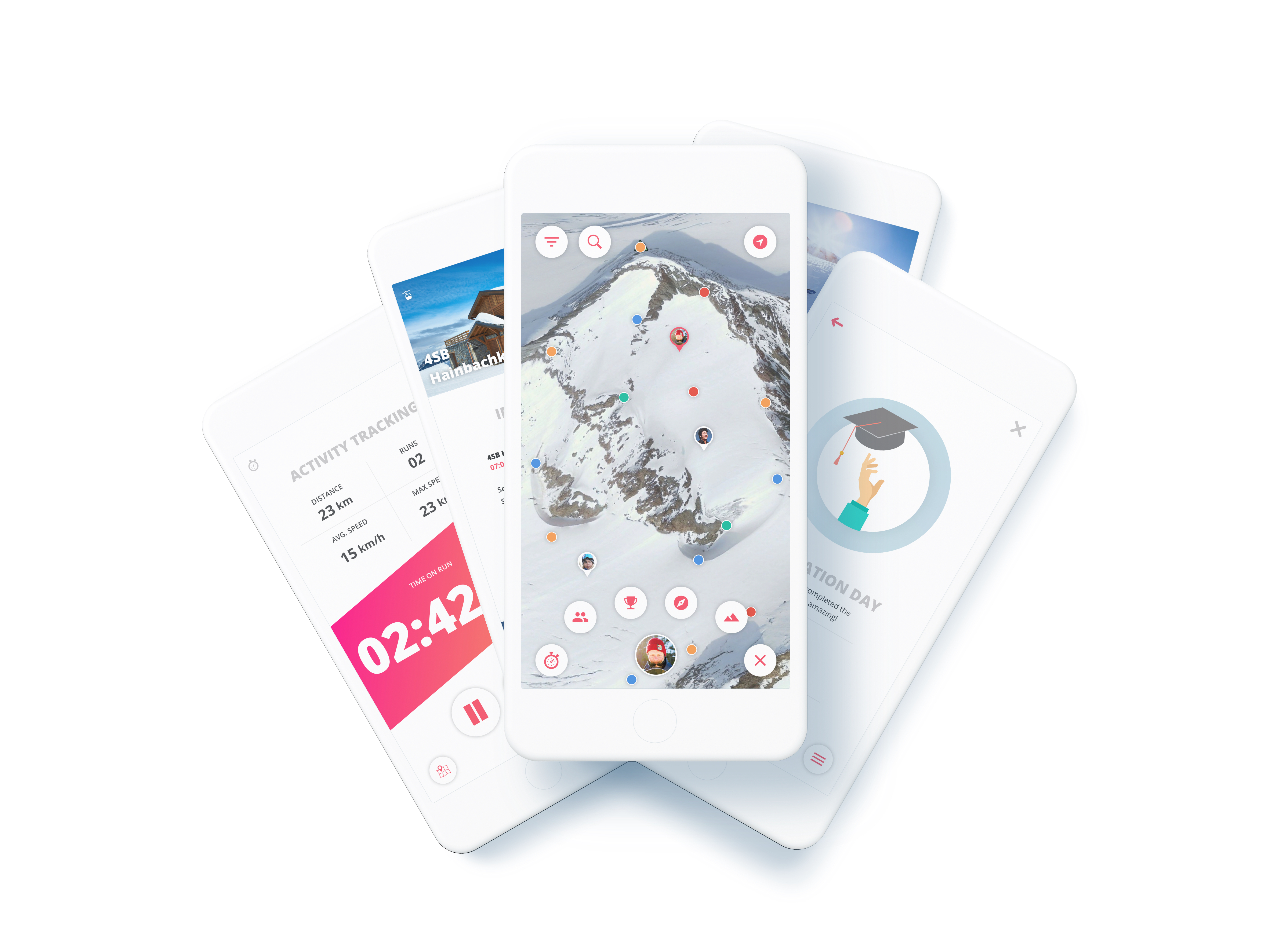
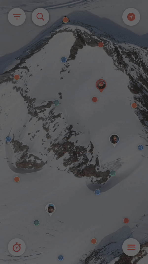
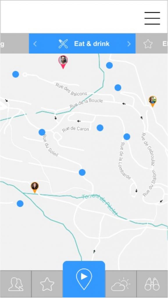
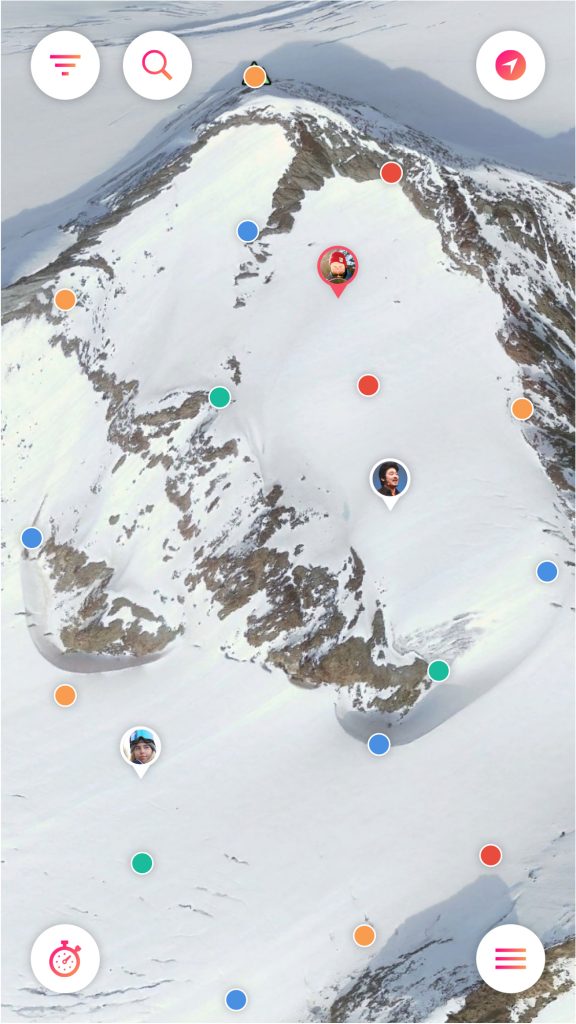
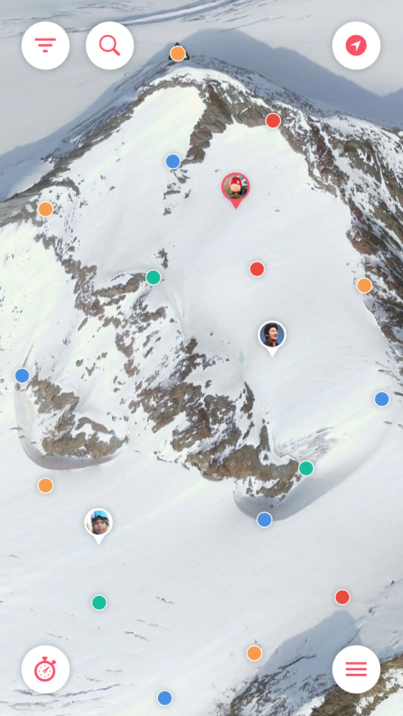
1. Map
A 3D map with points of interest.
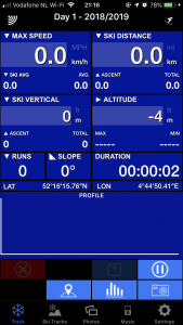
2. Activity Tracker
The user can track his/her data while skiing or snowboarding.
3. My Mountain
Here the user will find the weather, forecast and can see who is king of the hill.
4. Discover
The user can discover new places and routes on the map.
5. Achievements
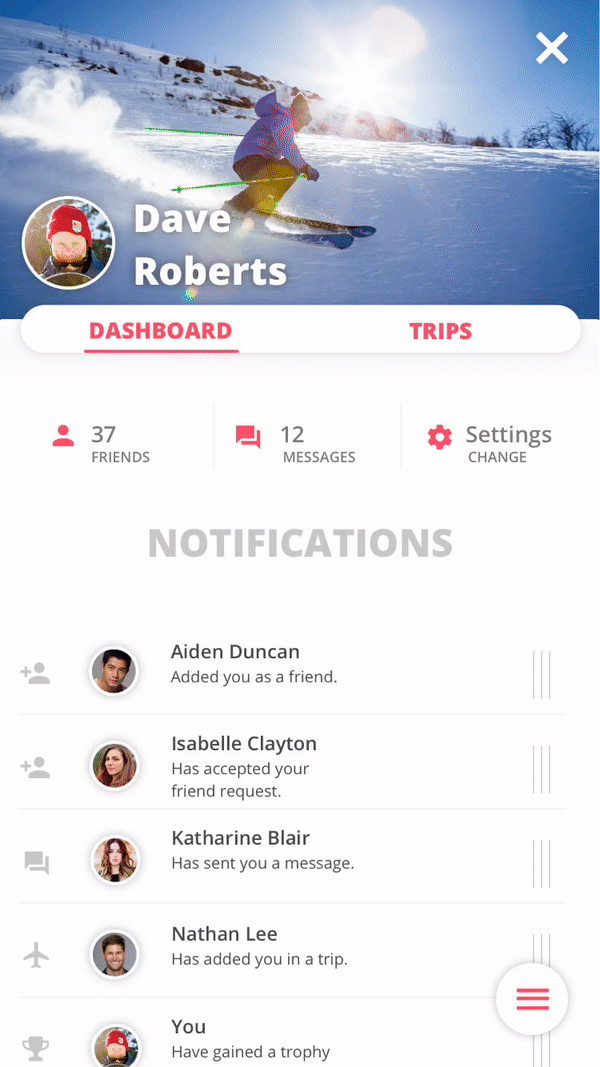
The user can earn medals and compete with friends on the leaderboards.
6. Activity feed & Profile
Social feature to connect with other users.
More information and details about the features,
please read 4.3.2. Features in the product biography.
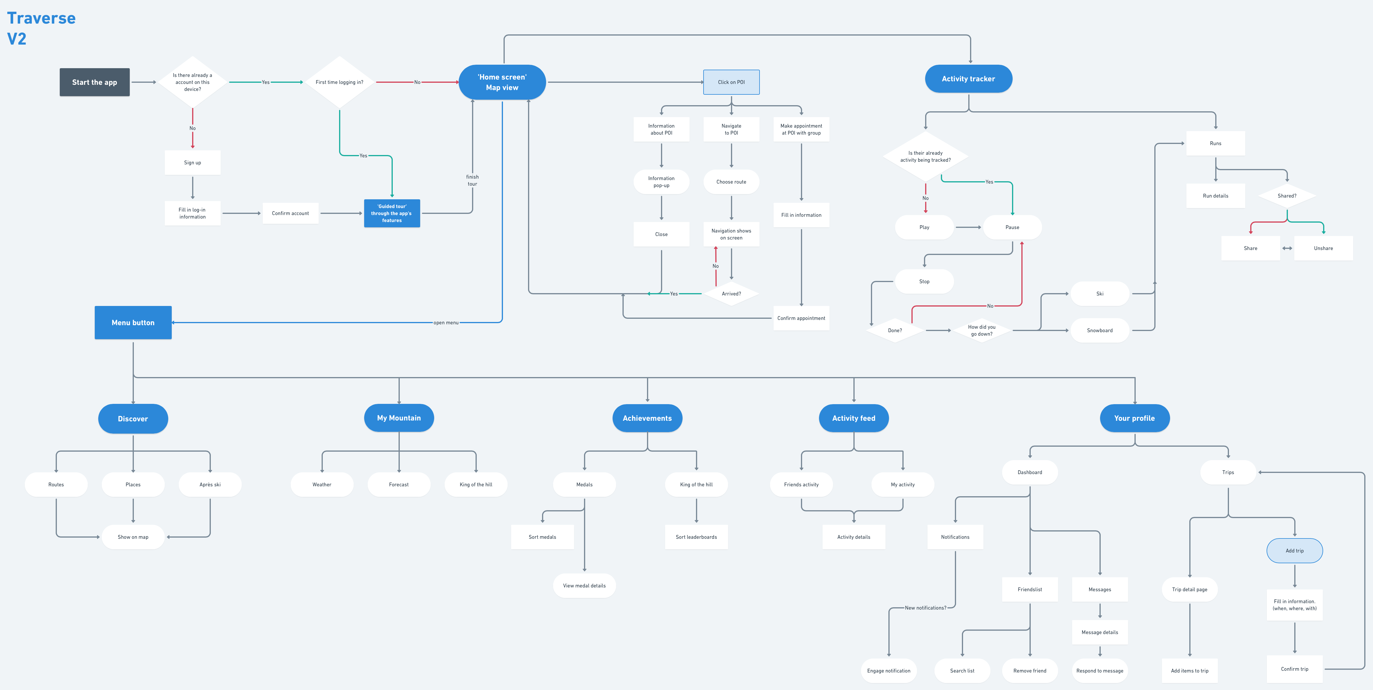
UX flow
5. Gamification
In this chapter you will find the research and reasoning behind the gamification used in the application.
Yu-Kai Chou
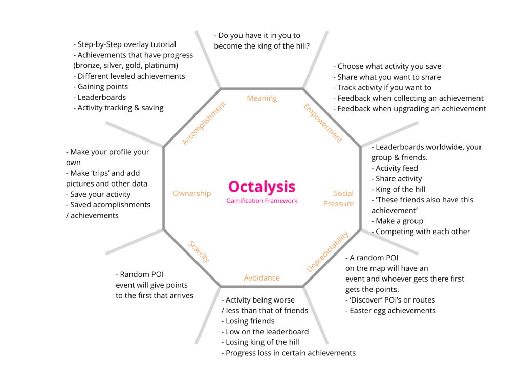
I came across gamification guru Yu-Kai Chou when researching the subject. I participated in his 14-dat gamification course and learned about gamification and the 8 core drives of human motivation. I used this research to add gamification to my own project. You see this in the filled in Octalysis framework below.
“Gamification is the craft of deriving all the fun and engaging elements found in games and applying them to real-world or productive activities.” – Yu-kai Chou
More about the research on gamification can be
found in 5.4. Gamification in the product biography.
-
- Octalysis framework
-
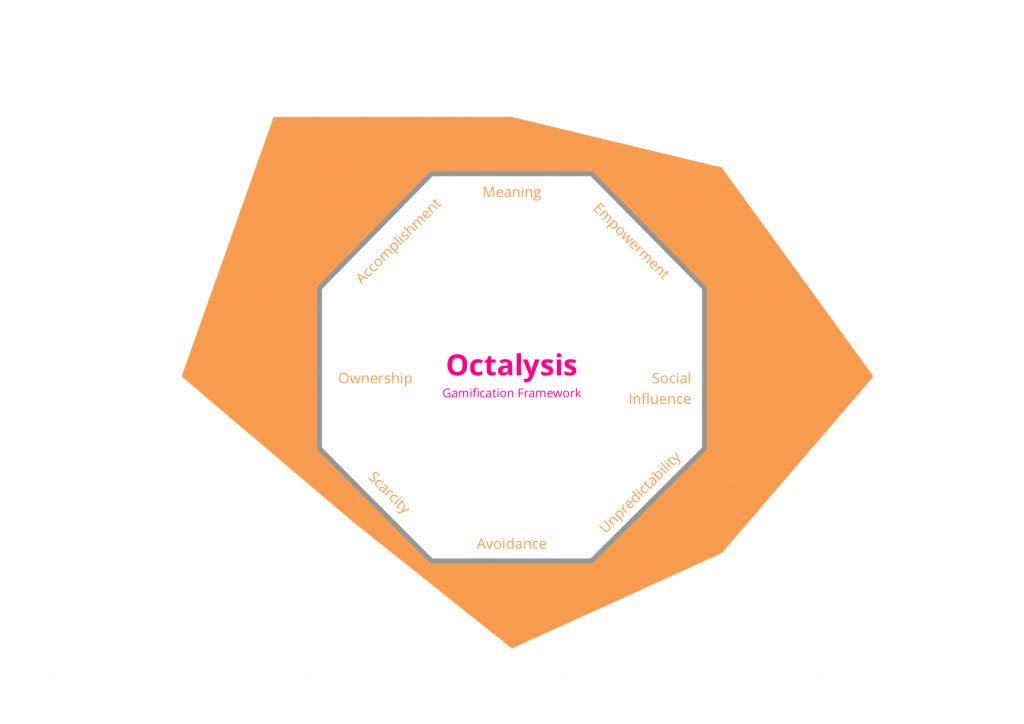
- Octalysis balance
“Whether you know it or not, you’re playing a game right now.”
– Yu-kai Chou
Gamify the experience
As shown in the framework there is balance in my in the gamification drives. After this research I was able to fully implement the 8 core drives. I have implemented all 8 of the core drives, but in here the rationale I will explain a key example used per drive.
1. Epic Meaning & Calling
Epic Meaning & Calling will be used to make the user feel like they are the one that needs to get the job done. In the advertisement before downloading the app the user will be enticed to become the ‘King of the hill’.
Narrative
“Do you have what it takes to become the king of the hill?”
-
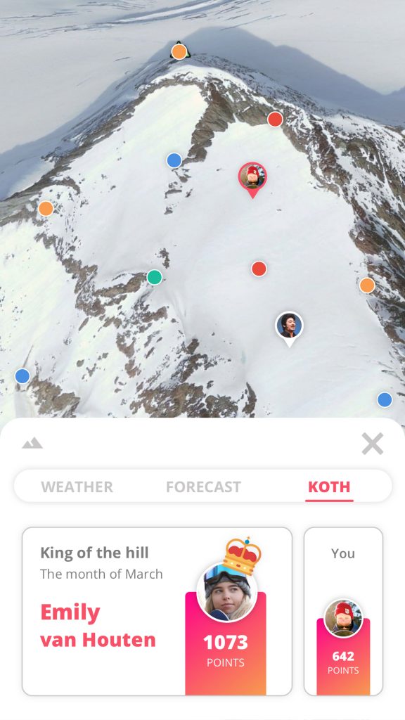
- Traverse – king of the hill
2. Development & Accomplishment
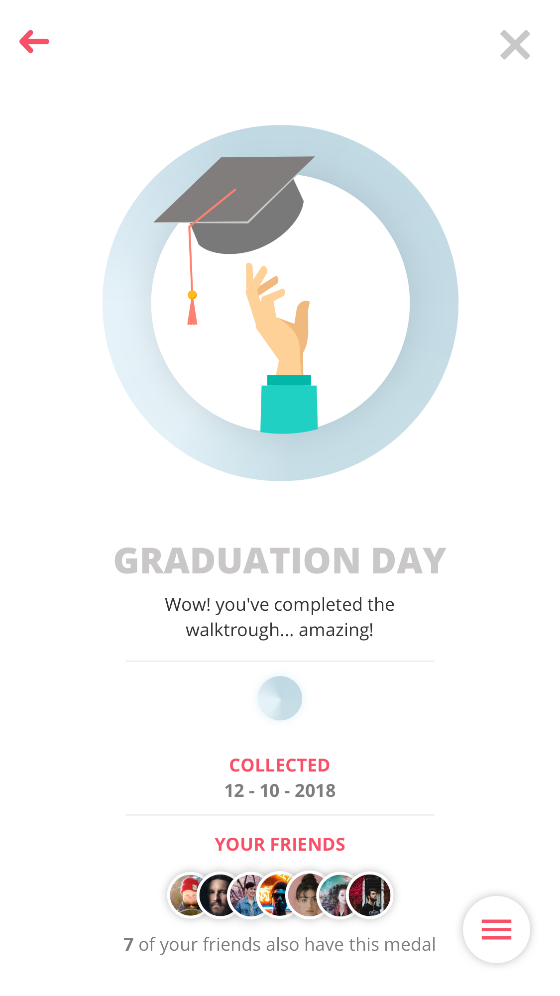
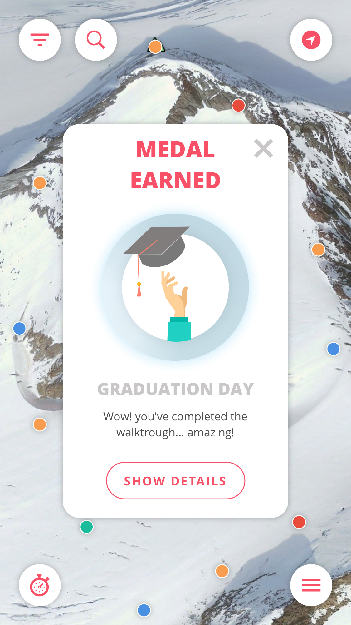
Development & Accomplishment will be used to please the users internal drive to make progress, develop his/her skills and overcome challenges. The user will be gaining points during their activity and can get achievements. While some achievements are relatively easy to get some will be more challenging, giving the user the motivation and drive to show off his skills. Also a step-by-step tutorial will be used to give new users information about all the features. When the user is done, they will receive a shiny new medal.
Medals
-
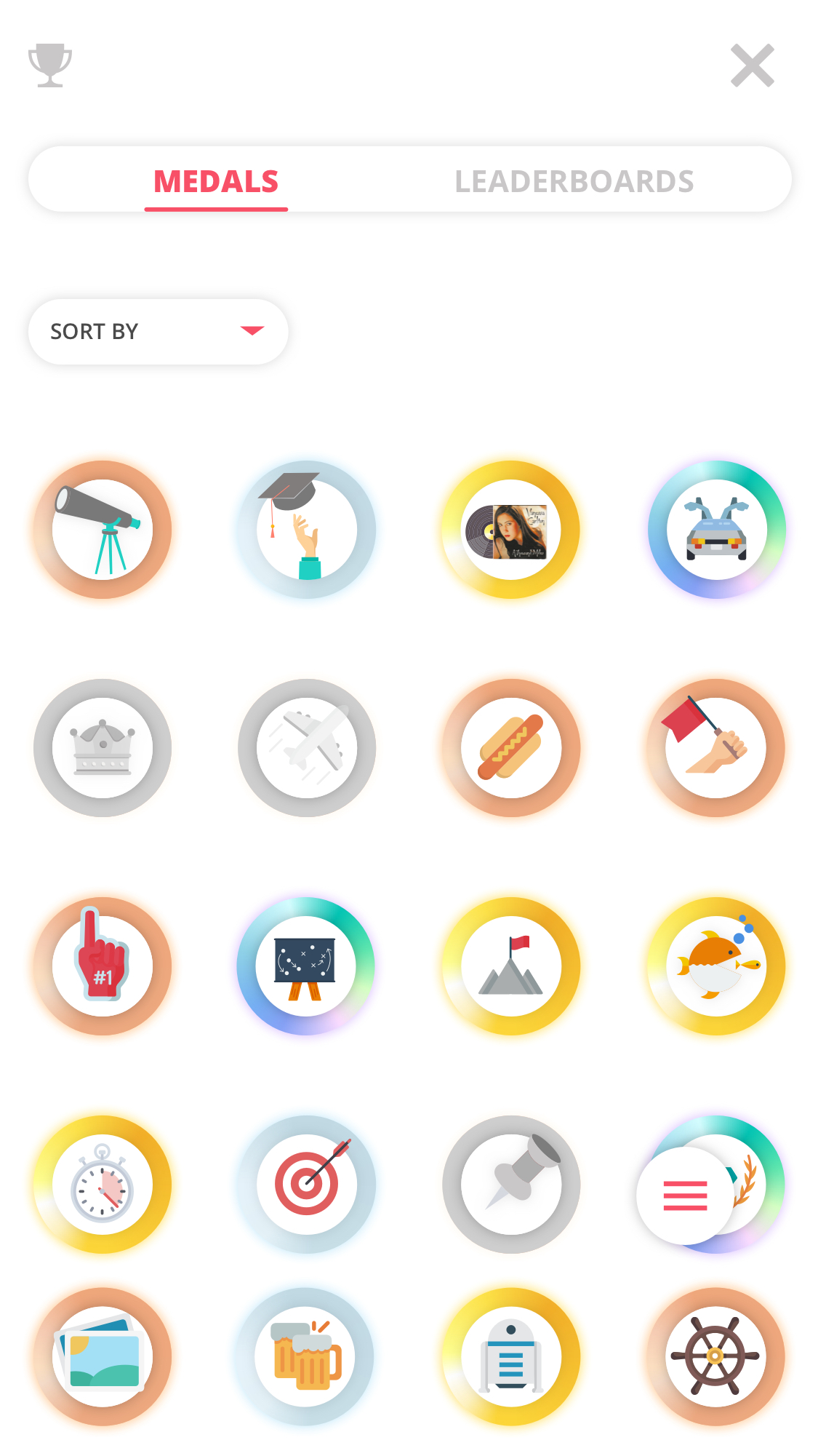
- Traverse – medals
-
- Medal example
-
- Earning a medal
-

- Diamond medal shine
3. Empowerment of Creativity & Feedback
Empowerment of Creativity & Feedback is actually implementing itself, the user was already planning to engage in winter sports activities but now with my product they get points, achievements and can track their activity. This helps a lot with feeling empowered. The user can share any info he/she wants, whenever he/she wants. The feedback element comes in play when collecting achievements or upgrading them from bronze to silver for example. An cool animation shows and you feel empowered by completing your quest.
Earning a medals
-
- Earning a medal
4. Ownership & Possession
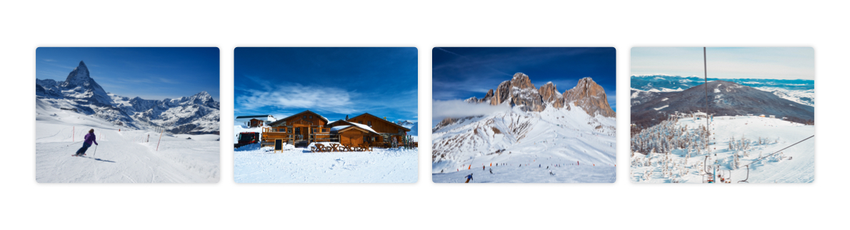
Ownership & Possession makes the users motivated because they feel like they own the product. The user will accumulate points, achievements and will save their activity. The user can make a custom profile, join a group and make ‘trips’. These trips contain all kinds of data like activity, photo’s and friends. The user will feel this is a personal belonging.
Build from scratch
-
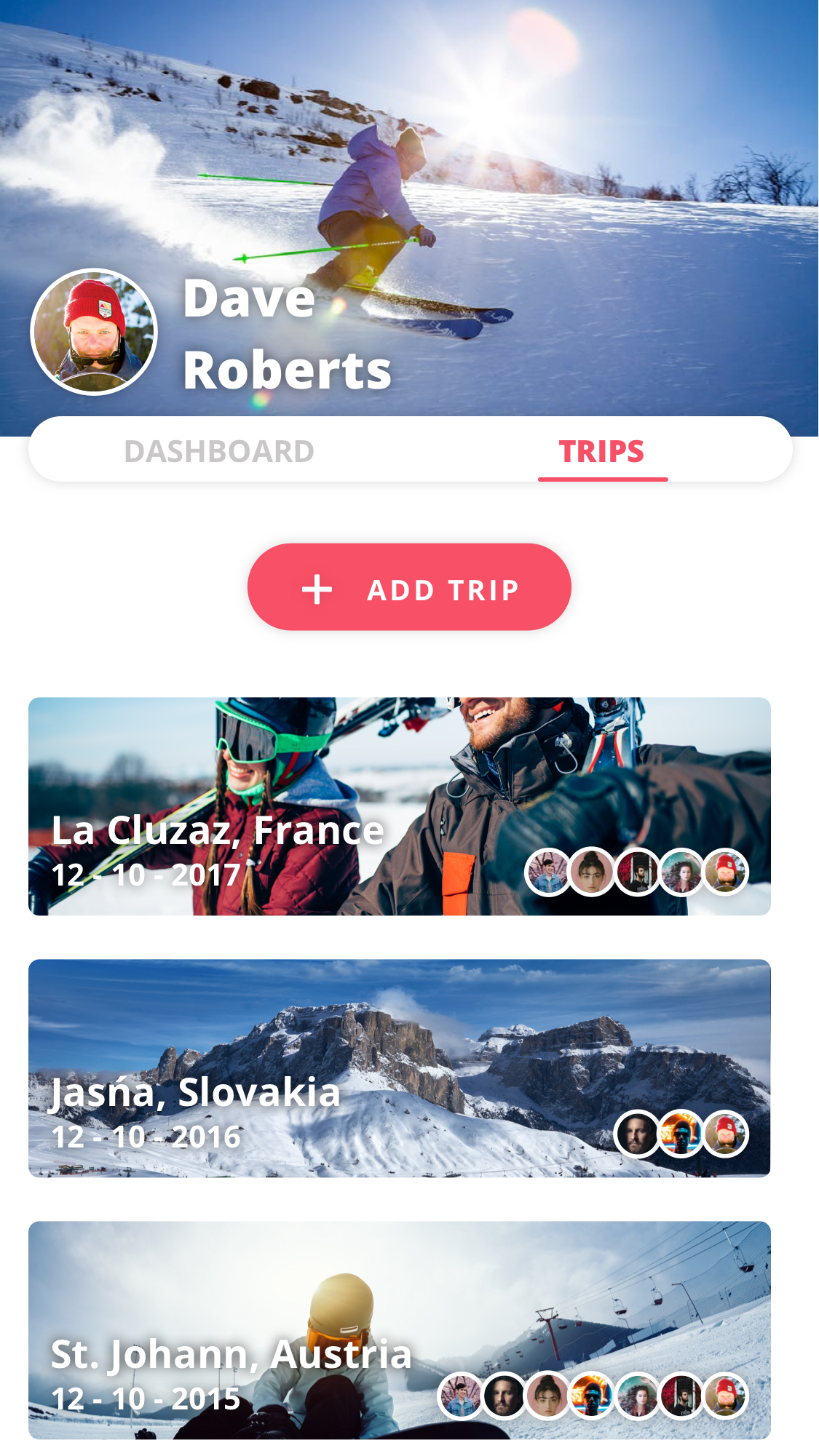
- Traverse – Trips
-
- Trips
5. Social Influence & Relatedness
Social Influence & Relatedness, this drive is one of the big ones in this project. The user adds friends, this makes it possible for friends to see your activity, but also for you to see theirs. The user will feel motivated to gain points and achievements because they can compare each other on leaderboards for points, speed etc. The user can also become ‘King of the hill’ if they accumulate the most points on the mountain they are on right now. And finally, the app will show who of your friends also have each shiny medal to motivate the user to grind harder due to that social pressure.
Bragging rights
-
- Medal example
-
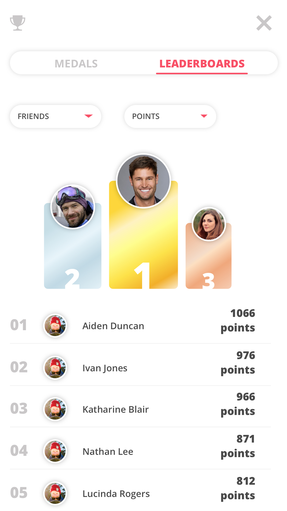
- Traverse – leaderboards
6. Unpredictability & Curiosity
Unpredictability & Curiosity is usually a harmless drive, it sparks the curious nature of the user. This is mostly why people watch movies, the downside is that this is also the core drive behind gambling addictions. I will be using it in the addictive black hat way, but I will spark the users curiosity by having secret achievements. Little ‘easter eggs’ e.a. a achievement called ‘Back to the future’, this is achieved by accidentally starting a trip in the past. Also, the user can gain points by being the first at an event POI and ‘discover’ things on the map.
Easter eggs
-
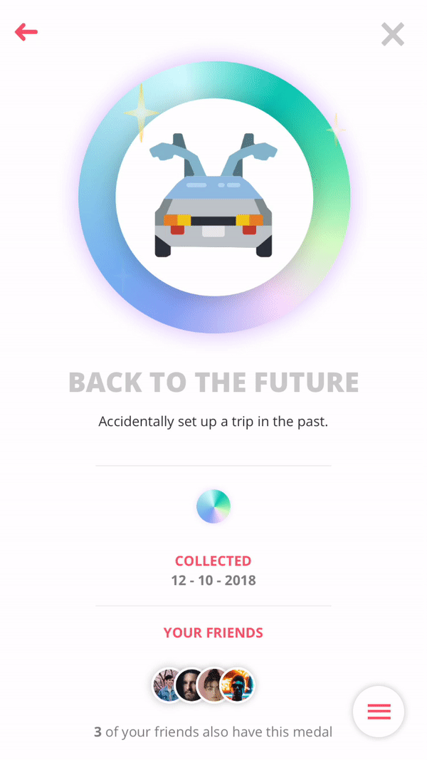
- Traverse – medal shine
7. Scarcity & Impatience
Scarcity & Impatience is one of the black hat gamification methods I will not really be using. The only element worthy of mentioning is that once in a while a random POI on the map will glow up due to an event. The first user that arrives here will get points and progress to an achievement.
Dangling & Timer
-
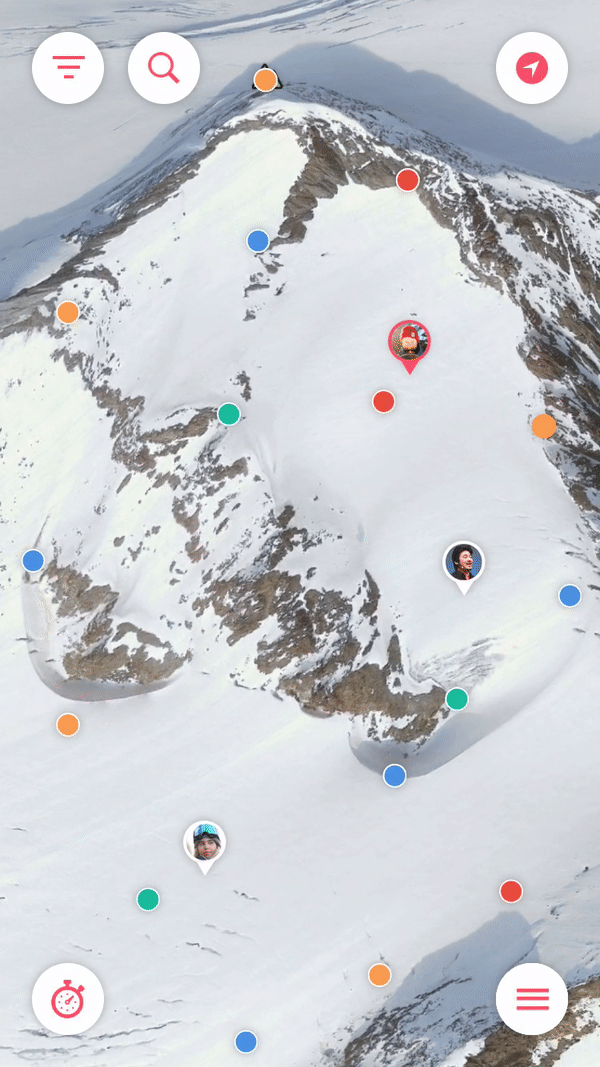
- Traverse – random glowing reward
8. Loss & Avoidance
Loss & Avoidance is all about not wanting to lose progress or not wanting something negative to happen. A black hat method I will use in a minor form. The user can try and get an achievement like ‘Office hours – have a run that lasts 8 hours‘ or the example below: ‘Going up? – Spent 20 consecutive minutes in a lift.‘ If the user quits early, they will lose this progress and they will see the progress bar go down. Naturally the user also does not want to be in the bottom of the leaderboards or lose the ‘King of the hill’ title while they just got it.
Progress loss
-
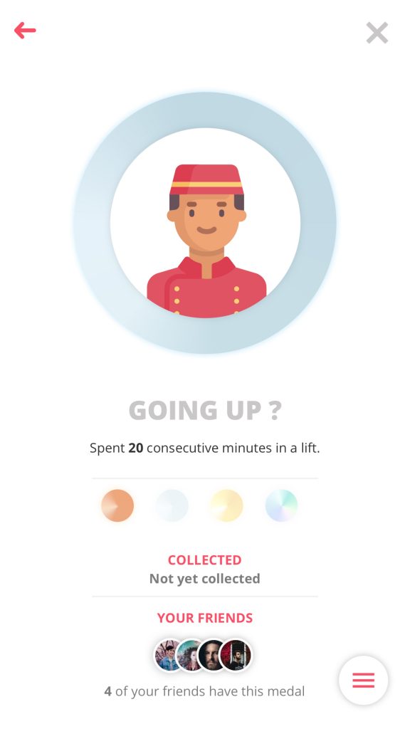
- Traverse – possible progress loss
More detail about the implementation of the 8 core drives can
be found in 5.4.1. Gamify the experience in the product biography.
6. Design
In this chapter you will find the research and reasoning behind the look & feel, visual- and motion design of the application.
Moodboards
The moodboards for visual design and typography were created early on to get a hold of the style direction the application was going to take.
-
- Inspiration wall
-
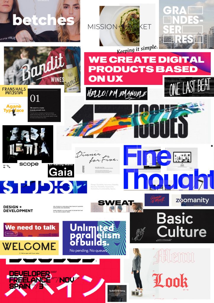
- Typography moodboard
-
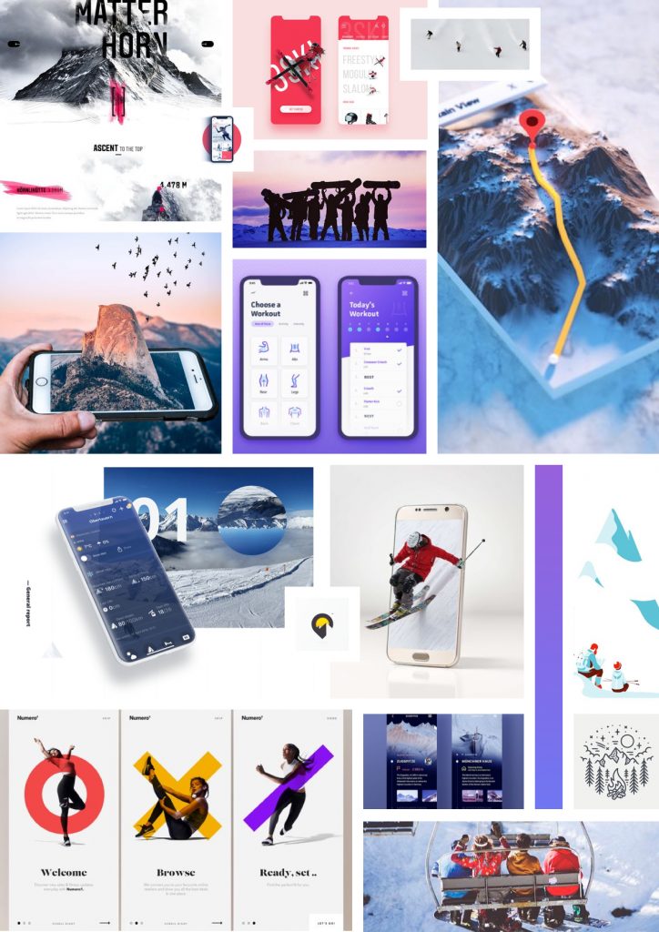
- Visual moodboard
Look & Feel
This is the styletile, it represents a lot of visual styles and elements like fonts, colors and interface elements that make up the style of Traverse. The style tile helps communicate the brand identity to possible future stakeholders and other interested parties.
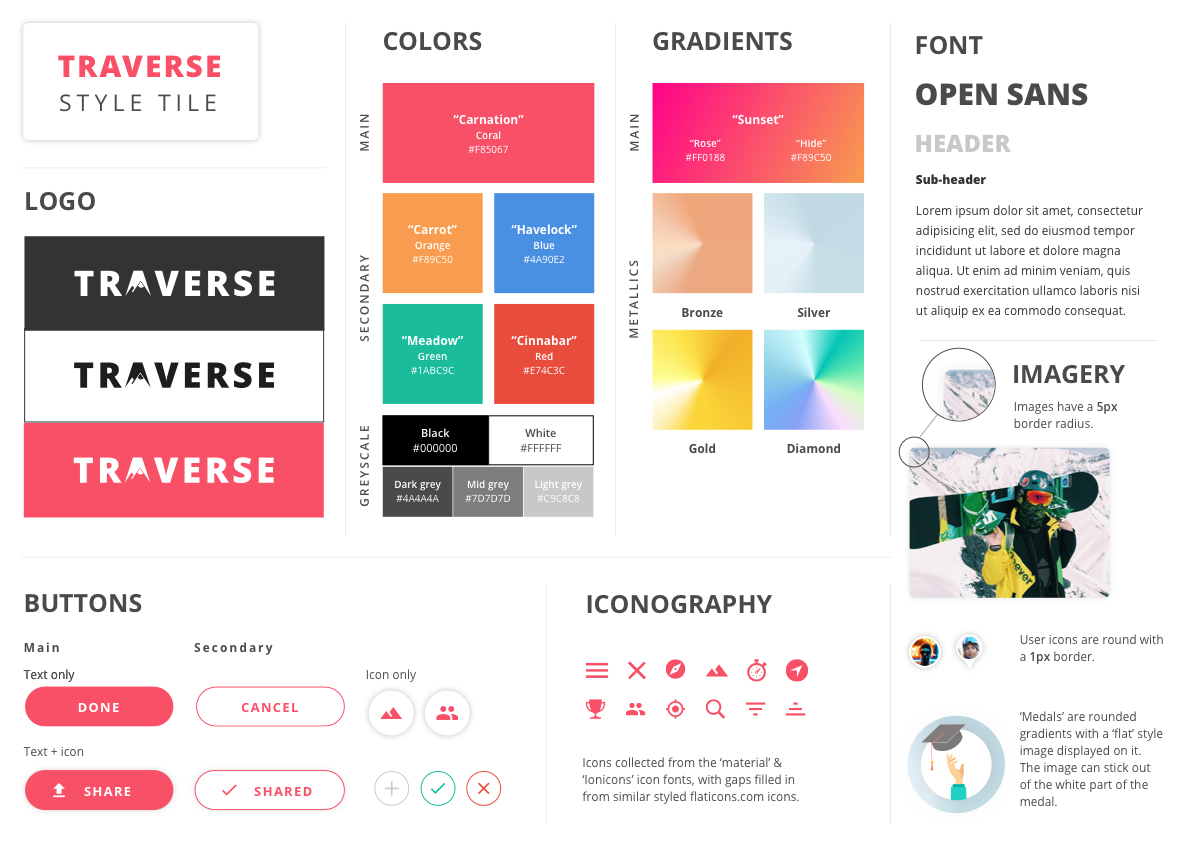
Color
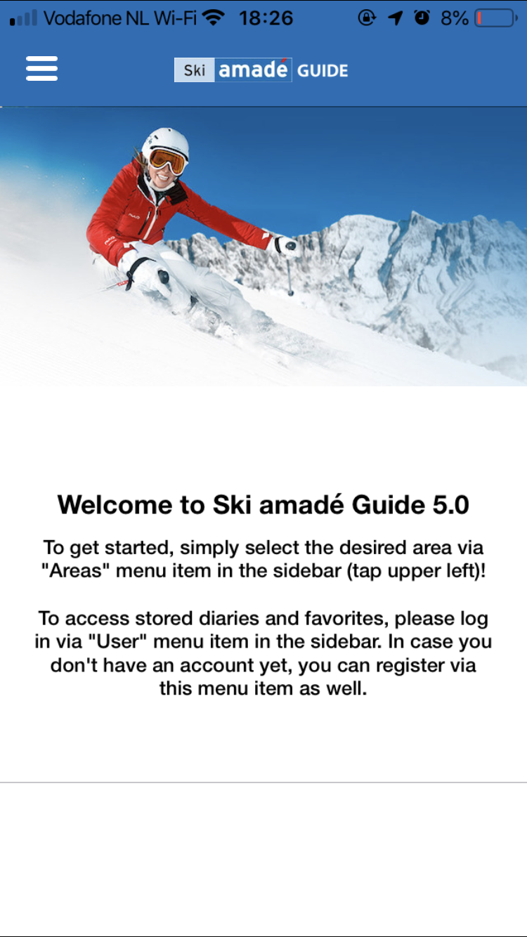
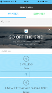
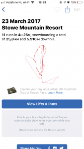
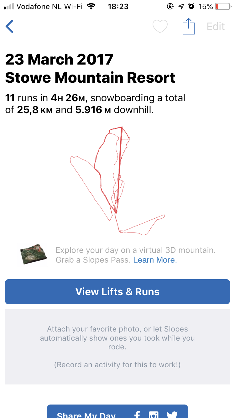
White powdery snow and clear blue skies, when having to imagine skiing these two things pop up inside your mind easily. I guess this is the exact reason behind giving a winter sports app a white and blue color scheme, white representing snow and blue representing the skies. When searching for apps used during winter sports, may it be activity trackers, map apps or apps with ski resort information it is hard not to find one without this white and blue color scheme. About 95% of winter sports apps use these colors, which I consider not thinking outside the box. You can see examples of this in the images below.
-
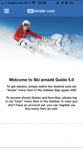
- Ski Amade
-
- Fatmap

-
- Slopes
-
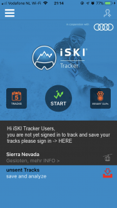
- iSki tracker

-

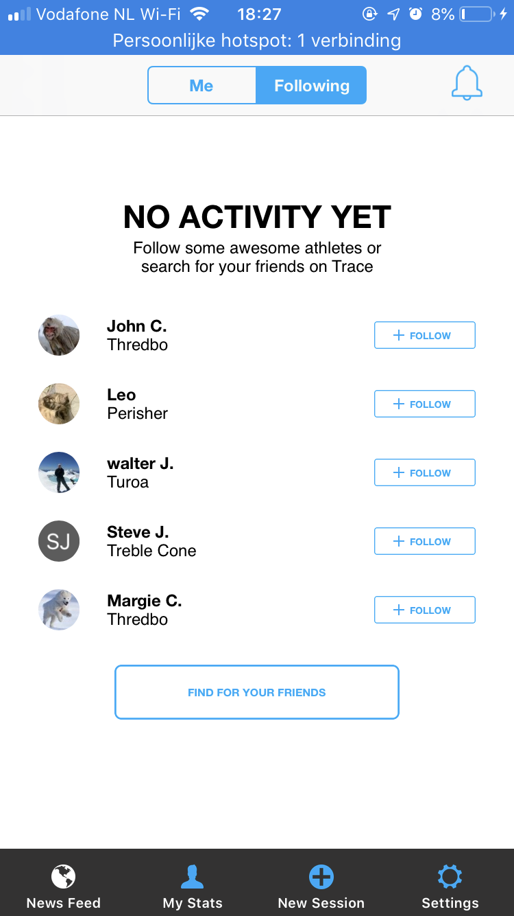
- Trace
-
- Skiinfo
-
- bergfex Ski
-
- Ski Tracks

More energy
This is the exact reason I chose to experiment with different colors. Associating skiing or snowboarding with the colors blue and white and using that in a winter sports application is a logical step towards making something that looks like everything else. I chose to look into more energetic colors, colors that radiate energy. Sunsets during cold, snowy winter sports days are a beautiful thing to behold. I wanted to use the colors in this imagery as a step towards a more vibrant color scheme.
White and blue winter imagery
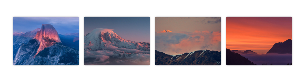
Sunsets on snowy mountains
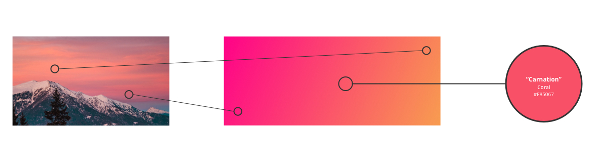
A different vibe
Sunsets and sunrises on snowy mountains often give an orange-y or pinkish glow to the pure white snow. I used this as a starting point for what later became my main gradient. As you can see in the image below, the main color of the application is a color called “coral”. Coral is described by Google as a ‘reddish or pinkish shade of orange’. And while my coral is more on the pink color spectrum as the orange one, it’s coral none the less.
The reason behind this color is my main gradient. I took the pink and orange tones in images of snowy mountain sunsets and blew these up to more vibrant versions of themselves. Somewhere around the centre of this gradient my shade of coral came to be. This is where is decided to use this as the main color in the application Various color psychology studies have come up with meanings behind certain colors, I took this into account while making my color scheme. Orange is often used to convey optimism, adventure and fun. Pink is used to communicate energy and playfulness. Two colors that represent the idea of the application very well.
Font
For my typography I used Open Sans. Open Sans is an sans serif font family described as a font that has an open, neutral, yet friendly appearance. It works well with other sans serif fonts and is a pleasure to read on the web. It’s also a plus that it’s a free web font on Google Fonts used by many other online services like applications and websites.
Open Sans was designed with an upright stress, open forms and a neutral, yet friendly appearance. – Google
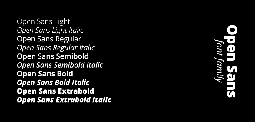
Open Sans styles
Logo
The Traverse logo is based on a customized version of the ‘Open Sans – extra bold’ font with a edited ‘A’ depicting a mountain with a snowy mountain top. The logo itself is a combination between a wordmark type logo and a logo mark, with the ‘A’ in Traverse being able to function on his own as a logo mark in possible future branding.
![]()
Tone of voice
While the visual style shows off one side of the branding, the tone of voice shows the other side. marketingtermen.nl describes the tone of voice as ‘the voice of the organization’. The tone of voice should compliment the visual style, and I tried to achieve this by having a tone that is serious with a touch of humor. The business side of the application, like the detail pages of the various eating establishments will be more serious. While the more ‘fun’ side of the application, like the gamification elements will have more humor and whits. For example, the user can be made fun of in a medal description like: “oh wow! you’ve completed the unskippable walkthrough.” or the user can obtain medals that have references to movies or music.
Where the inspiration for the visual design came from
is found in 7.3. Visual design in the product biography.

Discover & My Mountain
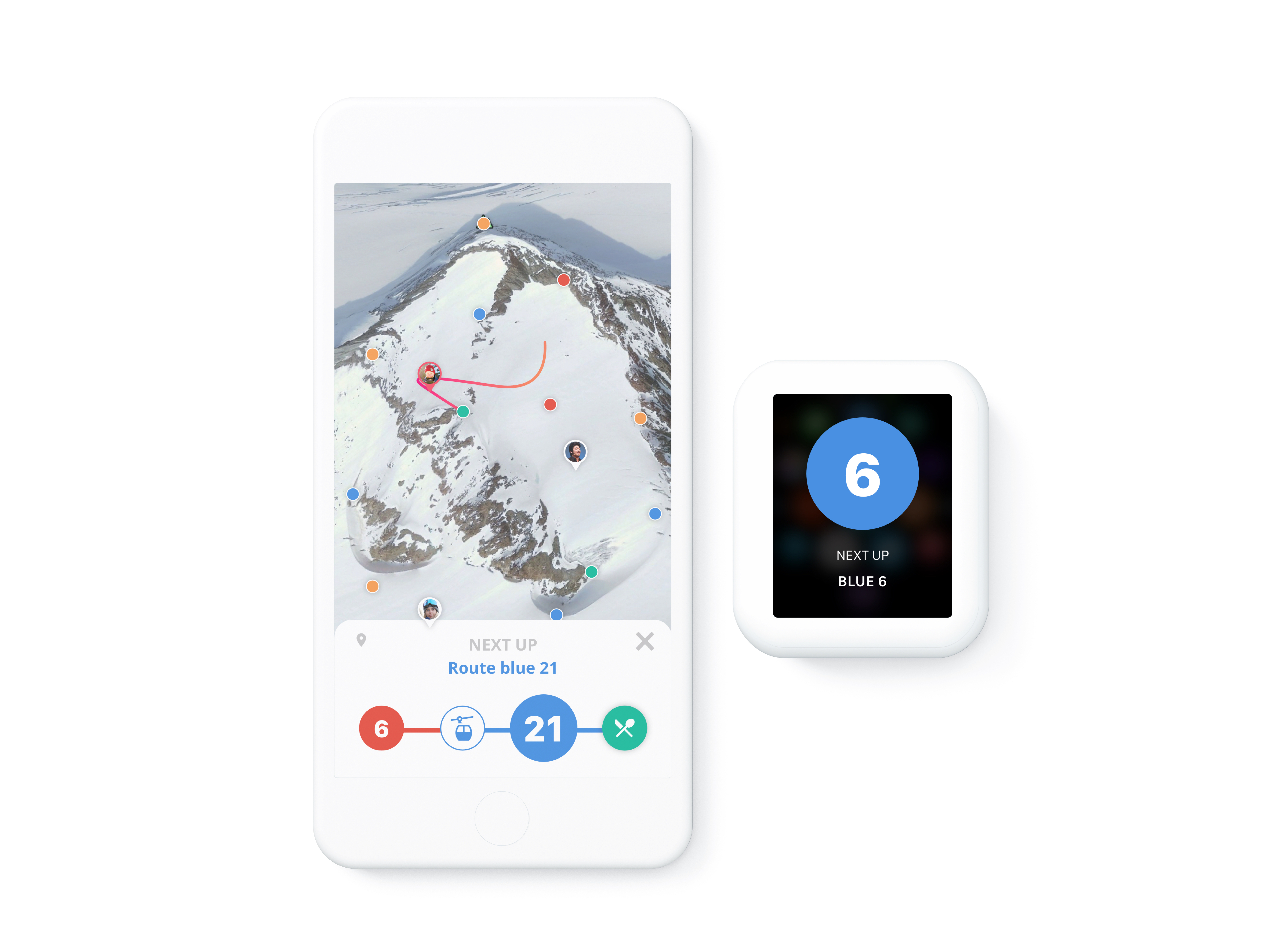
Navigation
7. Prototyping
In this chapter you learn how there was iterated on the prototype, how the prototype was made en how it was tested.
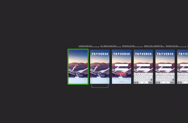
Iterations
Make a design, will it be by sketching or in Sketch, test it with users, note down the feedback, process the feedback and repeat. This the the process of iterating the design and the prototype.
-
- prototype v0.1
-
- prototype v0.2
-
- prototype v0.3
-
- prototype v0.4
-
- prototype v1.0
Details about all the prototypes and user tests can be
found in 6. Prototyping in the product biography.

User testing
Prototype v1.0
Designed in Sketch, prototyped in Principle. This fully fledged out prototype almost shows everything it could do if it really was developed. The prototype took about a full seven day week to produce. It not only has micro animations on every screen, but also screen to screen animations.
Principle timeline
I decided to use Principle, not only because I have used Principle in the past and I know I can work my magic in this. Principle also focusses on on screen animations, micro interactions so to speak. Since this was one of my focus points, Principle was the one to go with. The Principle prototype I have made has approximately one hundred screens, each with its own distinct animations. It has larger screen to screen animations like other screens sliding in from the bottom, gesture based animations like swiping a notification to the left for the options (like an email on IOS) to small animations like a button changing from a ‘plus’ to a ‘checkmark’ when clicked.
Complete Principle timeline
Downloading the prototype
This prototype was made in Principle, this is a prototyping tool that converts the prototype into a Mac app. This means it can only be viewed on a Mac computer. To download the prototype, follow these steps:
1. Click on the download button below
2. When in Dropbox select ‘download’ in the top right.
3. After downloading it from Dropbox, your computer will ask you to trust it.
4. Click on ‘trust it’ in your ‘Security & privacy’ preferences.
5. Unzip the file.
6. Now you have a Mac app of the prototype, enjoy!

Full prototype walkthrough
In this video the whole app will be explored.
More details about the final prototype can be
found in 6.5. Prototype v1.0 in the product biography.
8. Conclusion
“How can an interactive product help make winter sports enthousiasts exited about exploring while competing and sharing their activities with each other.”
– Design challenge
Did this project solve the design challenge?
Traverse is a winter sports application for snowboarders and skiers based on gamification. The snowboarders and skiers will be able to use this application before, during and after skiing trips to not only have insights on their performance, but also compete with each other for points and achievements and make and share memories with friends and family.
During various tests users described their interest in the product after recognizing most of the problems. The features that are implemented not only solve the issues that were described but also gave the project an extra twist to stay ahead of competitors. The 3D map and informational features give the users a good deal of useful ski trip data, while the fully implemented 8 core drives from the gamification make this project fun to use for the whole family.
The scope
In the limited time that the project was realized, not everything could be implemented. Some details will sadly not be in the prototype, for example the detail view of a trip. There is also the issue of ‘who will be the admin of the app?’, this is an issue that I came across after the green light presentation. This has not been fully thought out, but there are a number of possibilities.
1. The ski resort assigns someone to fill in all the information.
2. The app is community based and users will fill the app themselves over time.
3. The app is filled in by Google.
While the third option is a good indication of what could happen, it will probably be a combination of options 1 and 2. With Google filling in most data from their maps, and some admin user of the resort filling in the blanks.